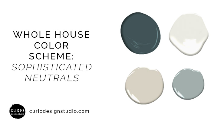
Working on a new construction project is a dream. We get the opportunity to look at the entire house as one unit and select finishes, fixtures and furnishings that tell a cohesive story. Anytime I work on these I always start with a whole house color scheme that will set the tone for the rest of the selections. The North Highlands House was no exception. This client has a very diverse set of taste and an amazing collection of artwork that needed to be highlighted. We decided on a sophisticated neutral color scheme, with pops of large scale wallpapers to call attention to some specific areas.
Ready to get color scheme cohesiveness? Choose our Custom Color Consult and choices made for your home will be delivered to your inbox in 7-10 days.
WHOLE HOUSE COLOR SCHEME: SOPHISTICATED NEUTRALS + BLUES
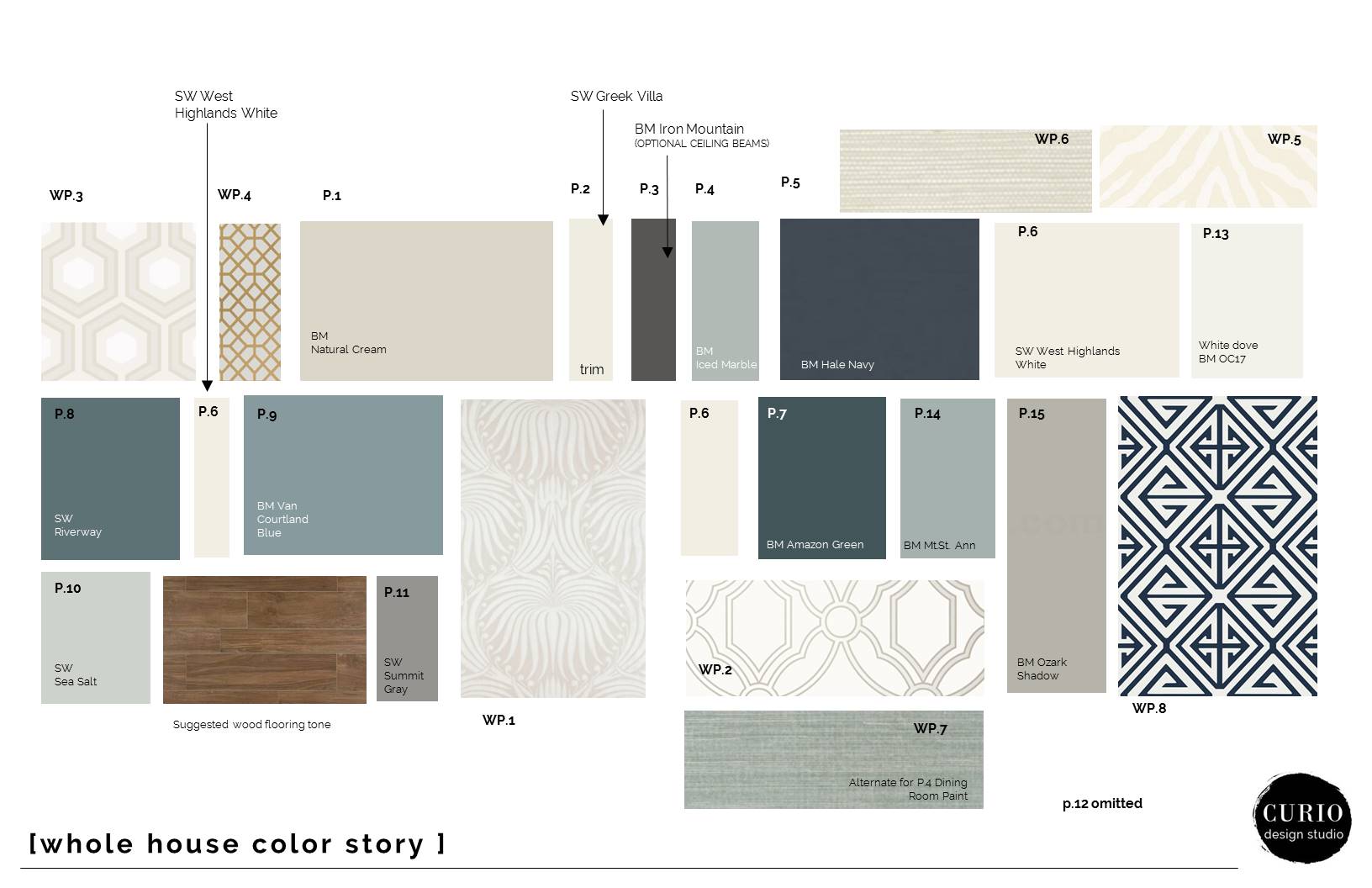
Creating a good whole house color scheme is really a balance between diversity and unity of color. Especially in larger homes, you want to have enough variety of color to lead you through the home, without having every room be completely independent from the look of the house as a whole. I always like to lay out my paint plans for clients so they can see how the colors will flow from front of house to back of house and from basement to top floor.
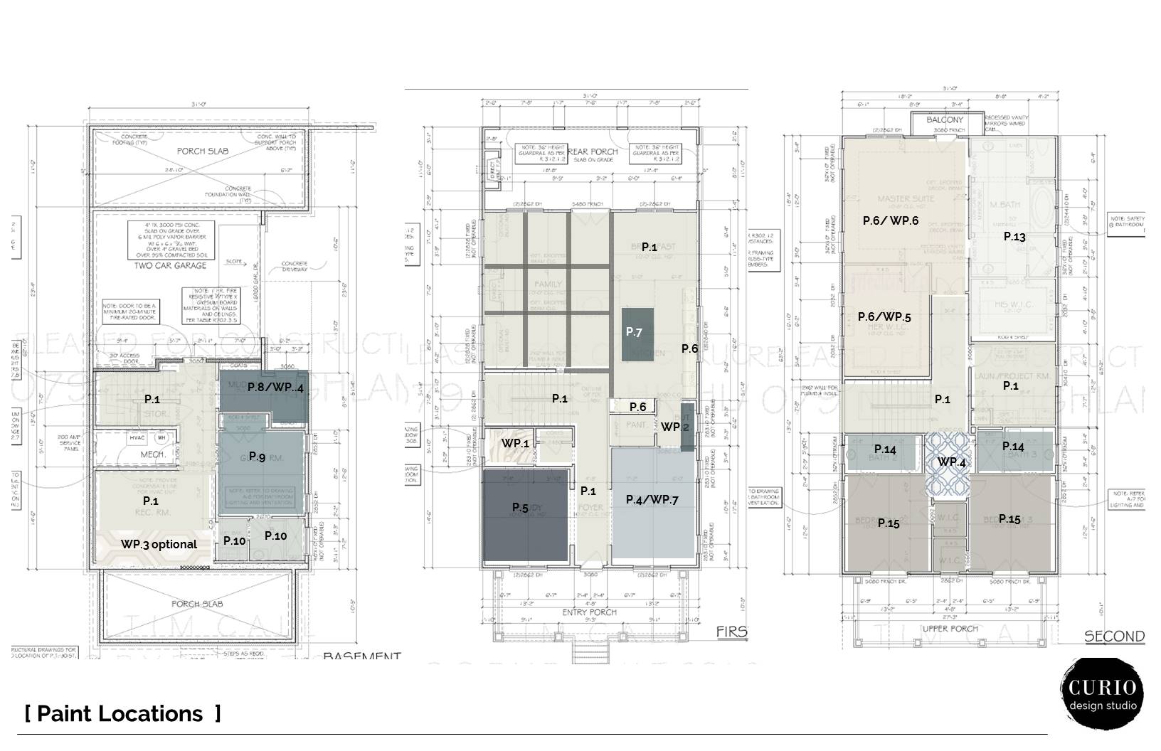
For this scheme we are suggesting a neutral color,Benjamin Moore Natural Cream, for most of the common spaces (halls, great room, basement rec room). This gives us a simple and clean base to work from and will let the client’s art collection shine. Some of the other key colors brought into the space were Benjamin Moore Hale Navy for a dark and Dramatic Study, Benjamin Moore Mount St. Ann for a soothing dining room space, and Benjamin Moore Amazon green for some seriously stunning island + butler pantry cabinetry.

Custom Color Plans—Delivered Virtually to clients nationwide
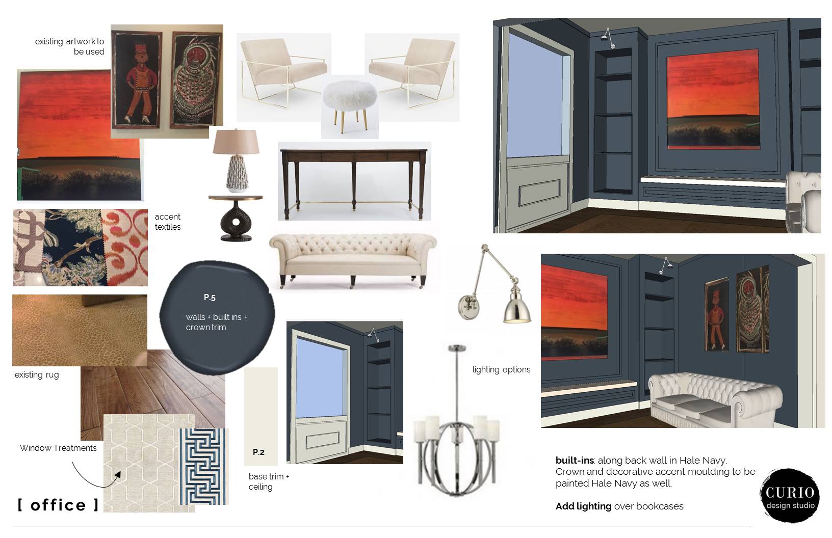
design concepts for Study with Benjamin Moore Hale Navy paint
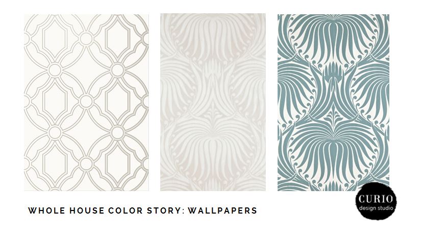
Wallpaper also played a huge role in the initial design direction of this scheme. Since the client had such an eclectic taste, we wanted the wallpaper to reflect that as well. We played with mixing neutrals with saturated blues and geometric prints with large scale scroll type patterns.
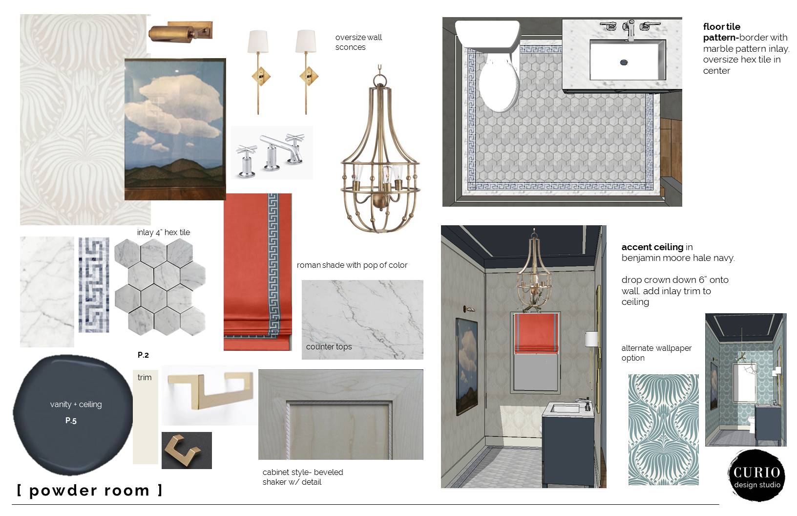
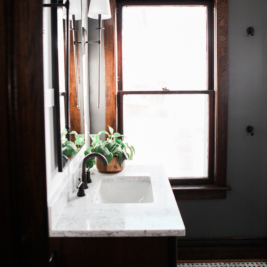
design concepts for Powder room with Farrow and Ball Lotus Paper
One of my favorite areas we carved out with wallpaper was this small reading alcove in the hallway that connected the master to the guest rooms. We punched out this little block of dark blue casework and backing the shelves with this Awesome Geometric wallpaper by Thibaut .
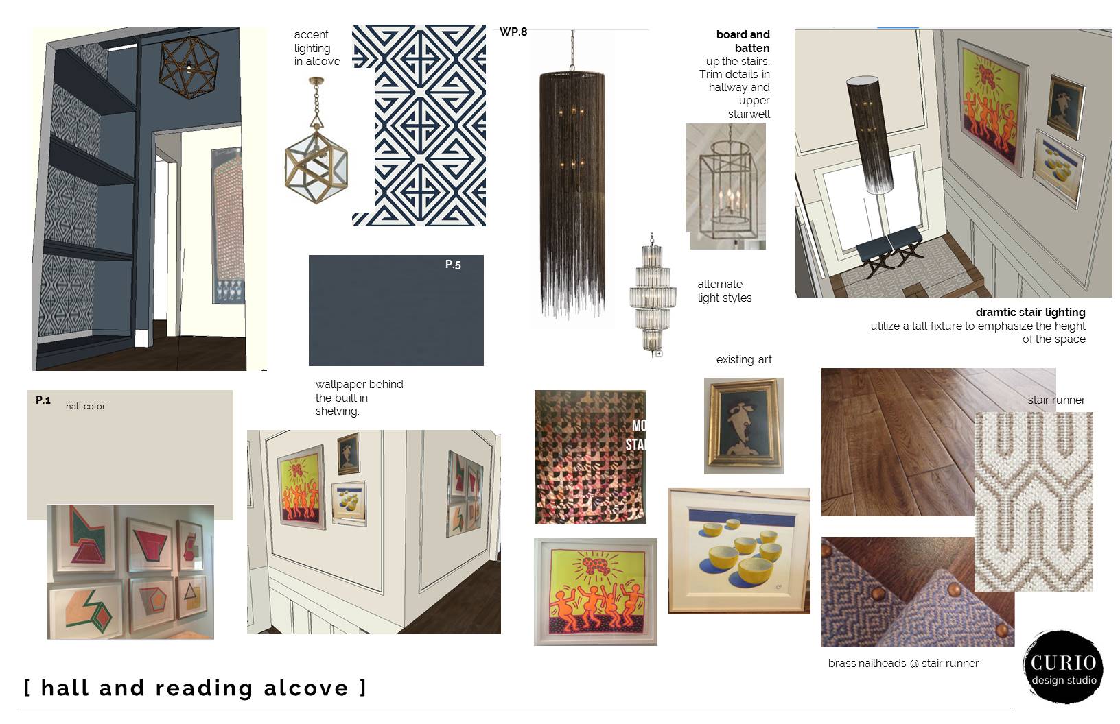
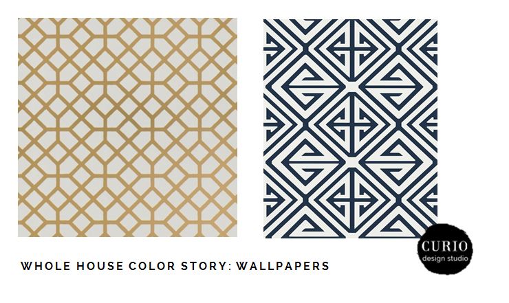
Another place we opted for a geometric wallpaper was for the basement mudroom ceiling, a nice unexpected application.
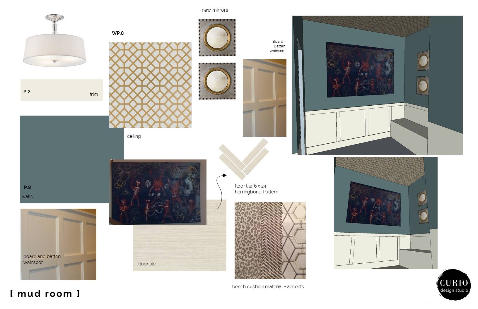
design concepts for mudroom
Overall the scheme is neutral with pops of color and pattern in contained spaces. The main common spaces are kept simple and consistent with a nice neutral color throughout. Utilizing wallpaper in small areas, such as the powder room or reading alcove, not only create unexpected design details they inject pattern and texture throughout the house.

Ready to get color scheme cohesiveness? Choose our Custom Color Consult and choices made for your home will be delivered to your inbox in 7-10 days.


Sincerely,
Allison
MY SHORT BIO.
Founded in 2012 by Allison Harlow, Curio Design Studio focuses on creating distinctive interior environments for new construction, whole house renovations and kitchen + bath remodels for modern families and leading professionals.