Kitchen design is one of my favorite things to work on. There is so much opportunity to enhance function, make the space easier to use for the homeowner + there are all those shiny pretty finishes. The Fourth Street Kitchen was no exception. There were tons of challenges to overcome: nonfunctional layout, outdated materials and a 100-year-old house that had been renovated many times over ( not always in the best way).
With any kitchen renovation we always start by addressing function first and foremost. We use the kitchen tons, and it has to function. We start by talking to the client about their preferences in the kitchen, who is cooking, how many people at a time, what type of appliances do you prefer? This is the framework that guides our initial layout. For the Fourth Street Kitchen we rearranged the layout to give them more usable counter space, a small breakfast bar for the kids to sit at, and laid out the appliances so there was plenty of room for two people to work. The range location also gave us a great focal point for some gorgeous accent tile–BONUS.
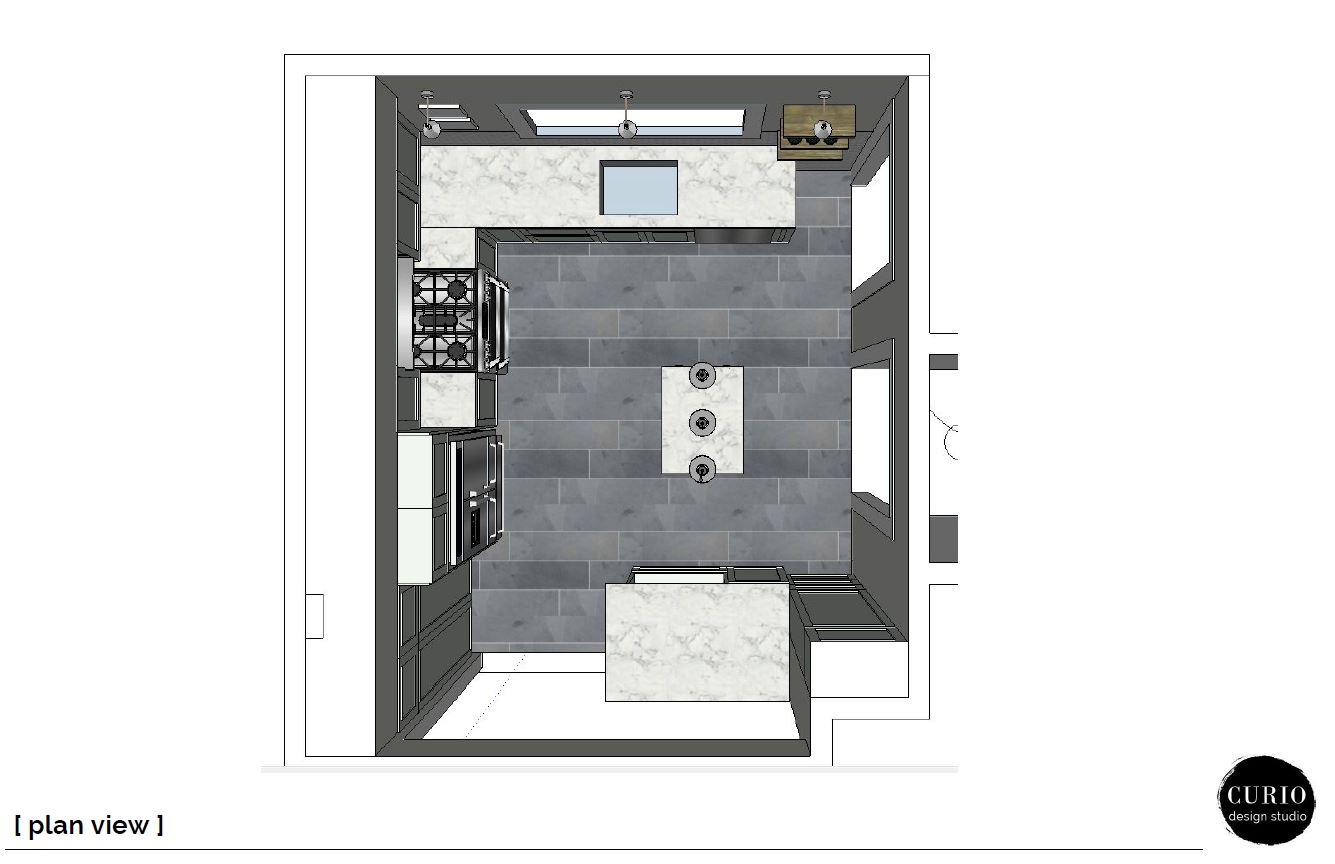
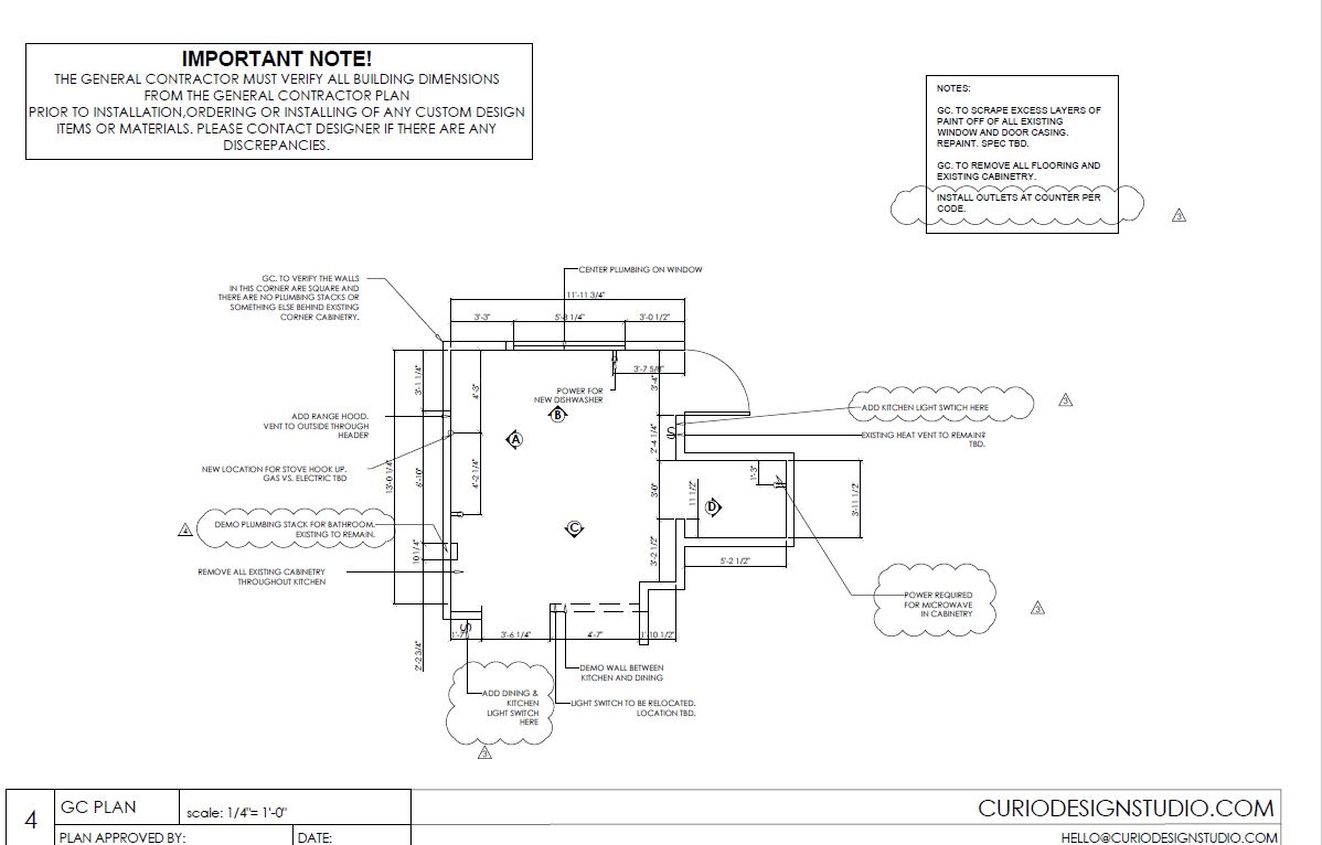
Through out the design process the layout did not change. That is not always the case. We came up with the preliminary layout and walked through it with the client. Once they were on board with our ideas we created a preliminary plan for the Contractor. We did a walk through with the contractor to see if he predicted any issues with our plan that would cause unnecessary expense or prolonged timeframe. It is important to note that a lot of times you don’t know you have a problem until you open up a wall and see what you are dealing with. Especially in old homes. But the initial walk-through with the contractor is KEY in our process. It get’s everyone on the same page and helps minimize the risk for any unpredicted expense.
Both client and contractor have a clear idea of what needs to be addressed in the initial contractor quote.
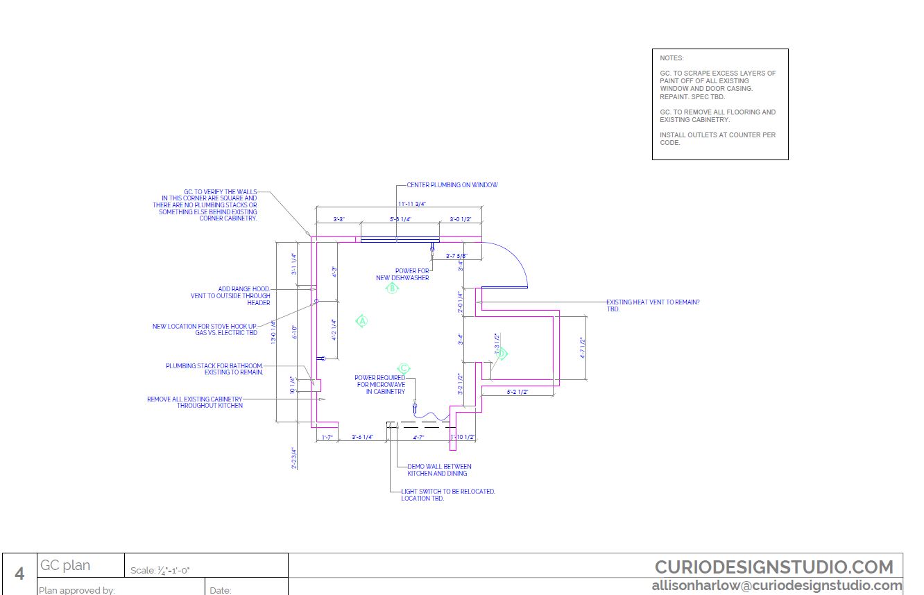
The Finishes
The original finish plan was light + transitional. It consisted of crisp white subway tiles mixed with warm nickel hardware and lighting and large-scale slate floors. With any project we have to make changes,usually always based on budget or the availability of a certain product. This project was no exception. We ended up having a swap a few things around but still kept the design intention the same.
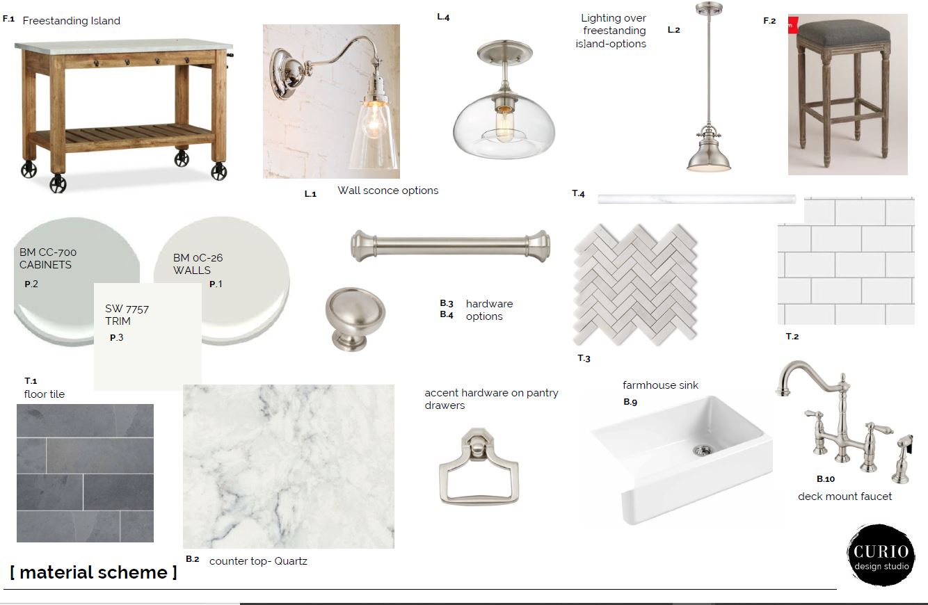
The main change in the revised finish plan was the cabinets. We went with stock colors vs. custom painted cabinetry to trim back the budget a bit. We also had to eliminate the pendants and rolling island. The client wasn’t sure this was going to make sense in the space. Since it wasn’t a permanent fixture it was easy to omit and then add back in the future if it felt needed. All the other finishes remained the same. Transitional light fixtures in nickel, white subway tile and an awesome marble chevron behind the range.
Changes and revisions are expected. We make sure to keep things on track and in line with the original design intent.
The Details
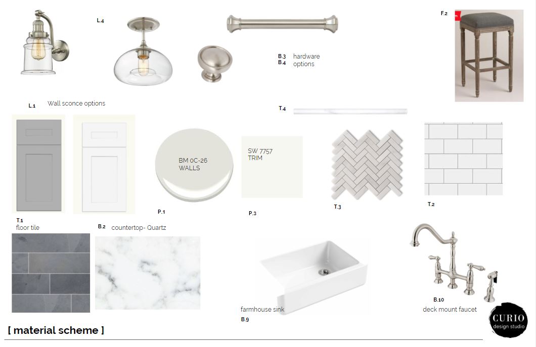
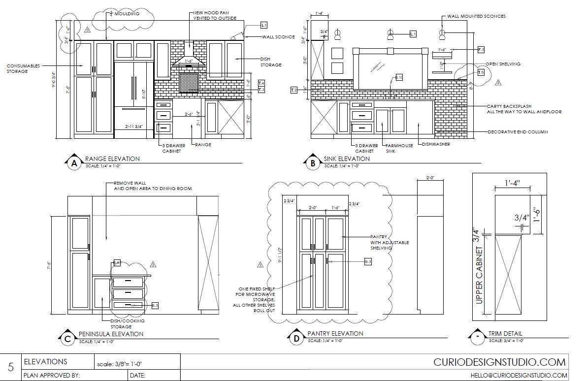
With design the devil is in the details. Once we nail down the layout and the finishes and reign that all in within the clients budget we work on the details. We put together a custom construction document set for all the contractors and installers. This consists of a cabinet layout plan, lighting plan, demo plan and detail elevations.
Now for most clients this document is overwhelming or hard to understand. There is a lot of detail in there. But for designers, contractors and installers this is the bible. This is what ensures that the final outcome looks and functions exactly like we had planned. We spend time to detail out lighting placement, ensuring that is casting the right amount of light on your work surfaces and (equally important) not casting light on things we don’t want to highlight ( the fridge perhaps?).
This is what ensures that the final outcome looks and functions exactly like we had planned
Project Walk Through
With every project, whether virtual or local in Marquette, MI we do a project video walk through. This is uploaded into your personal project management software for your reference. Take a look at the Fourth Street kitchen reno walk through below.
Kitchen renovations can be a tricky and complicated beast. Don’t go it alone! Let’s chat about how we can work together on your next project. And as always–stay tuned for the project reveal!

