If you are a local around Marquette, MI you have surely heard about the new Barrel + Beam Brewery that opened up in the old Northwoods Supper Club building. There is always lots of hype surrounding new businesses in our area, we love to rally together and support small and support local. The owners of the brewery did not want to disappoint. From the beer to the interior, they knew the devil was in the details.
I was beyond thrilled to be asked to join the team of amazing people who worked to pull off this transformation. If you haven’t yet, jump back a few posts and read about what went into the design + planning phase of this incredible project.
The transformation from abandoned log cabin to a lively + stylish brewery is nothing short of incredible. The pictures really don’t even do it justice. So if you are local and you haven’t checked it out yet, please do. And if you are reading this from afar– Marquette has lots to offer from beaches to breweries so please pop on by for a visit too!
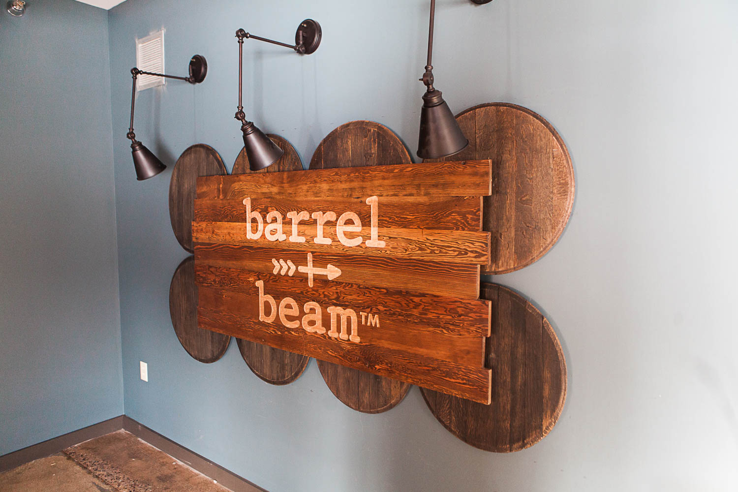
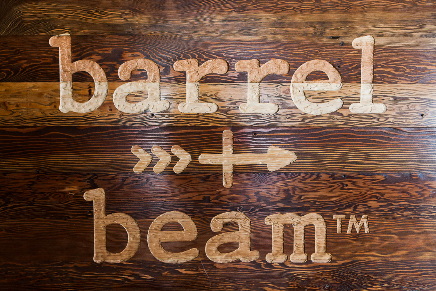
A welcoming entrance.
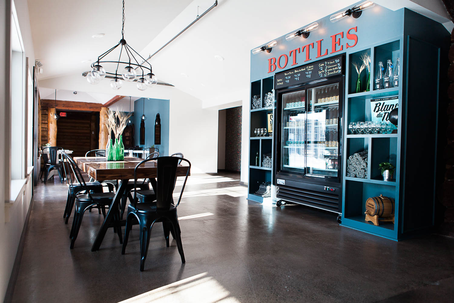
I talked a little bit about the entryway in the Design Plan post. This area was a moving target–constant changes to the building plan, ceiling height and column locations kept us on our feet. In the end it worked out perfectly and an area for this amazing branding wall was chiseled out from all the changes. The sign is made from reclaimed tongue and groove ceiling boards from the original building and was engraved locally by Bill Schumann.
Wall Sconces: Swing Arm Sconce by Trent Austin
Wall color: Benjamin Moore 2135-30 Nocturnal Gray
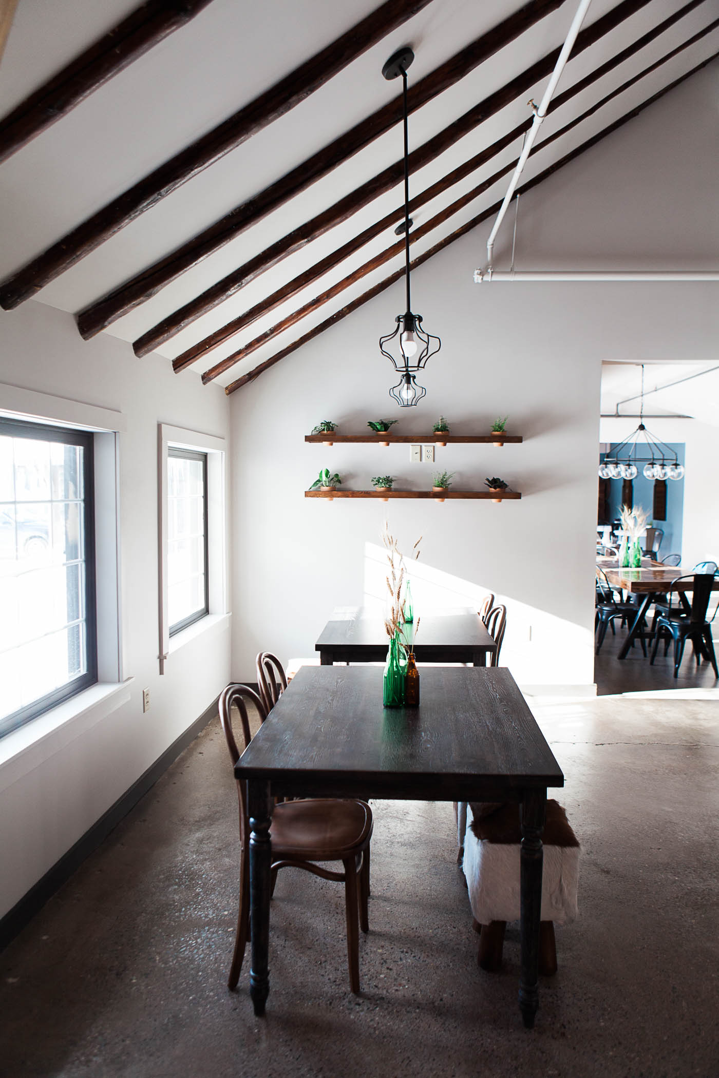
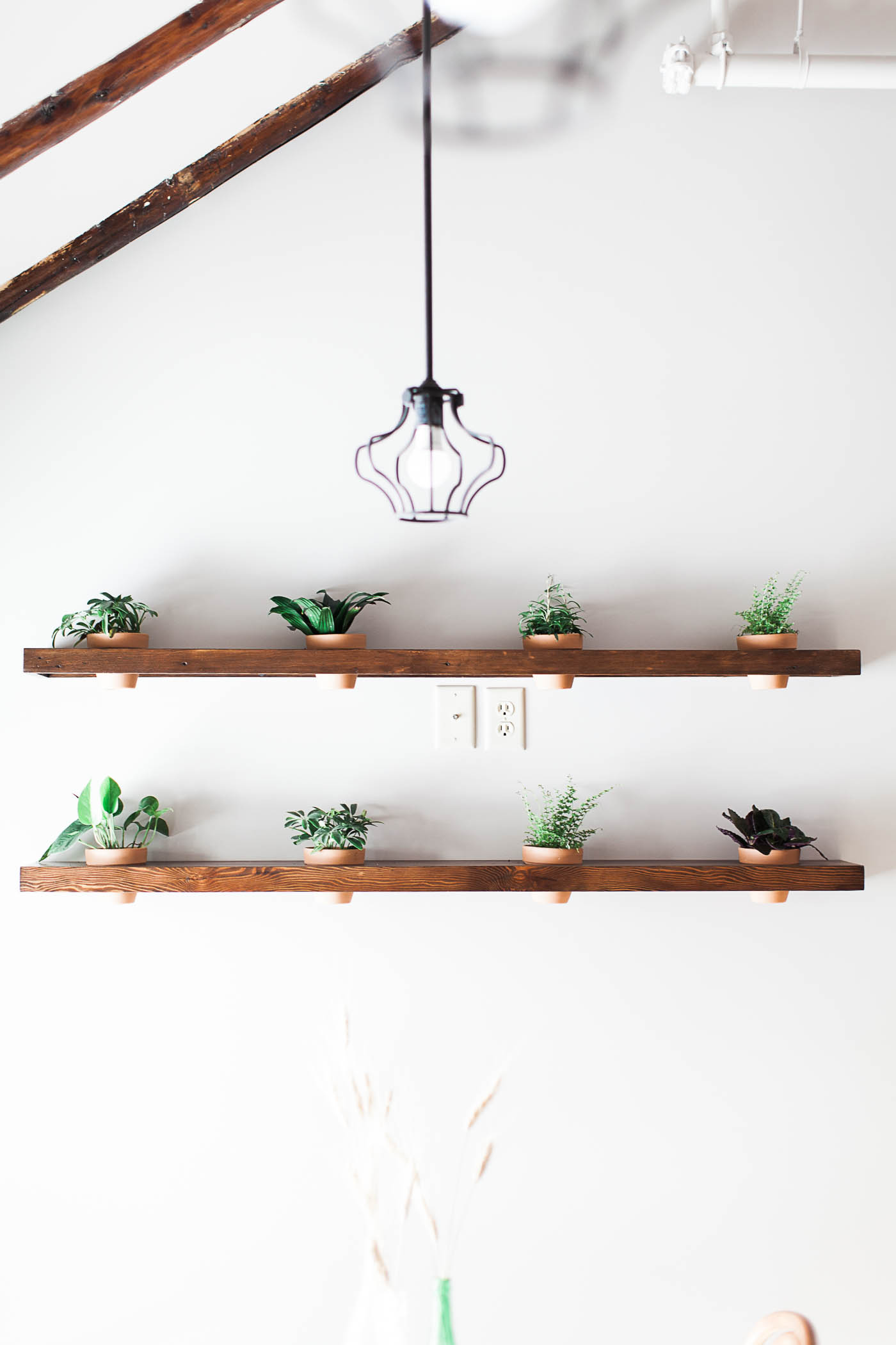
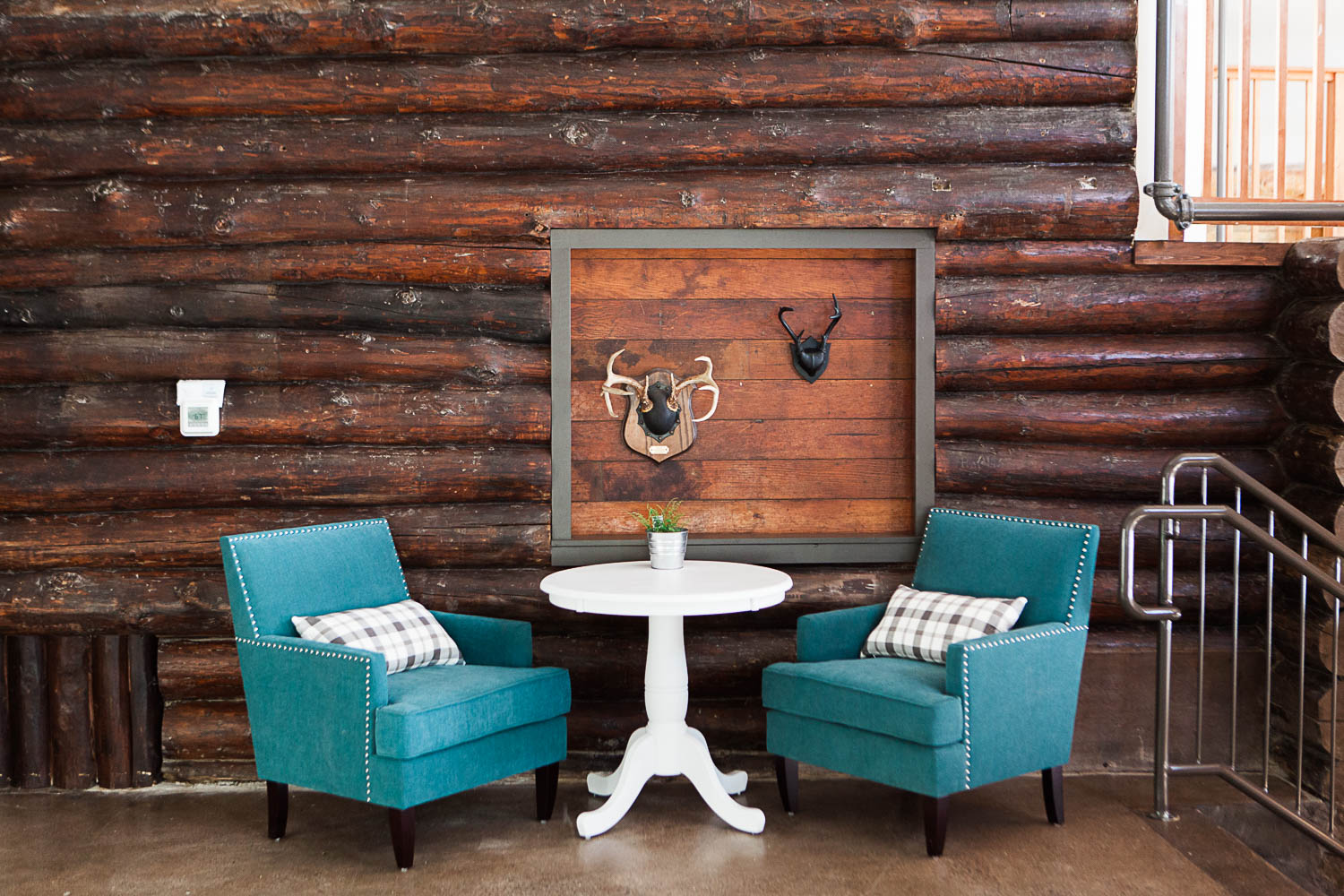
Carved Out Seating Areas.
Converting and adapting an old building into something completely new often means some funky or chopped up floor plans. In order to make this feel intentional, and like the electic cabin vibe we were going for, we used a variety of seating areas. There are intimate and cozy spots for 2, large tables for groups, and clusters of tables to encourage community and conversation.
Wall Shelves: Custom by Curio Design Studio
Cowhide stools: Sterling Industries
Blue Arm Chairs : Maultsby Armchair
Wall Color: Sherwin Williams 7634 Pediment
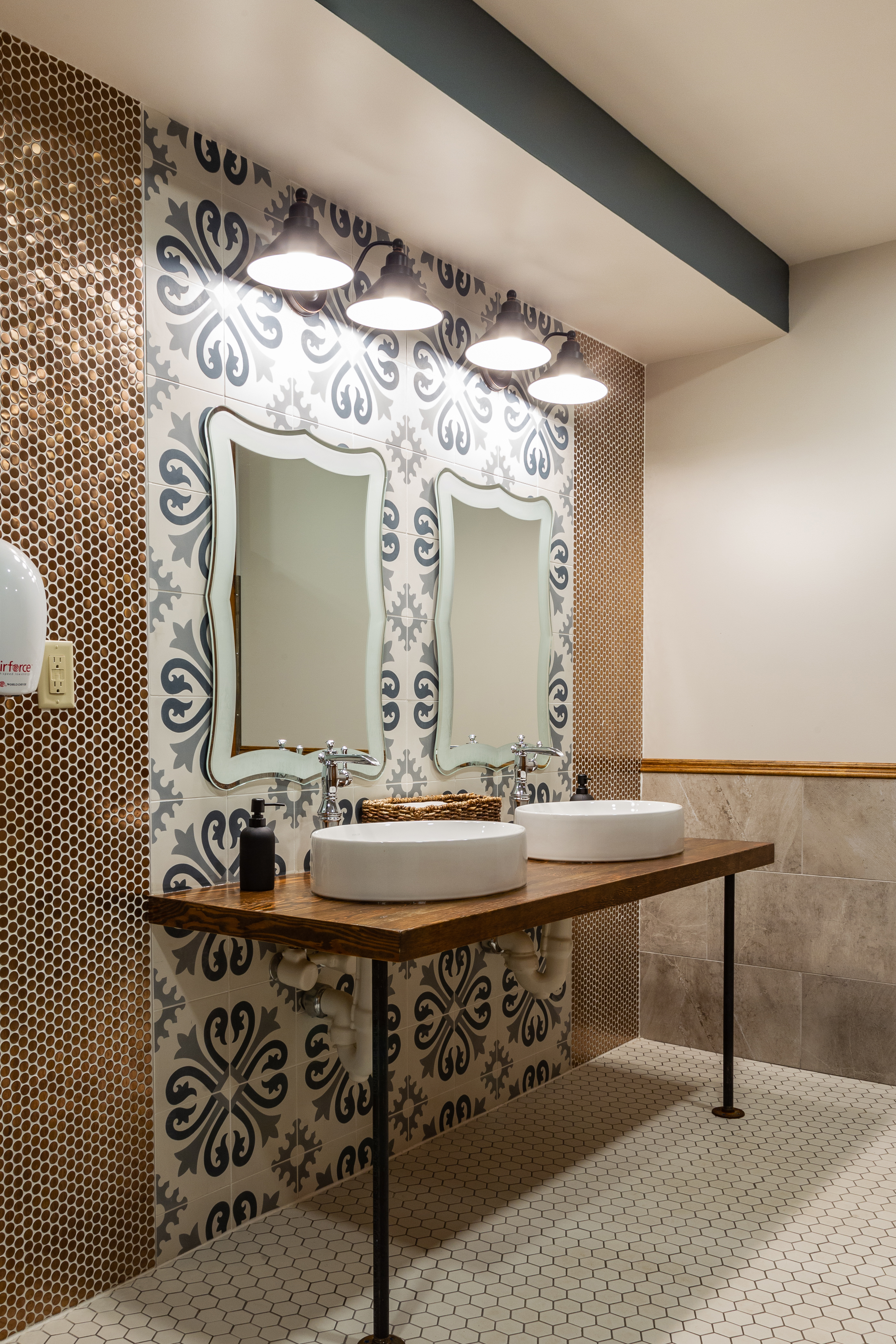
This tile is our fav.
A lot of love went into the bathroom. It is friggen stunning you guys.
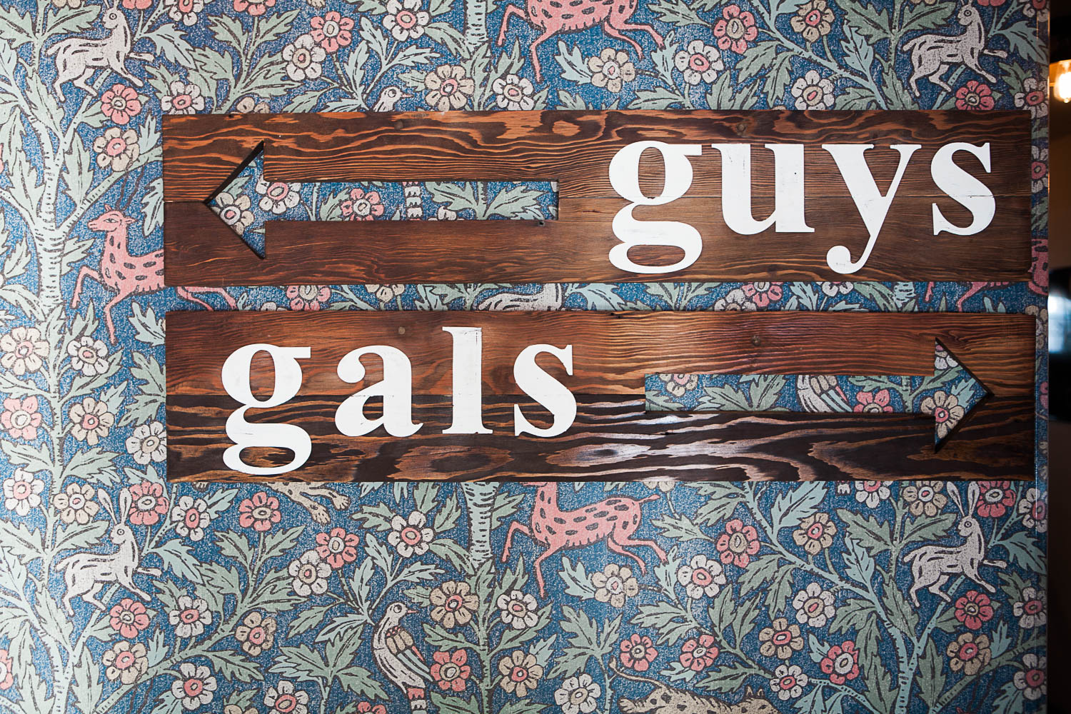
Wallpaper: Eva by Stark (no longer available) Similar paper here.
Guys/Gals Wall Sign: Custom by Kate Havel
Vanities: Custom by Curio Design Studio
Wall tile: Cement Tile Shop and Gold Penny Round
Sink Faucet: Single Handle Cassidy by Delta
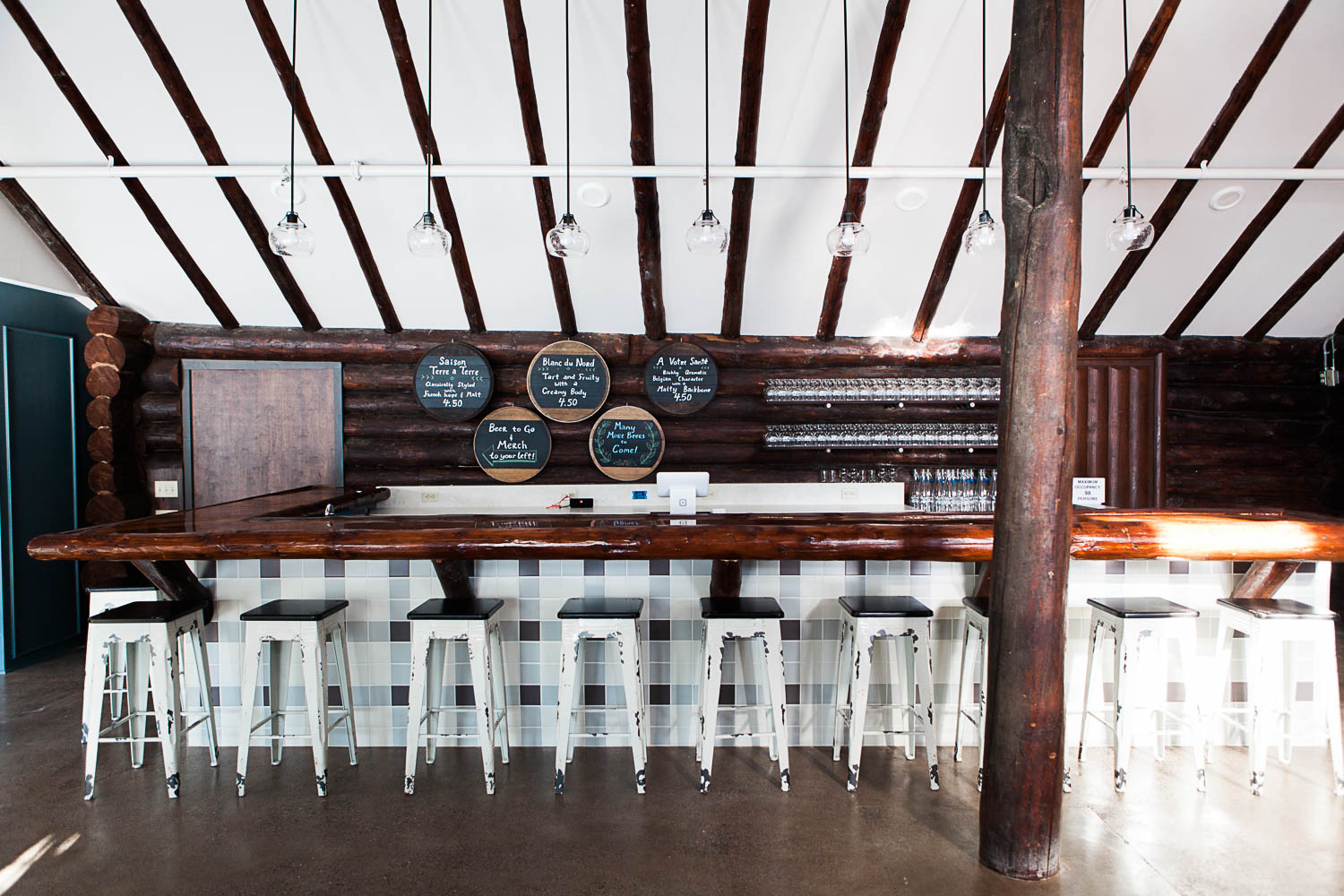
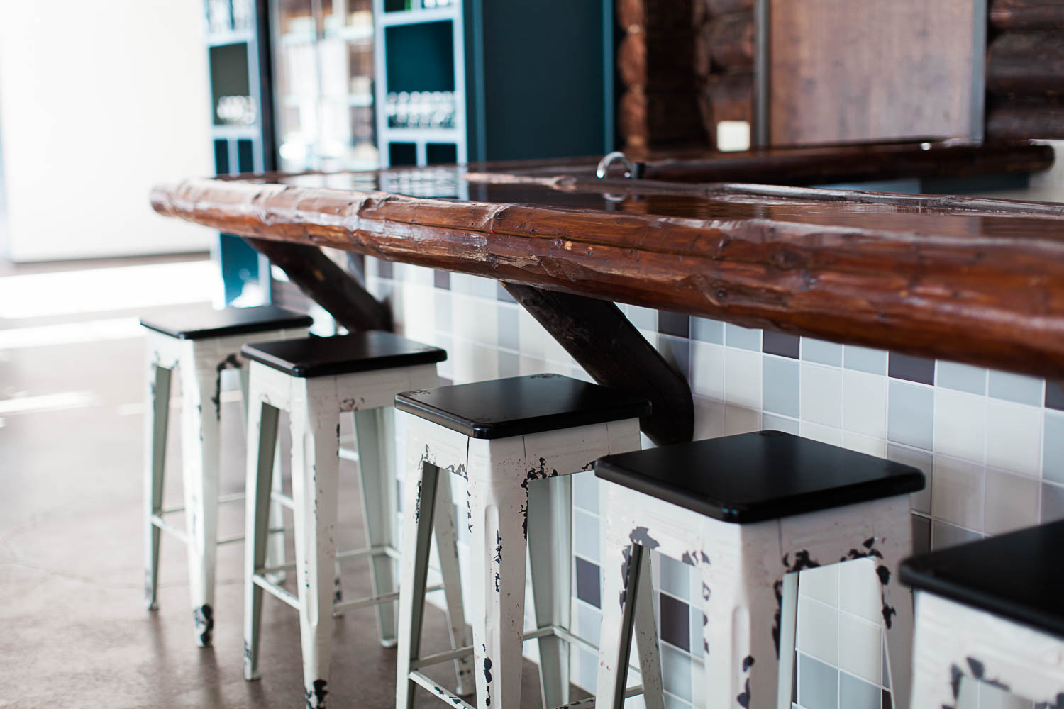
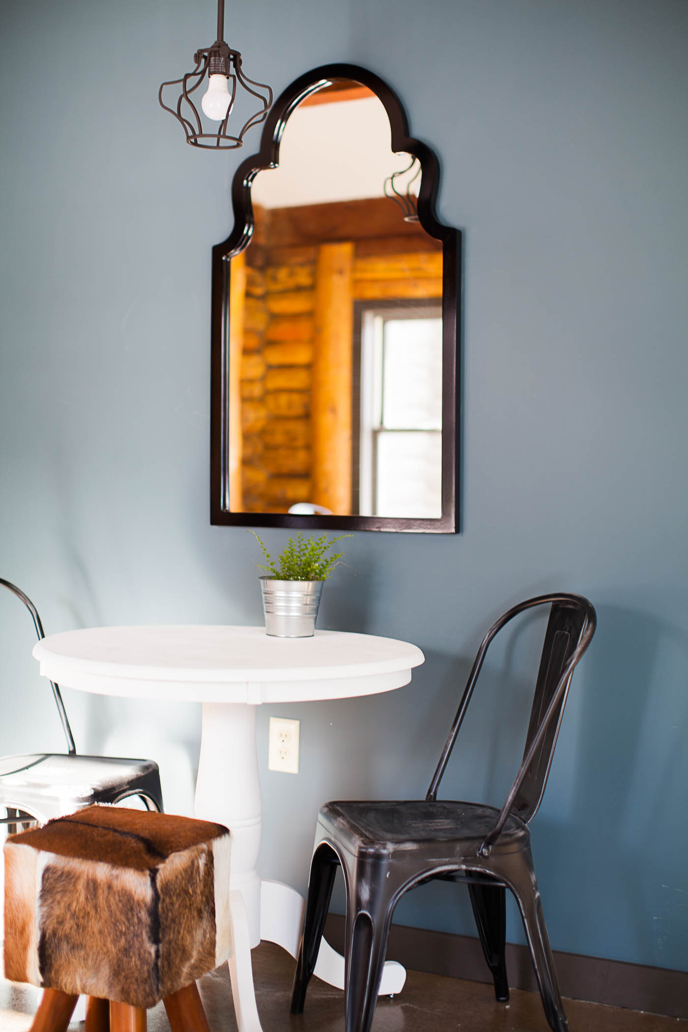
Pops of Blue.
This lovely blue color pops in and out of the design through the different levels and seating areas. It helps carry your eye all the way through, adds some drama and depth but still allows the majority of the space to feel light and bright.
Wall color: Benjamin Moore 2135-30 Nocturnal Gray
Barstools: Millie Barstool
Large Chandelier: Brayden Studio Gossard 6 Light Chandelier
Wall Mirror: Fifi Contemporary Arch Wall Mirror
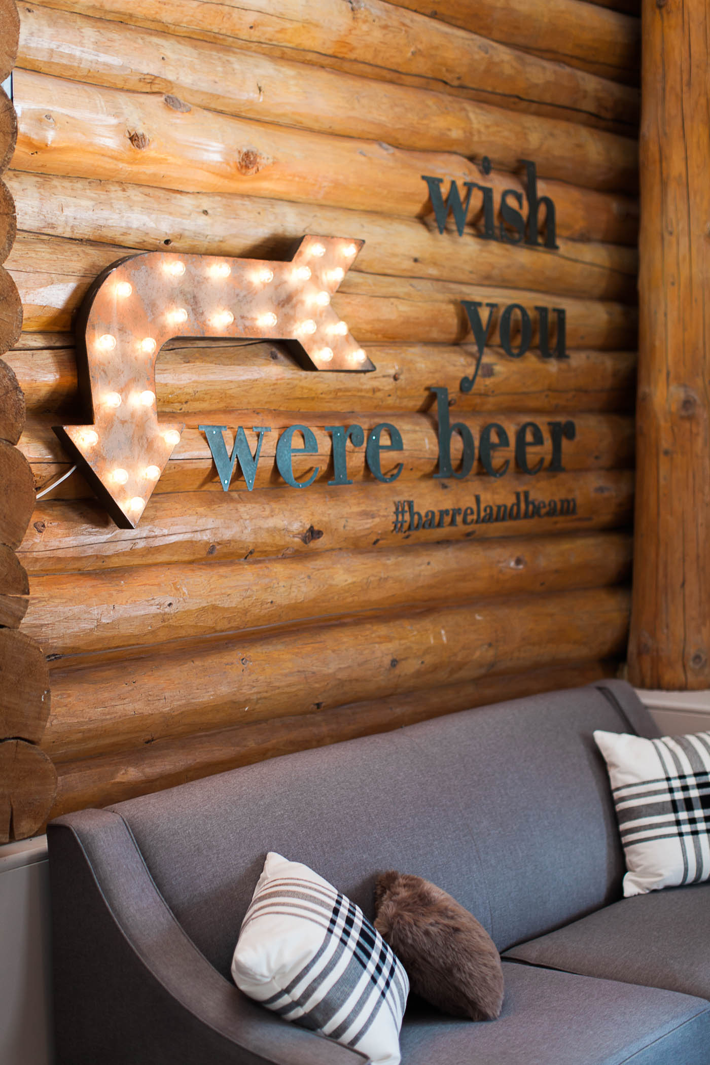
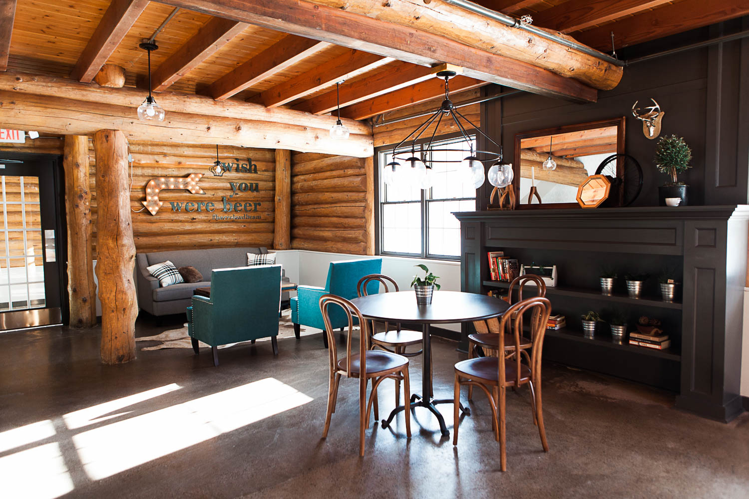
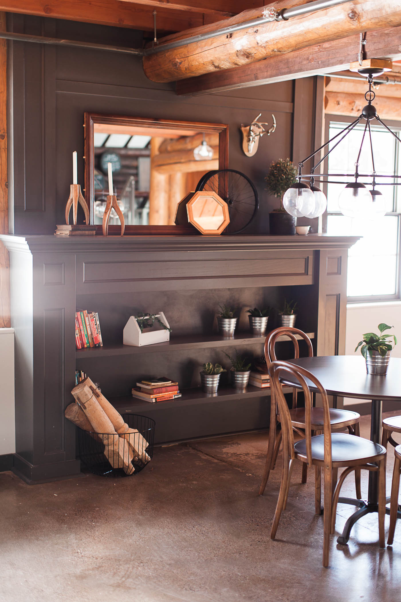
A cozy lower level.
This area could quite possibly be my favorite. If you pop in on a Friday night you will never find it empty, which to me is a good sign of the interior doing it’s job. It is warm and inviting and encourages you to stay for just one more beer.
Bentwood Chairs: Vintage
Fireplace Style Bookcase: Custom by Curio Design Studio
All Photography Courtesy of: Samantha Elizabeth

