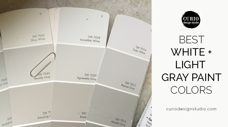
People ask me all the time–what are your favorite paint colors?! Like my mother used to say –it is constant! But more often than not people are actually looking for direction on selecting those oh-so tricky “non colors”. Whites and grays are super trendy right now but it is hard to know which one to pick. With all the variations, cool vs. warm, and undertones how do you decide? Don’t worry your pretty little head about it any longer, here are my BEST WHITE + LIGHT GRAY PAINT COLORS!
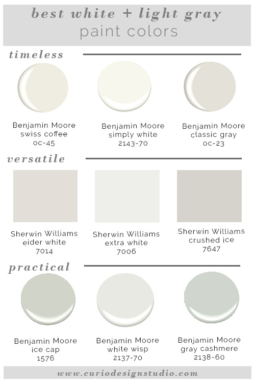
Custom Color Plans—Delivered Virtually to clients nationwideThe top row are all very versatile and classic. They would make excellent selections for a crisp bright kitchen, a modern family room or a well-defined trims or moldings.
If you are looking for a great white based neutral wall color the second row has some great options. A current favorite of mine is Sherwin Williams Crushed Ice. It has the ability to work with super modern schemes or go more traditional with it’s brown undertones. Sherwin Williams Extra White is a favorite that I always specify for trim, casework and baseboards.
If you are in love with the”all-white” schemes that are popular with Scandinavian and modern styles but you are not sure how it would translate into your life filled with little ones and/or pets then this third row is full of options! These are great light grays that won’t show dirty hand prints as easily as a bright white from row one would. But they are still crisp, simple and clean colors that will allow the space to feel airy and modern.
Need help with the perfect color in the perfect room? Let us help! We work locally with clients in Marquette, MI and virtually with clients nationwide!


I need help finding the right color for my bedroom – I want TAUPE – the rooms gets very little natural light – and the indirect light it receives is covered by greenery outside the window – I can’t afford to add lighting right now – I don’t want a color that pulls yellow, gold, red, etc. I really want a clean Taupe but eveything looks like mud because of the lighting in the room! Help!
Hi Lisa! This sounds like a problem that can only be solved by testing the right samples in the space and possibly changing lighting. All colors, but especially taupe/gray/white have a tendency to be highly influenced by their environments. If you are interested we could set up a 1 hour consult to discuss options specific to your space. This would include selecting several paint colors and sending you large scale samples to test in the space. You can check out that service here: https://curiodesignstudio.com/quick-expert-advice/
Also– sorry for any delay in our response. I encourage myself and my assistant not to open our computers over the weekend and focus on fun and family. Have a great week!
hello? is anyone out there?