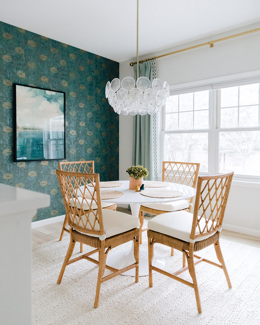
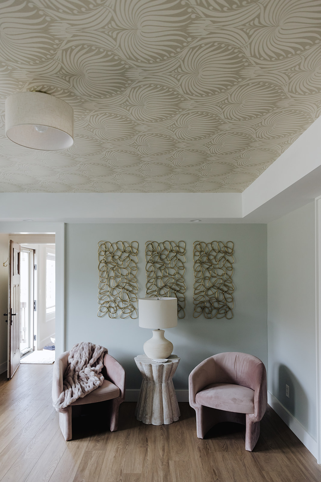
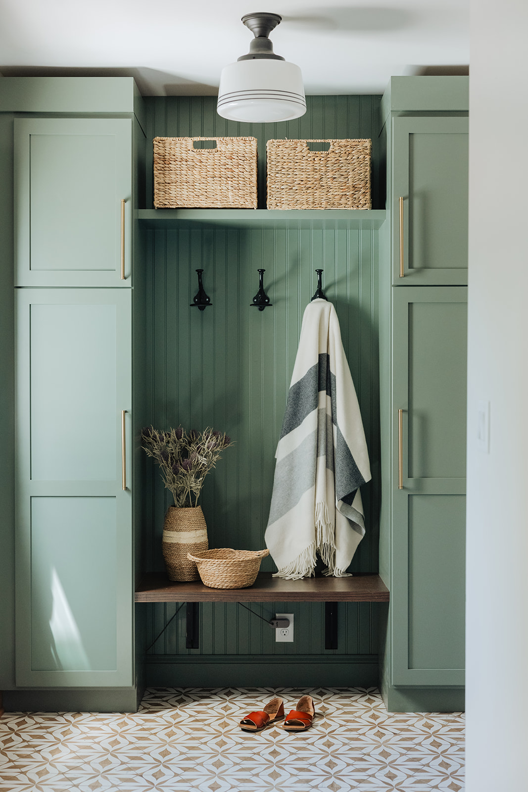
We spend hours choosing paint colors, architectural details and wall coverings for, well, walls…but what about the ceiling? One of our favorite places to add interest is right in front of you, if you just look UP! Some of favorite ways to give attention to the forgotten surface are below:
CEILINGS: THE FORGOTTON SURFACE
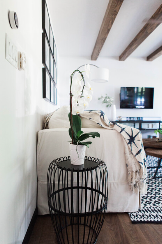
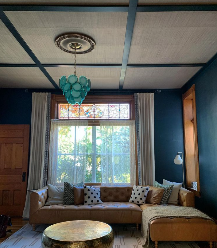
Adding architectural beams is not only for high spaces–just like going for a dark color on the walls of a small space –you can add beams and ceiling elements with average ceiling heights to emphasize coziness and add detail .
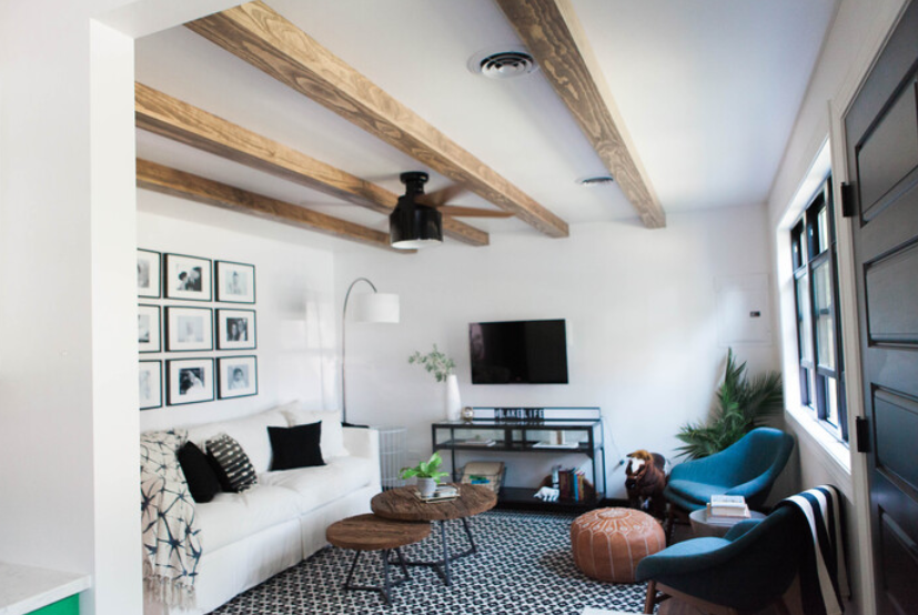
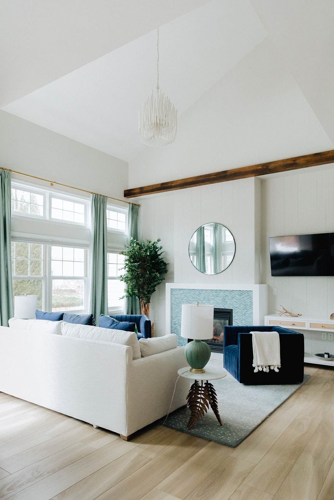
The drama of a wood beam along the ceiling line allowed us to create a more grounded feeling when we applied a wood tambour texture to the mantle wall. Bonus! This allowed us to accentuate the height of the gorgeous vaulted ceiling.
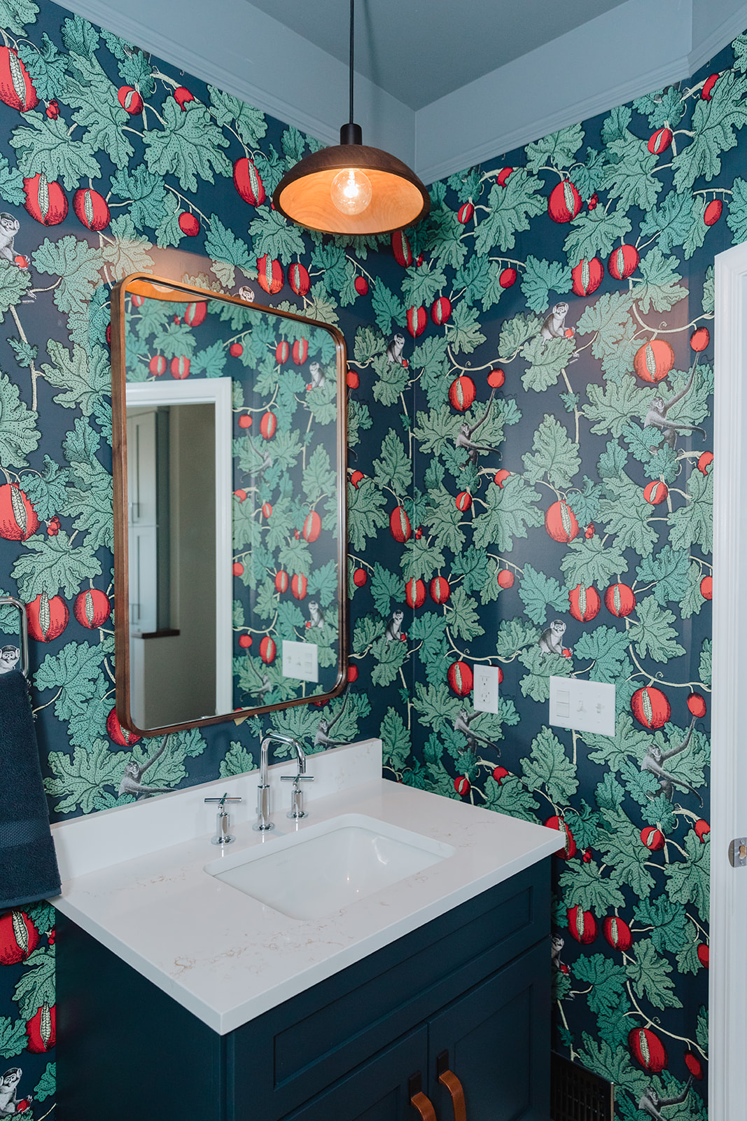
Accent color belongs on ceilings, too. In this small room with a high ceiling, we used this color to visually bring the ceiling down, to balance the proportion of the space.
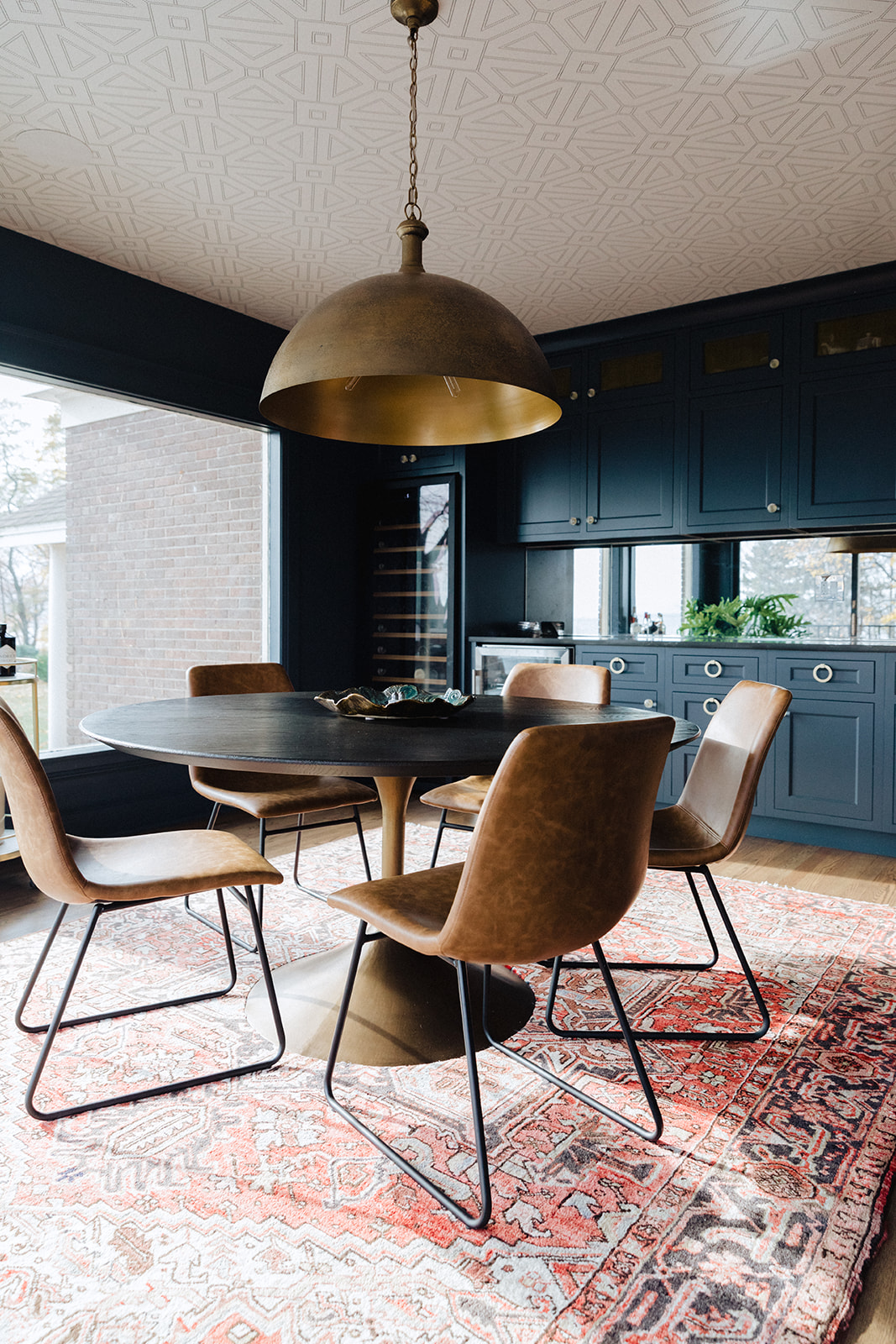
A subtle geometric pattered wallpaper was applied on the ceiling makes a large room much cozier. The dark, rich color of the cabinets partnered with the extra dimension overhead creates a more interesting, layered, feeling.
Adding ceiling detail to old homes can have an added bonus. In addition to a luxe feeling detail that is appropriate to the period this house was built, we covered existing cracks in the plaster in a more affordable way with this covering.
Want to dress up your ceilings? We’d love to help, reach out right here.

