Remember when I worked on a shared room for a little boy and little girl? That was tough design challenge, but at least it prepared me for my recent task of designing a shared space for two little girls. Although a project considering only one gender is slightly easier, anytime you are creating a space for multiple users the task becomes a bit more difficult. Not only do you have to consider the overall flow of the space, you need to consider the individual needs of each user. Packing all the necessary items into a space usually suited for just one person can be tricky.
My recent e-Design client gave me the challenge of creating a soothing, eclectic, not-t0o-girly room for her little ladies. The space needed to have space for books and cozy places to cuddle up and read. In order to come to a functional and pretty design solution I used 5 key strategies that could be applied to any shared place.
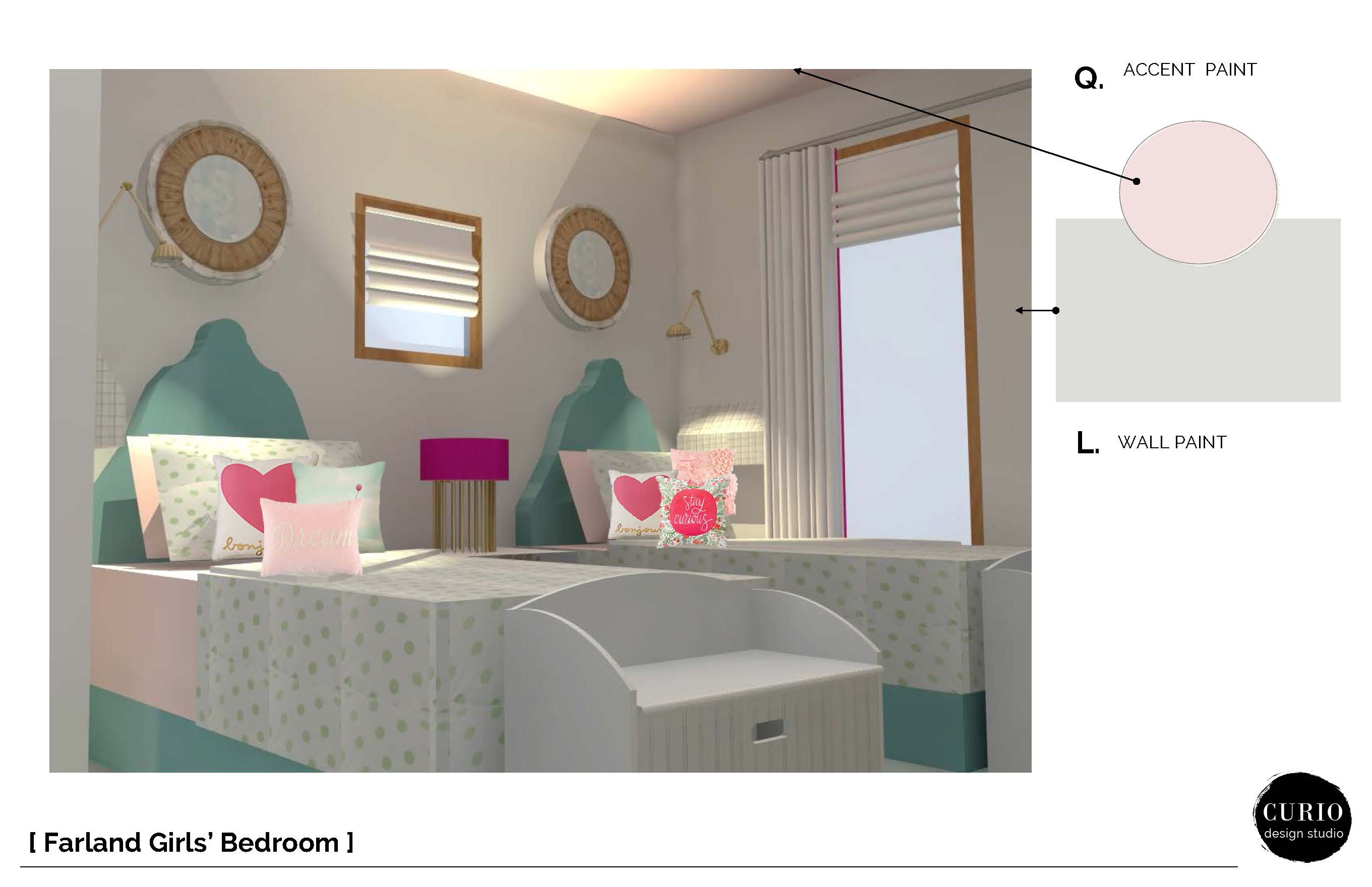
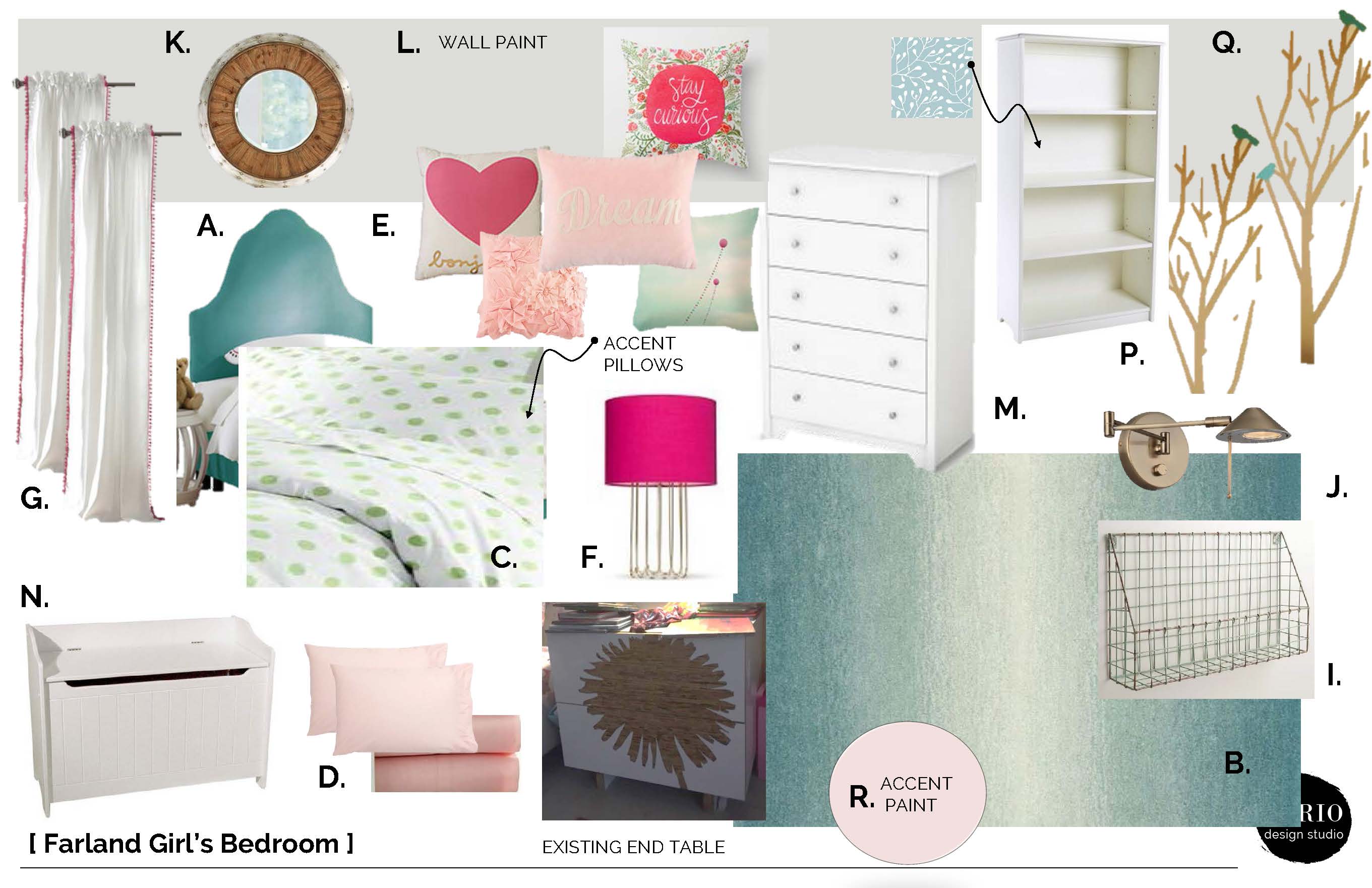
1. CREATE A NEUTRAL BASE. For the walls I chose a great neutral color, Sherwin Williams Fleur de Sel. Any time I am designing for young kids I like to make the investment pieces (expensive items or items that are time consuming to change–i.e. paint) a color that can grow with them as their decor preferences change.
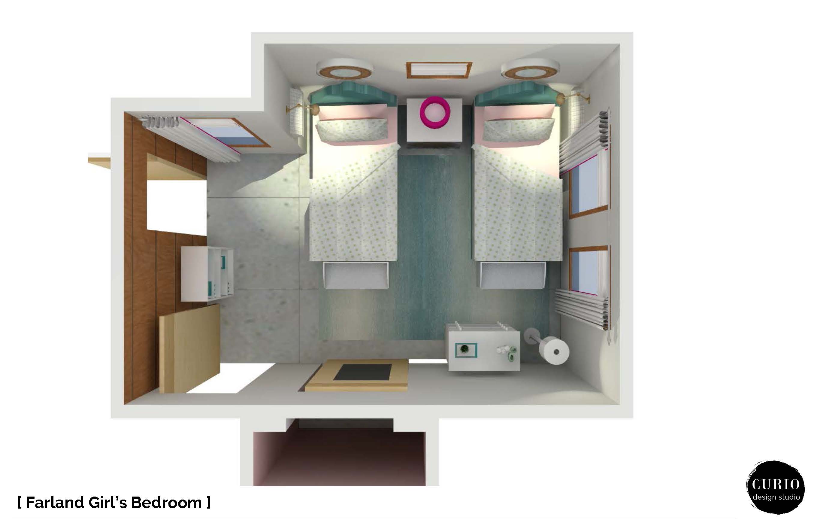
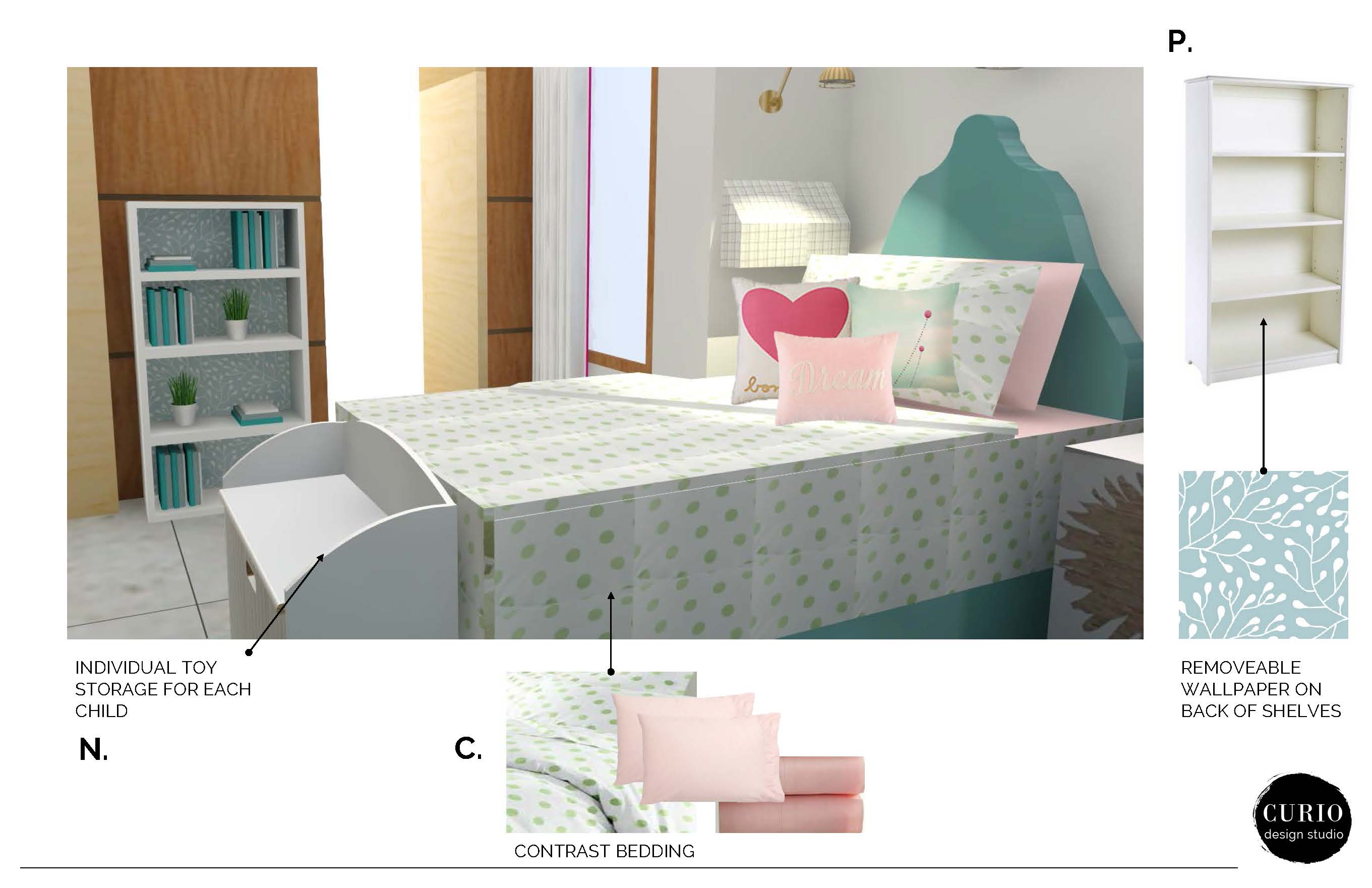
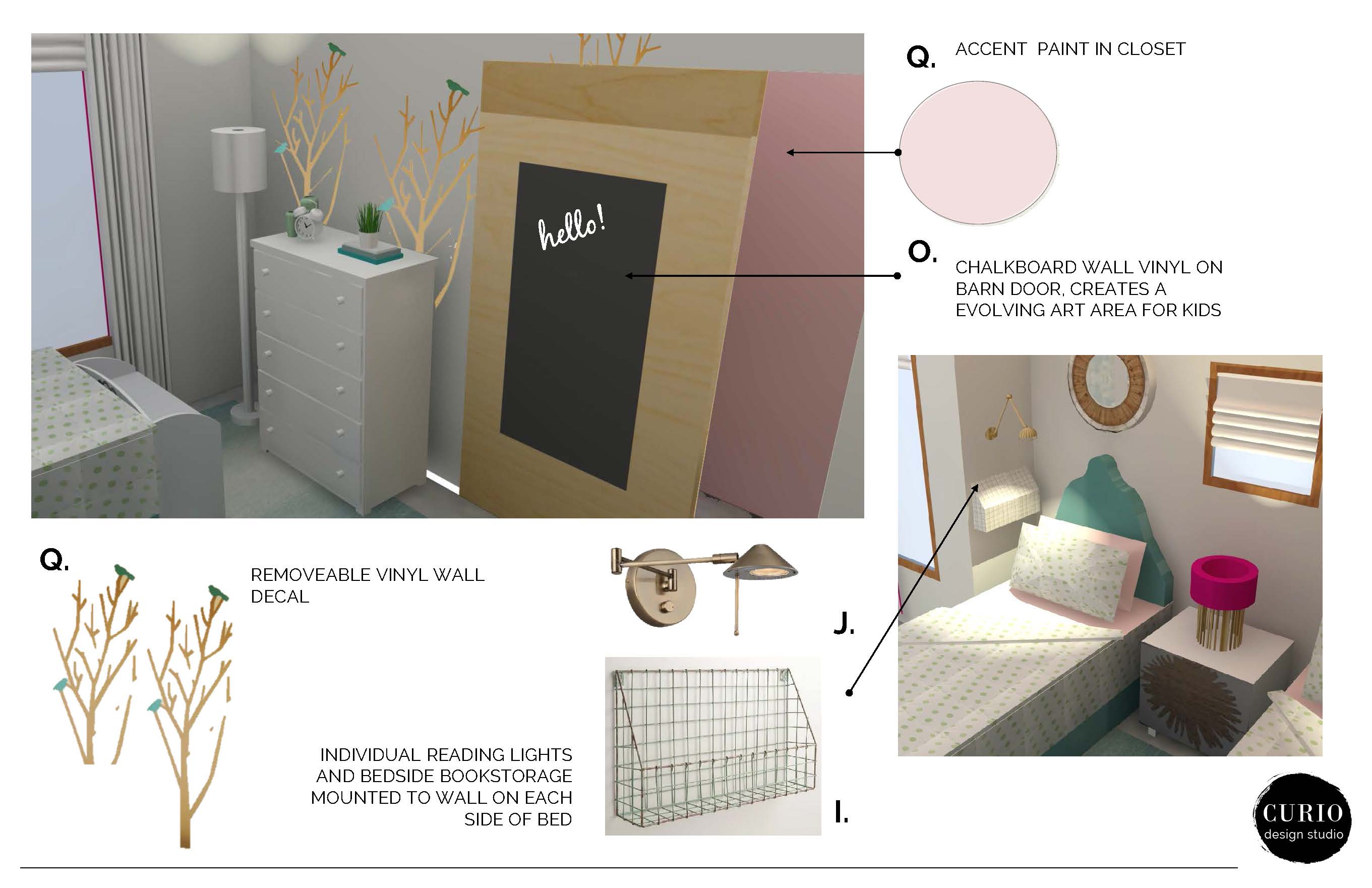
2. DEFINE SENSE OF PERSONAL AND SHARED SPACE. By designating each girl with a toy storage and reading area it helps define their personal sense of place within the room. Other areas like the bookcase at the entry door and the chalkboard decals on the closet door give them areas where items and activities can be shared.
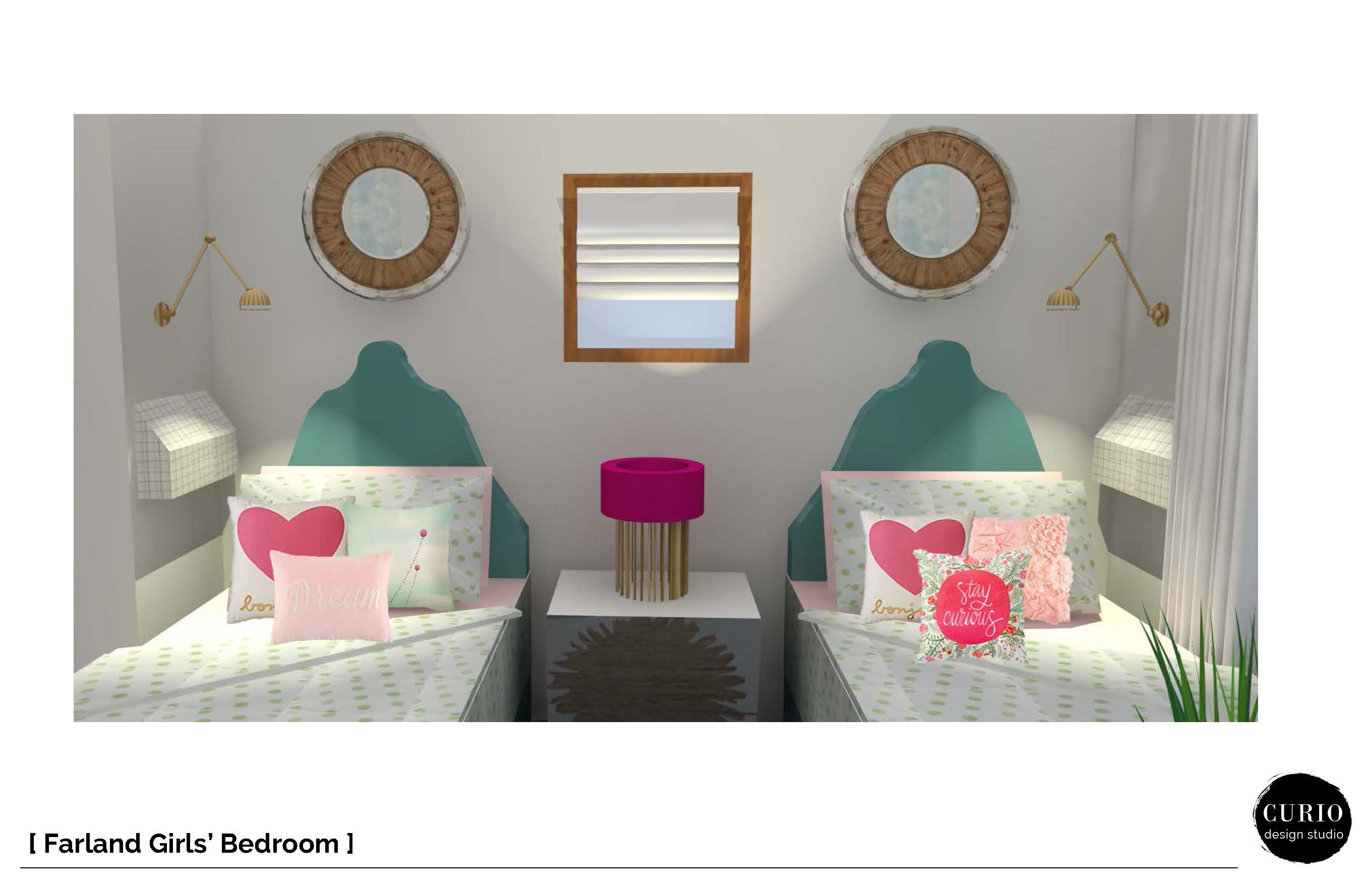
3. MIX AND MATCH THE BEDDING. Using matching bedspreads creates unity in the room, while keeping the look simple and clean. In order to expand on point number 2 and give the girls individuality in the room, pillows and sheet sets are unique to each bed.
4. ADD HIDDEN POPS OF PINK FOR A TOUCH OF GIRLY. To create a room that can grow with the girls as they (inevitably) grow out of their bubble gum pink phase, touches of pink were added in small doses. Painting the inside of the closet adds color and interest in an unexpected way.
5. USE WALL SPACE WHEN FLOOR SPACE IS LIMITED. These little clients are big readers and one thing that was requested was a space for reading. Having to incorporate two of everythign in the room ate up a lot of floor space and left no room for a cozy chair for reading. The solution is to go up! Using vertical wall space on each side of the bed and incorporating individually controlled reading lights paired with a metal basket creates an area where they can curl up and read and then quickly stash their book as they drift off to sleep.
These 5 simple design principles can help guide you to create a perfect shared girl room, and can even be applied to many other spaces in your home. Still feel like you need some guidance?We can help! We work locally with clients in Marquette, MI and virtually with clients around the world!

