Generally when people tend to visualize their space they think of a box with 4 walls around them. First paying attention to all the vertical elements and all the ways to address them, then focusing on the floor as they debate over the broad selection of material choices (**carpet or natural hardwood?! Tile or laminate?!?)
But there is another dimension to this cube we live in that people seem to have an aversion too. Is it because it’s just too hard to get too… out of sight out of mind? Or is it just because they don’t know how to treat this forgotten element, or are unaware of the impacts it can have? Well fear not my friends, today we take back the 6th dimension of our cubes…The ceiling!
The secret is the ceiling is really just another wall in your space. It can be treated with the same material applications and can have just as much of an impact as the walls…if not more!
Here are a couple of fabulous ideas we use to ensure that all the dimensions (vertical and horizontal) of the space are treated equally!
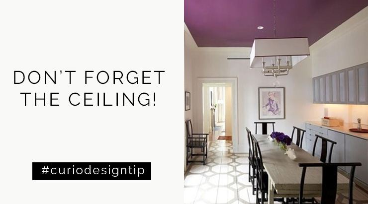
Add Color! I know I know, this is against your natural instinct … but trust me! Adding a splash of color overhead is completely unexpected and can add great visual interest to the space. This purple ceiling is super fun and helps the otherwise average ceiling pendant pop out in the space.
Not ready for a huge dash of bold color? Select a paint color for your walls and then go either two shades darker or two shades lighter in the color family. This will help tie your ceiling into the rest of your space without pushing you into color-cardiac arrest.
By now I am sure you all know I <3 wall paper. Big time. It is a simple way to deliver interest, pattern and color, so why not experiment with wallpaper on the ceiling? How amazing is this geometric pattern?! Not your style–go for something softer like the floral below.
Ready to take your wallpaper/ceiling relationship to the next level? Here are a few of my favorite picks:
a. Vivienne Westood for Cole & Son Wallpaper.Squiggle.
b. Oh Joy! Hygge & West. Petal Pusher (gray & gold)
c. Graham & Brown. Baroque (chocolate & orange)
Paying special attention to the ceiling is a sure way to create drama and beauty. Want customized tips for your space?! Contact us today for your initial consultation!


