Another kitchen in the books. Like I mentioned when we were chatting about the Fourth Street Kitchen, I love working on kitchen renovations. Even more when the renovation spills over into the other rooms and we get to look at how changes in one space create change in another. I always tell my clients, it is hard to design in a vacuum. What we do in one space will undoubtably have an effect on something in another space. I always encourage clients to try to look at the larger picture, and create a plan for the entire space—even if part of that plan is phase 2 or 3 or 10. Having a road map to the end result can help you make difficult decisions along the way, and also help to ensure that you are not wasting time and money by backtracking.
We did just that in the Grove Kitchen. The client came to me wanting to remove some walls, rearrange traffic patterns and of course upgrade the look of their kitchen. They were focused soley on the kitchen as the target of my design services. But with (minimal) nudging I got the client to understand that we need to zoom out a bit and make sure that the changes we do in the kitchen work with the rest of the (now open concept) space.
One of the main things the client wanted in their kitchen was an island. At some point in time someone had renovated this kitchen, removing the wall between the kitchen and dining to create that oh-so-coveted “open concept’ plan. But what they were left with was a kitchen with all the work space pushed up against walls and too much distance between them to work efficiently and functionally.
In order to get the island to work, and maintain enough clearance around for 2 cooks, we had to rearrange a few things. The sink and range stayed where they were, but we relocated the fridge to the other wall, so that the door swing would be just out of reach of the island. This allows us to have enough clearance to easily get in and out of fridge while maximizing the island size.
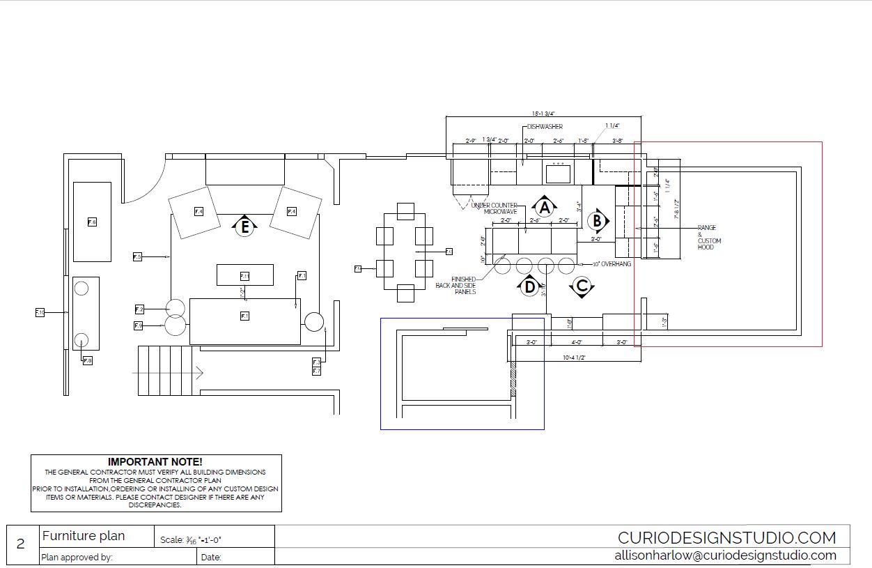
The client knew that rearranging appliance locations might be in the cards, but we pushed the envelope a bit further by suggesting some further modificatons to the plan. Below is the final plan we used for this renovation. The space highlighted in the blue box used to be their entrance into the kitchen from the garage. There was a small mudroom and bi-fold closet to the left. The space highlighted in red was a giant mudroom with a door from the driveway, and a space that went largely unused.
We suggested closing up the existing entry to the garage, knocking out that closet and claiming that entire space as pantry and storage for the kitchen. We then suggested popping a new door through to the garage in the larger mudroom, so that both entry points (from driveway and garage) are coming into one space.
Rearranging these traffic patterns helped to maximize and streamline their space.
Now we have one organized entry and mudroom and a massive pantry, instead of two spaces serving a combo entry and storage.
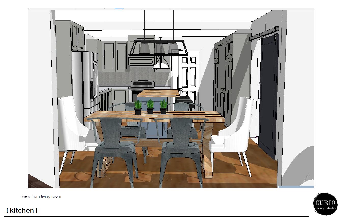
Another modification that was suggested was widening the opening between living and dining. The client had originally thought of removing those walls but you guys–SOME WALLS ARE BENEFICIAL!
They help create nice seperations of space and intuitive places for funiture. We did suggest widening the opening so that the trafflic flow went straight from new mudroom to living. This new opening also helps beautifully frame the sightline from living to kitchen, as presented below to client.
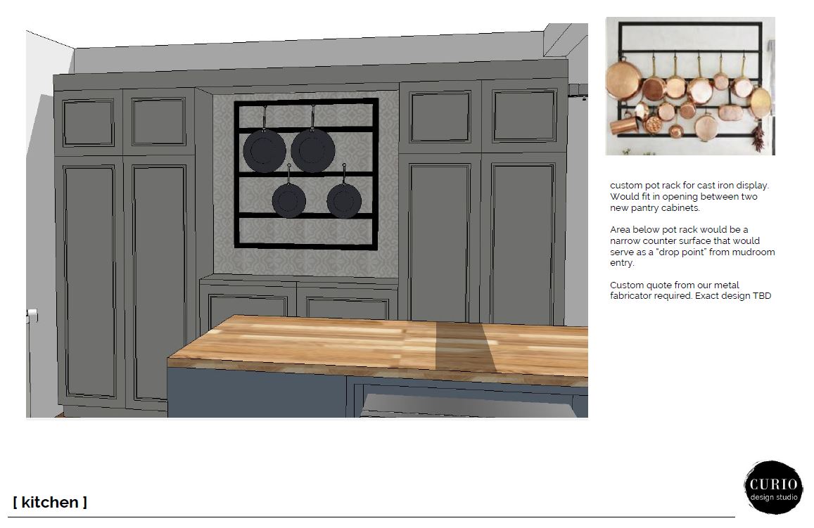
The wall where the fridge once was became pantry storage. We went with a narrower cabinet to allow the new traffic pattern to be as open as possible. Instead of providing a full wall of cabinets we suggested popping out an opening in the middle. The idea was to create a beautiful and functional way to display the client’s collection of cast iron. The additonal counter top also serves as a good “drop zone” by the new mudroom entry–always a bonus to have a place to set keys and mail when coming in!
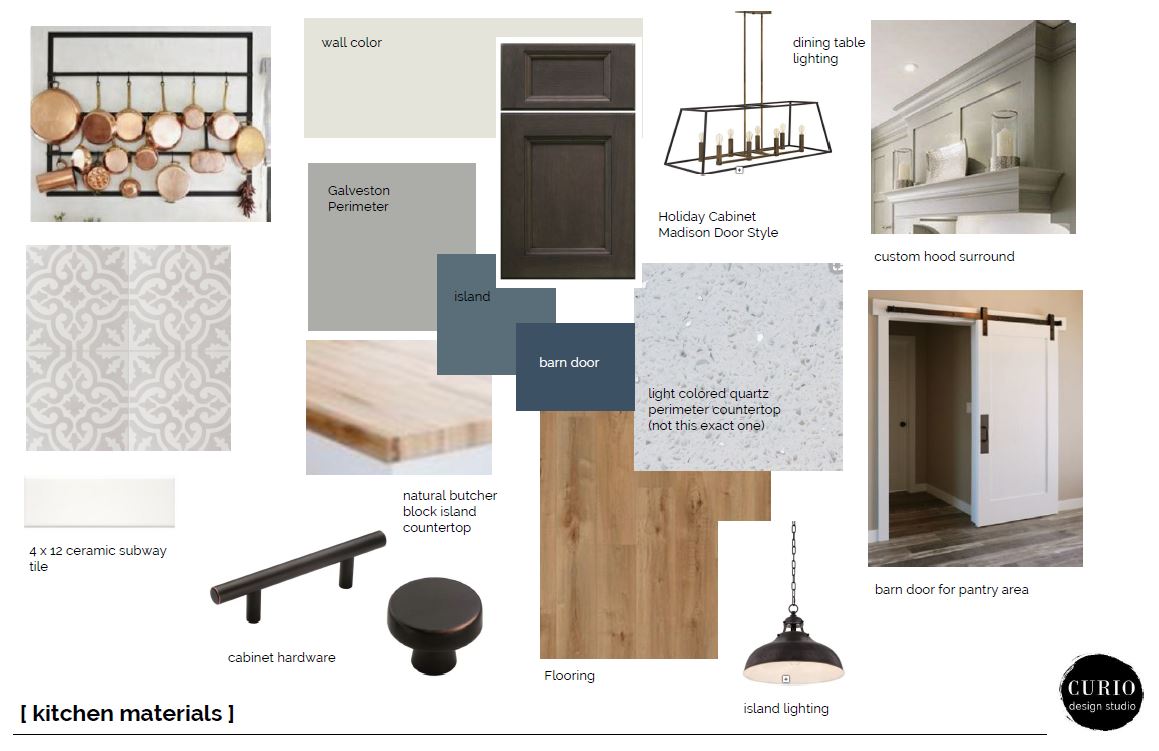
The suggested were bright and eclectic. They felt modern enough to push the house in the direction the client wanted but transitional enough to work with the other existing pieces that might not change. We went with a stock color gray for the perimeter cabinetry and upgraded to a custom color for the island.
A mix of quatz and butcher block, cement tile and bronze hardware creates a warm and inviting feel.
We opted for another contrasting shade of blue for the new barn door to add a bit more interest and contrast.
If this kitchen looks like a dream, its because it was. From the clients open-mindedness and eagerness to see new ideas down through installing the last piece of hardware. It honestly went off with out a hitch.
The end result speaks volumes to the design process and the importance of designer/client relationship.
As a client it is important to trust , listen and let go of a smidge of control. As a designer it’s important to communicate, push the boundaries and always aim for blowing client expectations out of the water. That’s a recipe for value and a knockout kitchen.
Interested in our design process? Let’s chat about how we can work together on your next project. And as always–stay tuned for the project reveal!