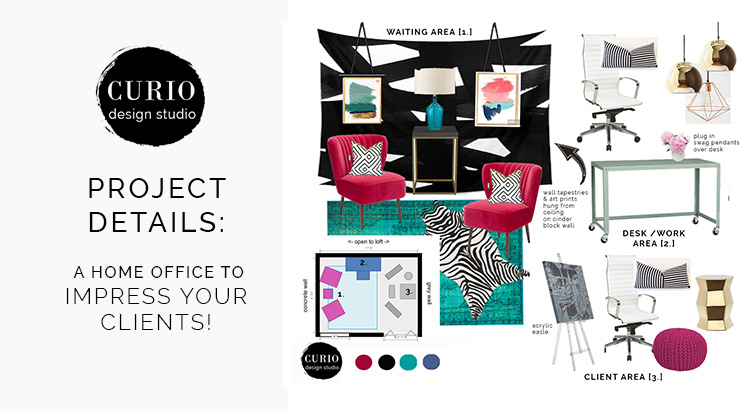
More people than ever are now working from home. And most of them are shoved in a corner surrounded by pile of laundry or baby toys and TONS of distraction. Not only is this type of set up not fostering productivity or efficiency when it comes to work tasks, it is also not a place where you can bring in potential clients, investors or other B2B contacts. WE ALL NEED TO STOP WORKING LIKE THIS.
When you work from home it is important to create a separate professional & organized work space. Not only will it help you remain focused on business tasks but it is important for your image and brand. Client’s make conclusions about your value and level of professionalism based on a lot of factors, including the appearance of your office. Creating an office that not only helps you be efficient at your job, but also attracts and impresses your clientele.
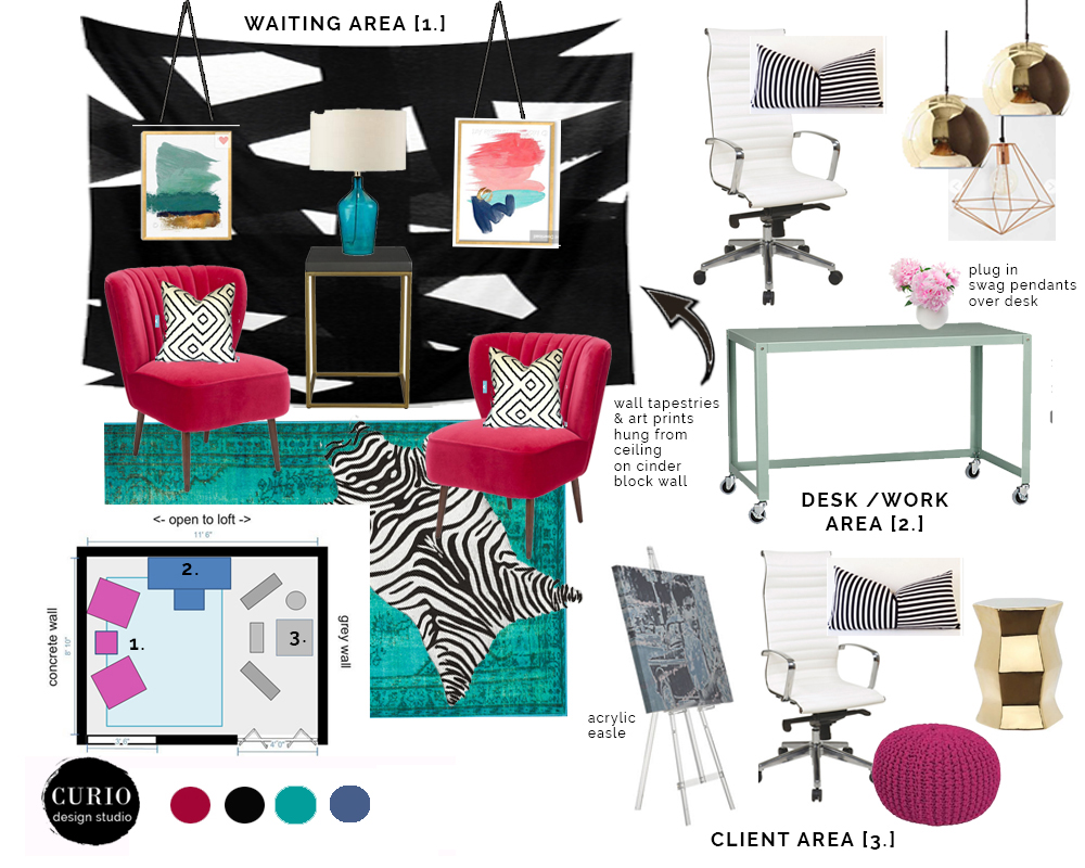
I recently worked on a very small loft for an image consulting business. There were tons of things that needed to be accomplished in this space including a workspace, storage, waiting area for clients and the actual area where the consultant and client will work together. It was tricky but with a bit of brain power I came up with this
Home office + Studio design plan that met all the needs of both client and business owner.
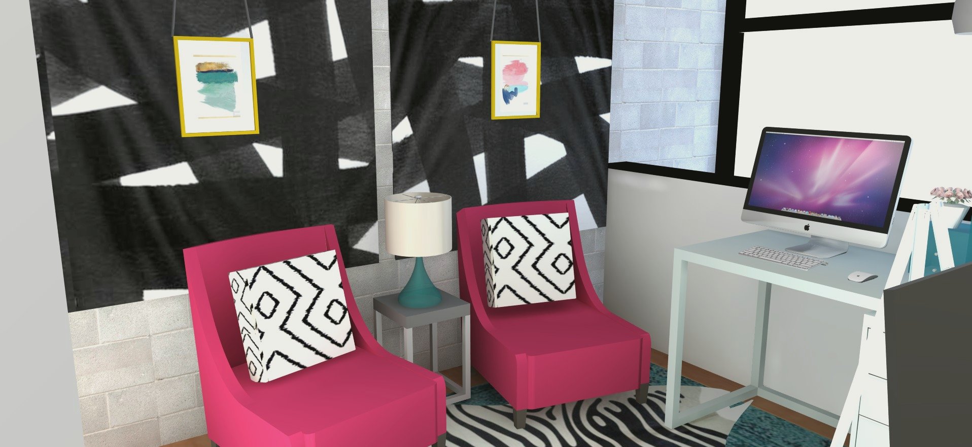
One of the biggest design challenges in this space was the full height cinder block wall. Not only was it cold and unslightly, it was almost impossible to mount anything. The client is a renter and didn’t want to go through the intensive process of drilling into masonry and then trying to deal with fixing it when she left the space. A great solution we came up with was hanging large scale wall tapestries. Since they are lightweight they didn’t require any intensive mounting and could be hung with 3M adhesive strips. Over the tapestries we hung some colorful abstract prints. They are strung up with pieces of leather and hung from a hook in the ceiling–again avoiding the issue of drilling into that wall!
The outcome was a great textural wall that adds impact and visual interest to an otherwise bland wall.
The overall color scheme was very bold for such a small space. People tend to think that you should stick with light colors and minimal patterns when you are short on space. But I 100% disagree.
If you have a small space go for maximum visual impact!
You can distract the eye and mind by using fun design elements, bold colors and large scale patterns.
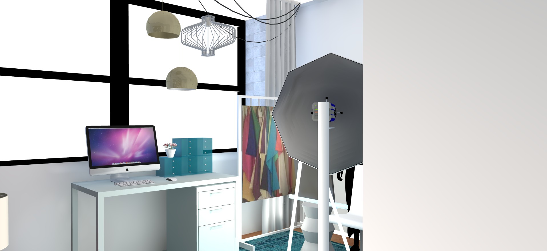
When you are looking to create function in your home office, creating and defining zones is key. I have said it here, here and here. In this space we had to incorporate 3 main zones: waiting area, work space, and client meeting zone. To help define the work zone we used a mix of plug in pendants hung at different heights. Instead of trying to conceal the plug in cords ,we used them to our advantage and created a unique look by swagging the excess cord.
Tricks to help define zones will keep you organized + help your clients understand how to use the space.
Creating a well designed home office, studio or loft requires a plan, attention to detail and consideration of how you want to appear to your ideal client. Having a space that looks professional and is in line with your brand identity will help you feel confident when it comes to growing your business, meeting with new + existing clients. It not only adds value to your brand but also to your bottom line.
When your clients feel confident in you as a organized professional that value will transfer directly to what they are willing to pay you!
Need help with your home office, small business or commercial space? I would LOVE to help you find value, efficiency and productivity in your space and ultimately translate your brand into a great interior. Let’s chat!
