Back to back reveals on the blog?! Sure — we totally need some beautiful distractions right about now. The master bathroom at the Mid Century main house is a perfect compliment to some of the other space (like their guest bath here and kitchen here). It carries a lot of the same design elements but overall feels much lighter and more romantic than the other spaces. A perfect relaxing retreat for this stylish couple!
MID CENTURY MAIN HOUSE MASTER BATH
The Before.
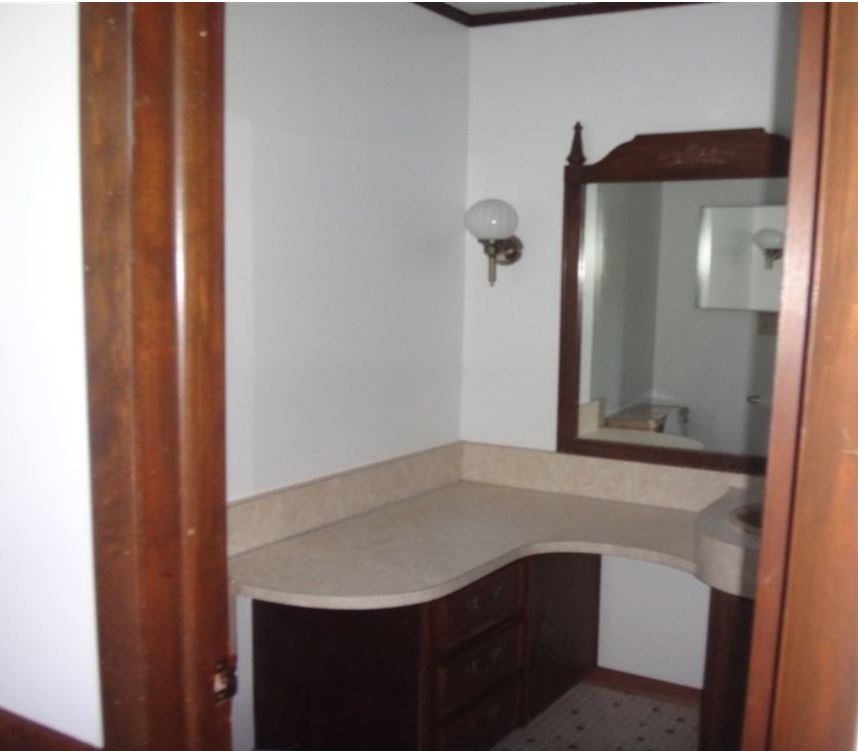
This bathroom started out super small, dark and cramped. Not exactly the master bathroom of anyone’s dreams. We had some original building plans from a drafter but we wanted to push the space even further– and the client had an open mind (dream client!) and let us explore some alternate options for the bathroom floor plan. We ended up pushing the bathroom into the closet and upstairs bedroom by about a foot and flipping the layout—allowing for a private water closet with a window on the exterior wall. This before picture is hard to even show you, the space was SO SMALL we couldn’t even get a proper picture of it. The toilet was on the left under that weird cut out and a small walk-in shower was to the right.
The Before
The Design Plan.
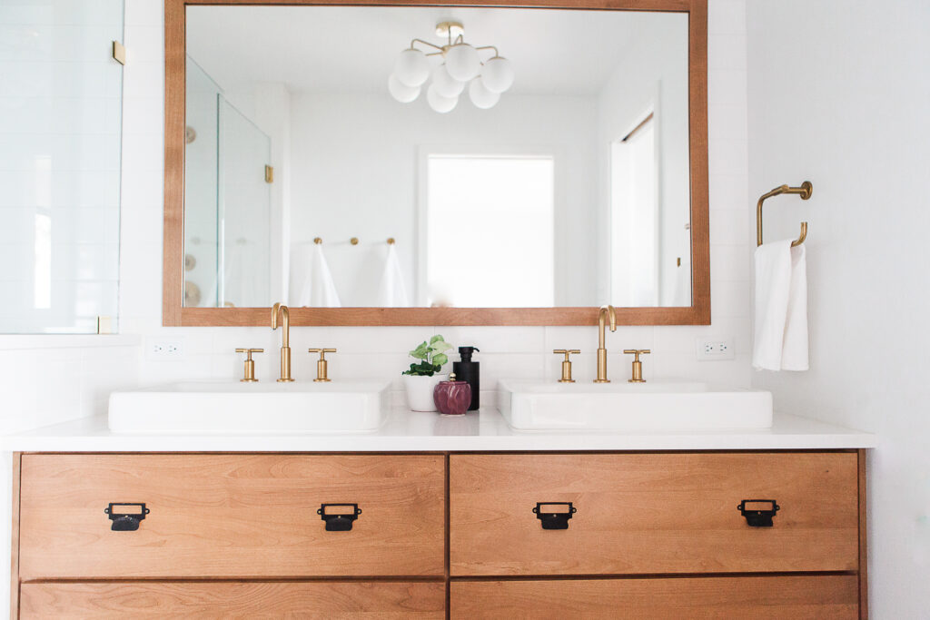
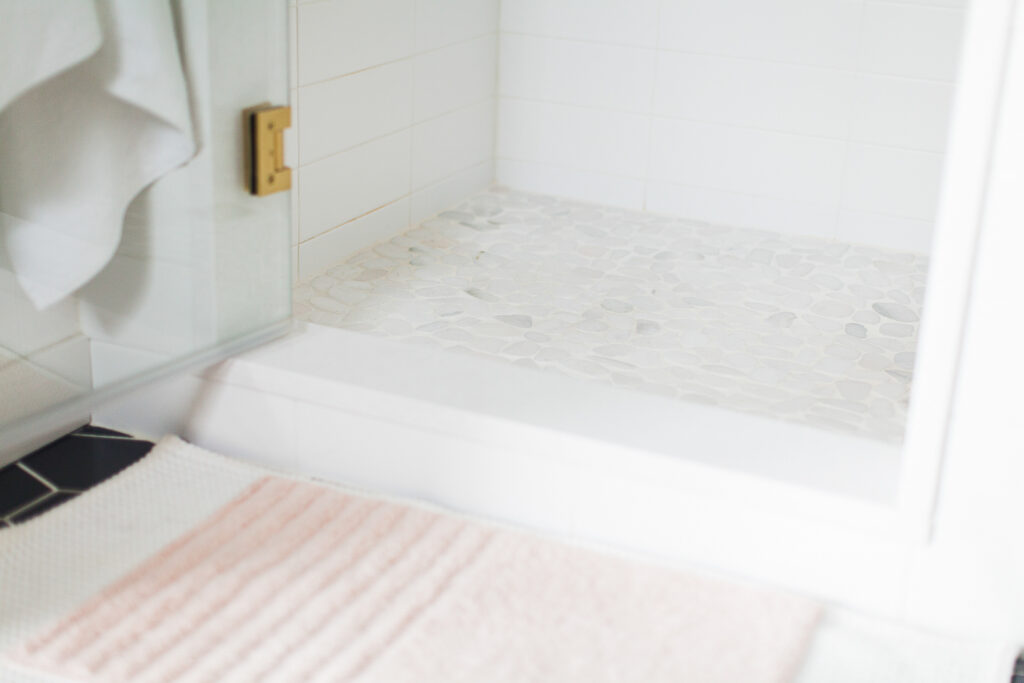
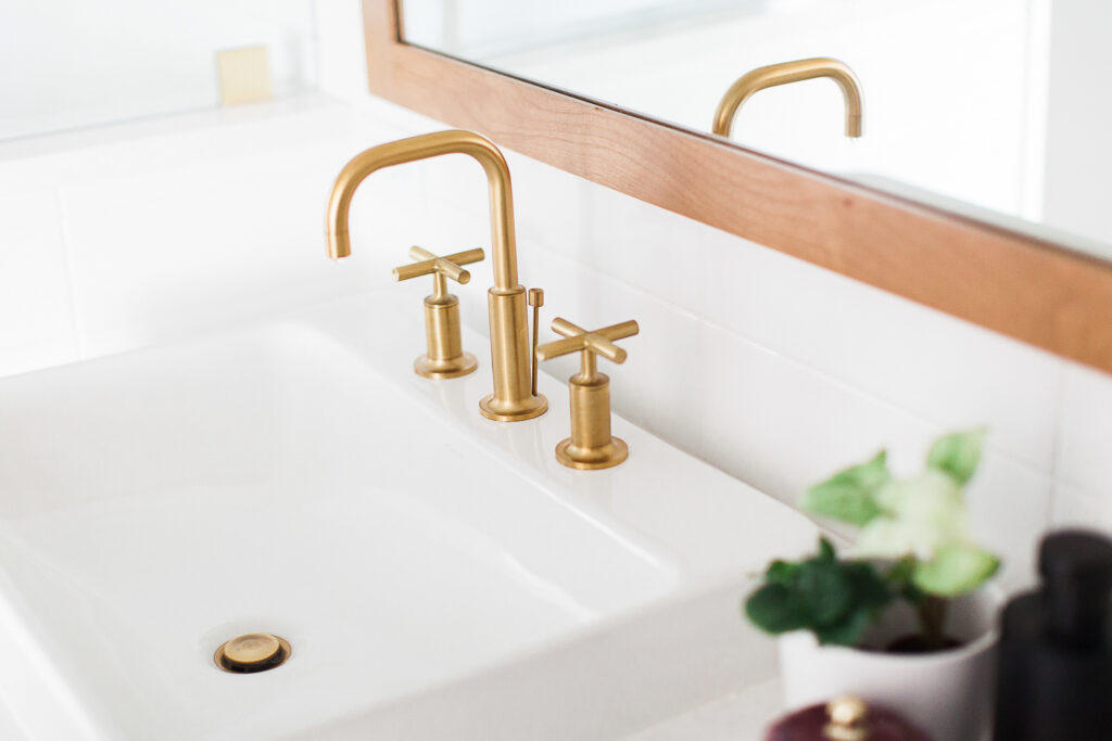
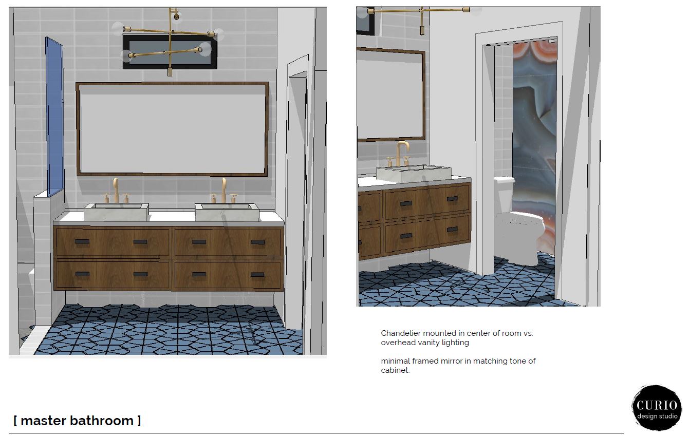
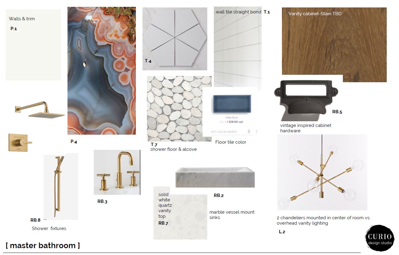
The selections for the bathroom flow with the rest of the house. Lots of clean elements– like oversized subway tile in a straight stack pattern. A splash of warm wood elements– a custom alder vanity and matching mirror. Modern brass fixtures like the kohler sink faucets which pop off the white tile. And a healthy mix of organic patterns to offset the modern lines. This came in form of the pebble stone shower floor tile and the AMAZING custom wallpaper mural in the water closet.
A few things changed from the original design plan to installation. This happens for a variety of reasons. We love to collaborate with the client and progress the design with THEIR input, afterall it is their space & their money. We never push our visions on the client as “a take it or leave it” (ok, never say never—there are some things we will put our foot down about) but collaboration in this process is key. And often that results in revisions to the design prior to final sets being issued.
From conception to installation revisions included:
1. Switching from marble vessel sinks to porcelain || lower maintenance for client.
2. Omitted window above vanity/added window in water closet || on site ceiling heights had to change but we still wanted natural light.
3. Floor tile switched to an elongated hex in similar color || due to shorter lead time and cost savings.
4. Switched the custom wall mural pattern || to better match new floor tile selection (sometimes changes have ripple effects!)
The Reveal.
The end result is one of my FAVORITE spaces to date. I tend to be a colorful person drawn to dark saturated colors and patterns– so that the fact that a space that is almost completely void of color makes my heart explode surely means something.
Take a look at how the Mid Century Master bathroom came together:
Thinking of renovating? Let us help! We work locally with clients in Marquette, MI and virtually with clients nationwide!

