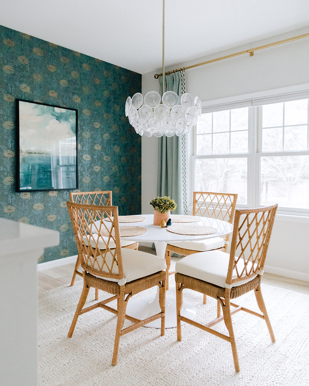
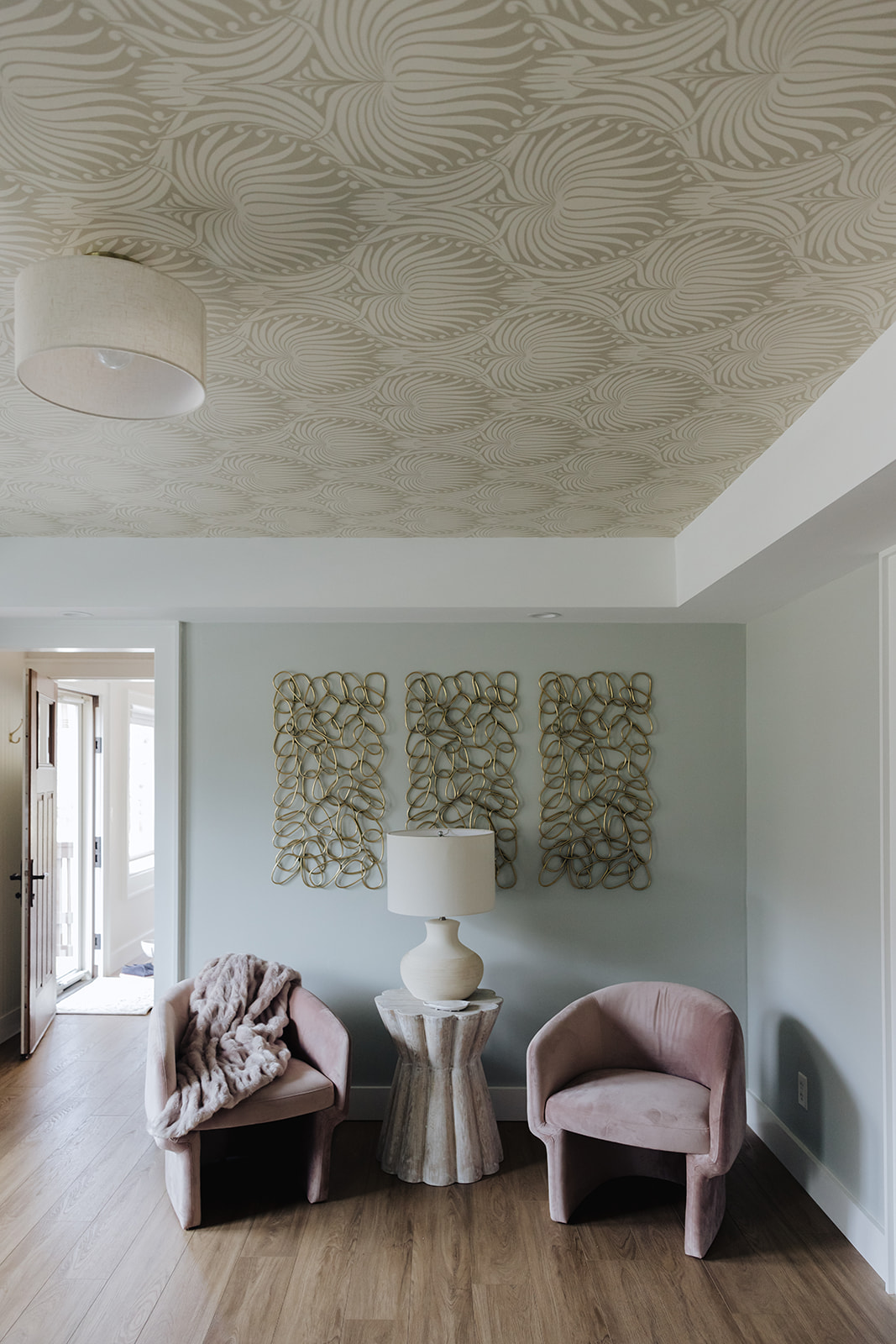
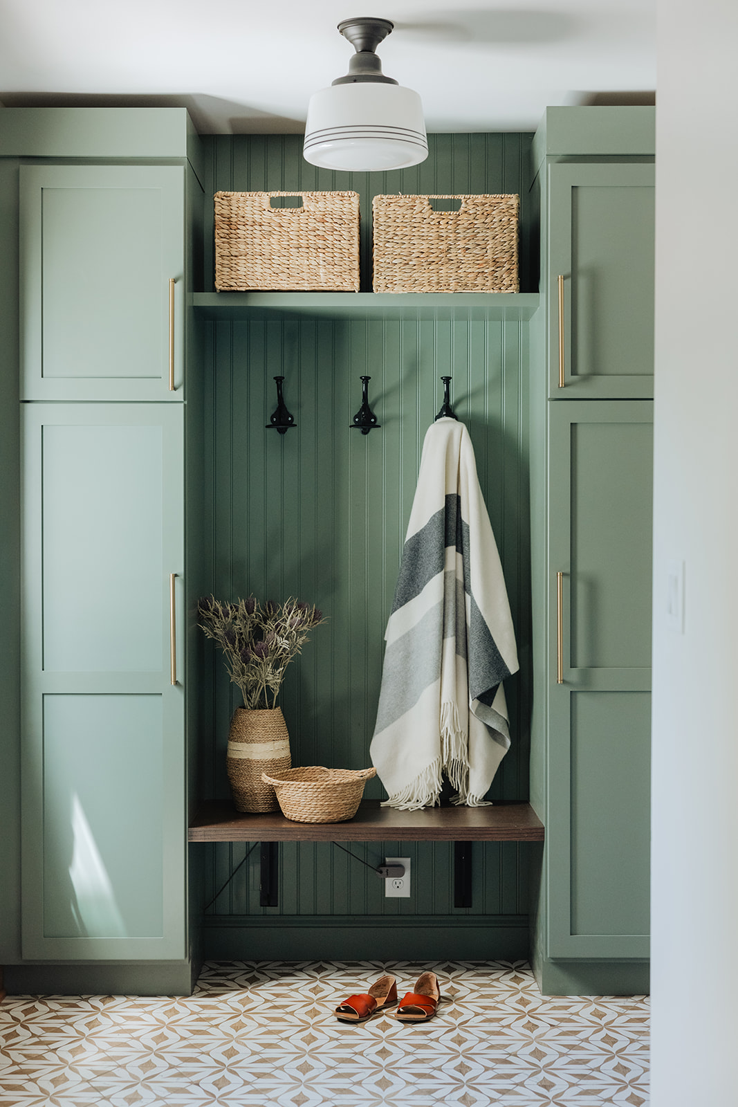
The Midcentury Cottage project was a huge undertaking for a relatively small space. What once was a dark, dingy rental house out near the lake has been completely transformed. The end result is a bright and cozy cottage with pops of fun color and a midcentuy meets boho vibe.
The entire space was gutted down to the studs and we started fresh, incorporating all new doors, windows, trim, flooring, lighting and cabinetry.
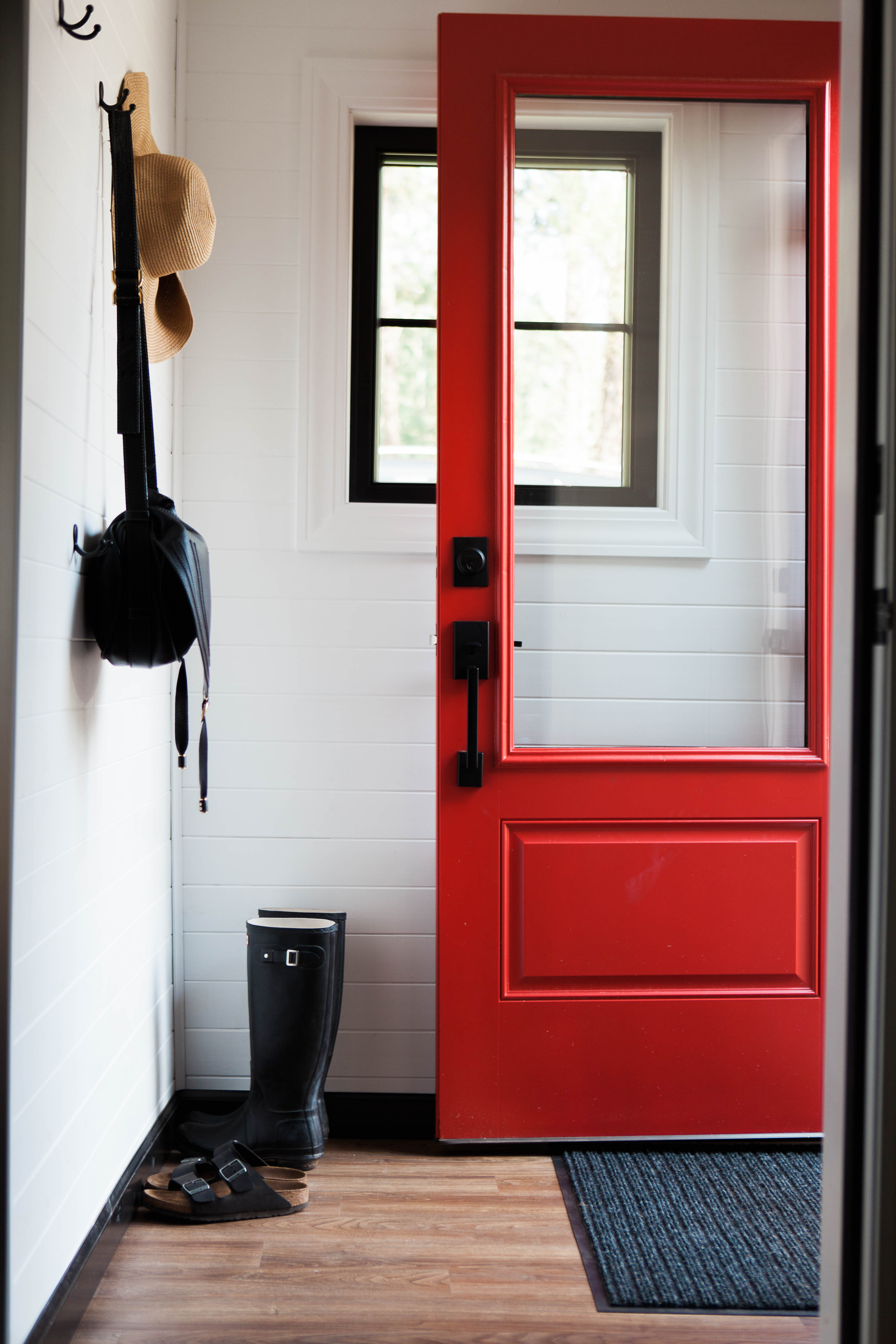
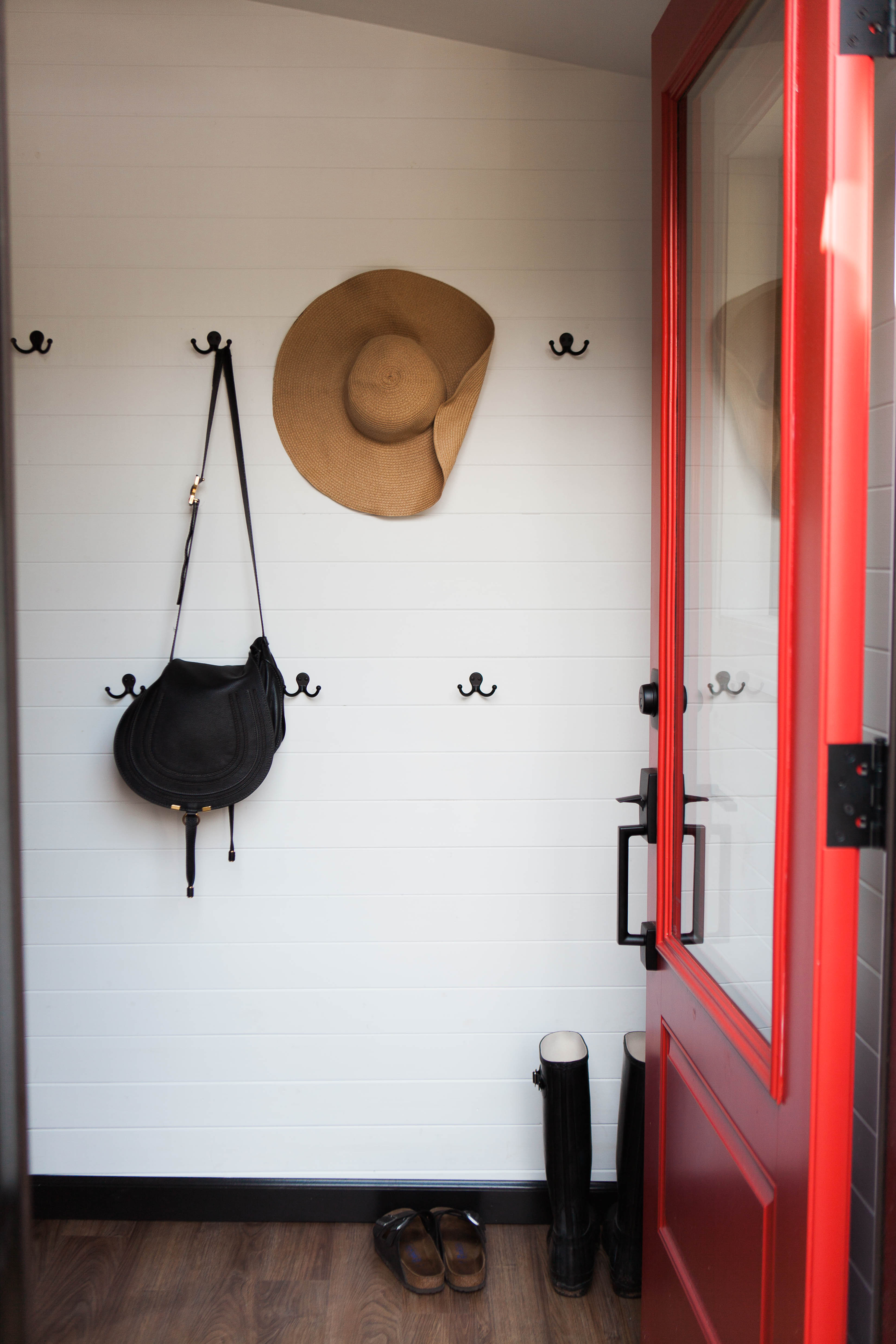
We added an amazing custom painted red door at the entryway with a huge glass panel to let in tons of light and make the space feel as big as possible. Adding a ship-lap inspired wall finish brought some interest into the space while still letting it feel clean and minimal.
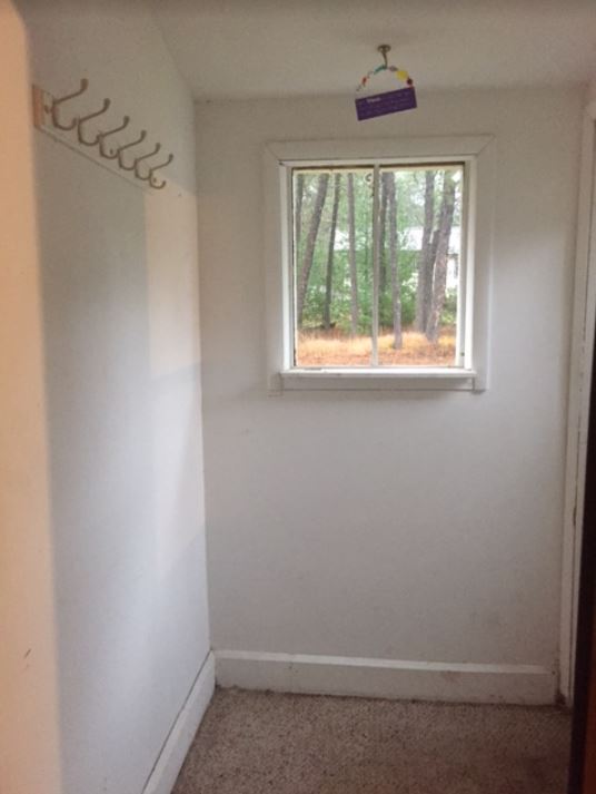
Entryway Before
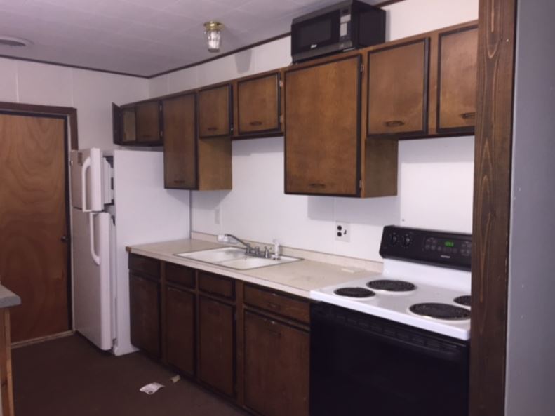
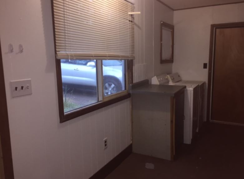
Kitchen Before
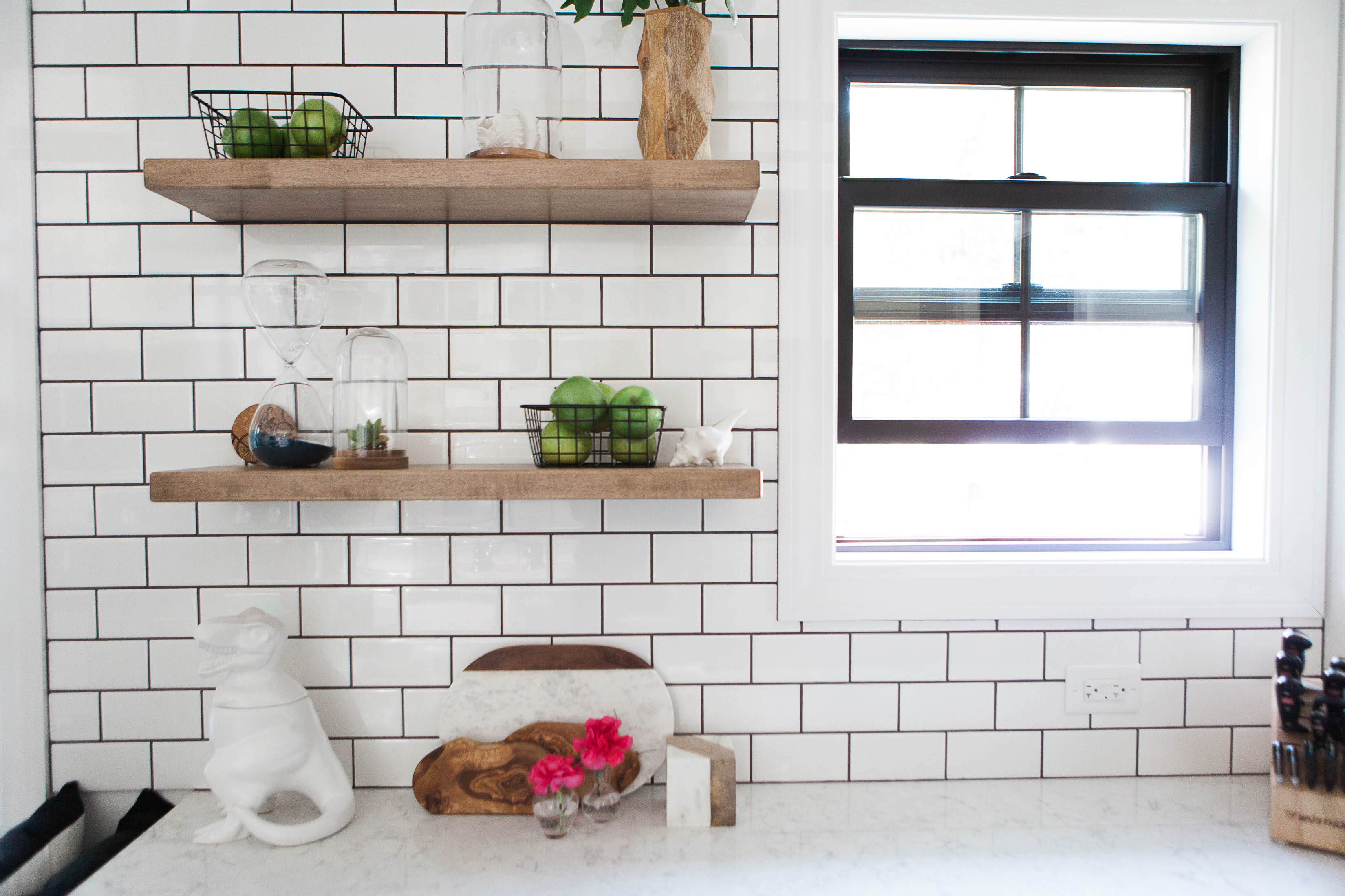
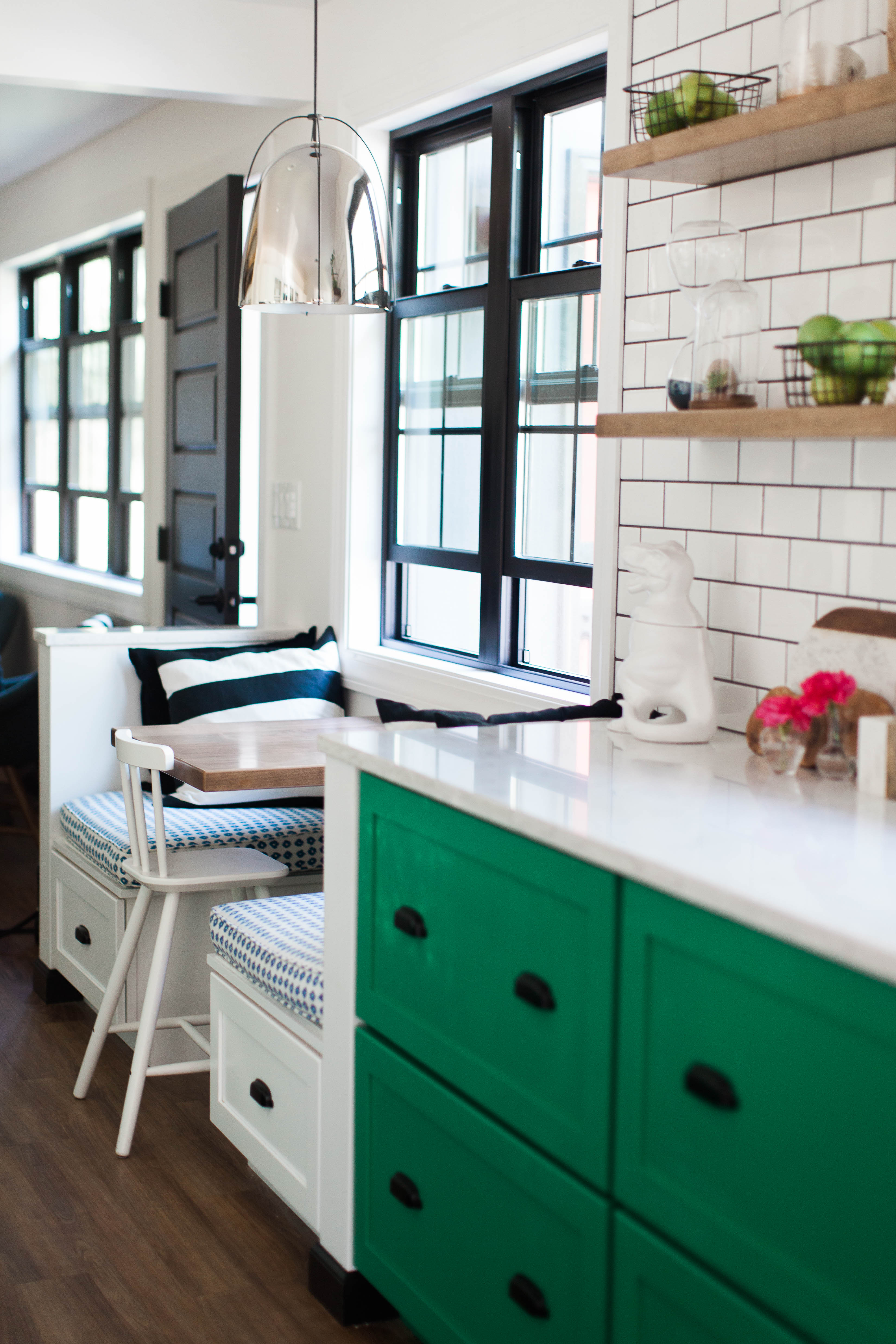
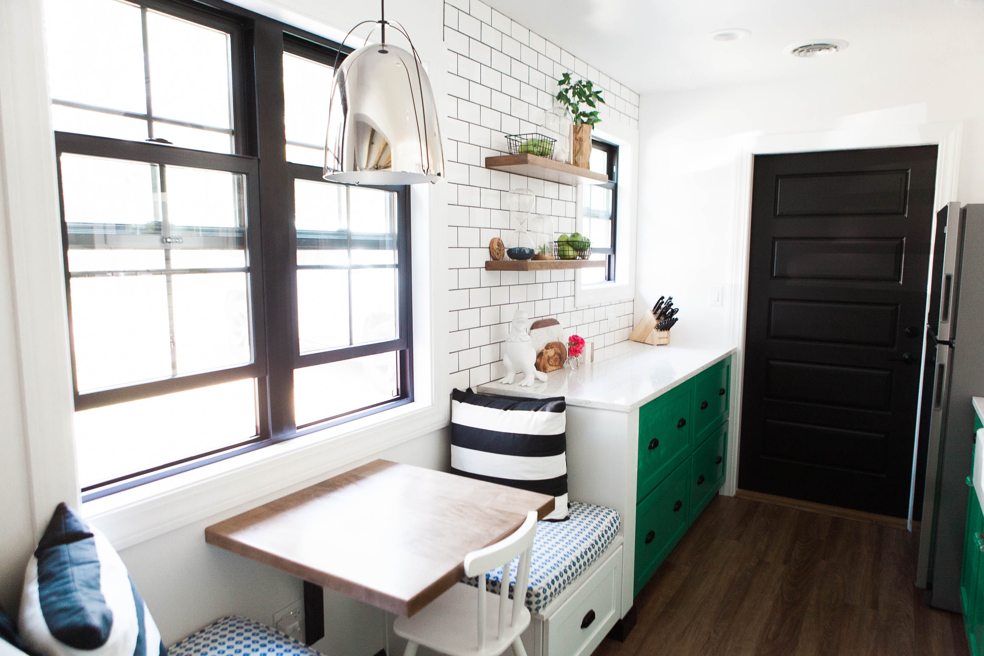
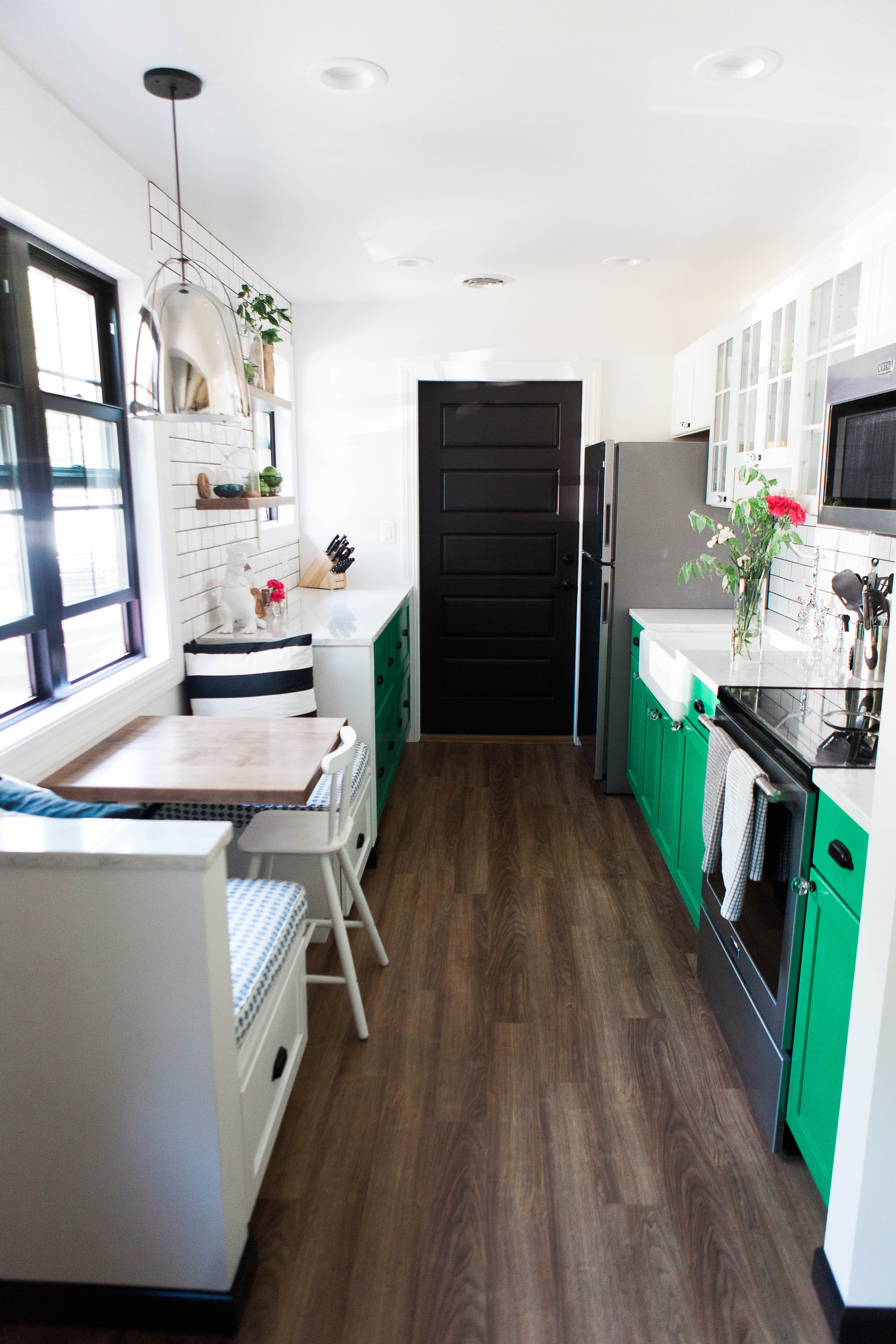
The kitchen before was less than inspiring. When the client gave me an inspiration image with gorgeous green cabinets I knew we were going to create something amazing and super impact despite the small square footage. The layout of the space stayed pretty much the same on the one side, with the exception of moving the range away from the wall to give a little more space for cooking.
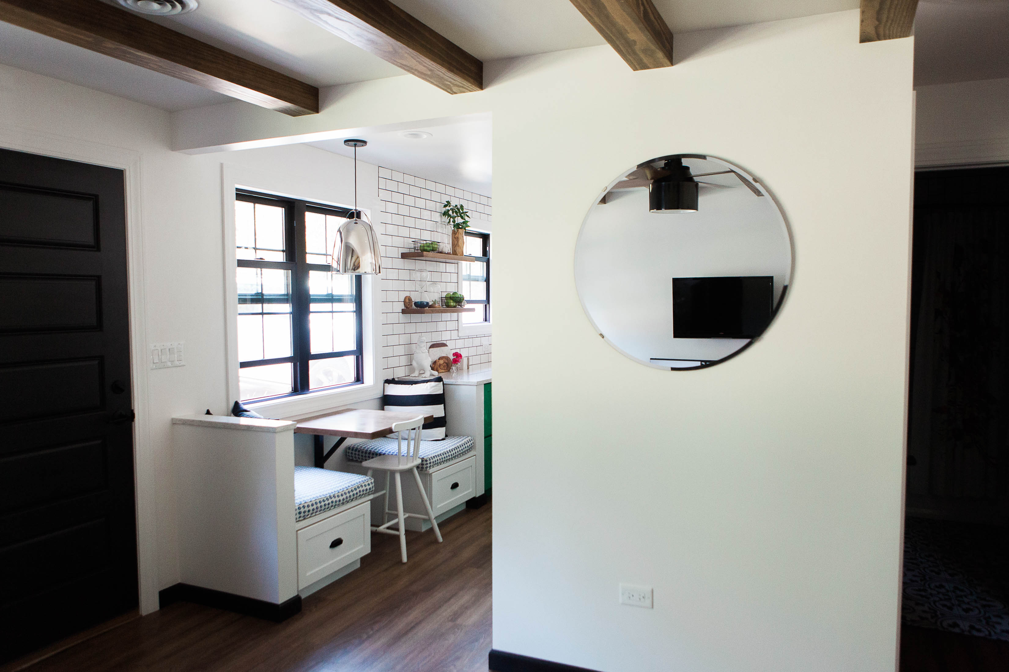
On the opposite side from the appliances we added a bank of over sized drawers to maximize storage space, and created the most perfect 2 seat banquette. Since we didn’t have room for any dining table in this cottage this is the perfect practical solution!
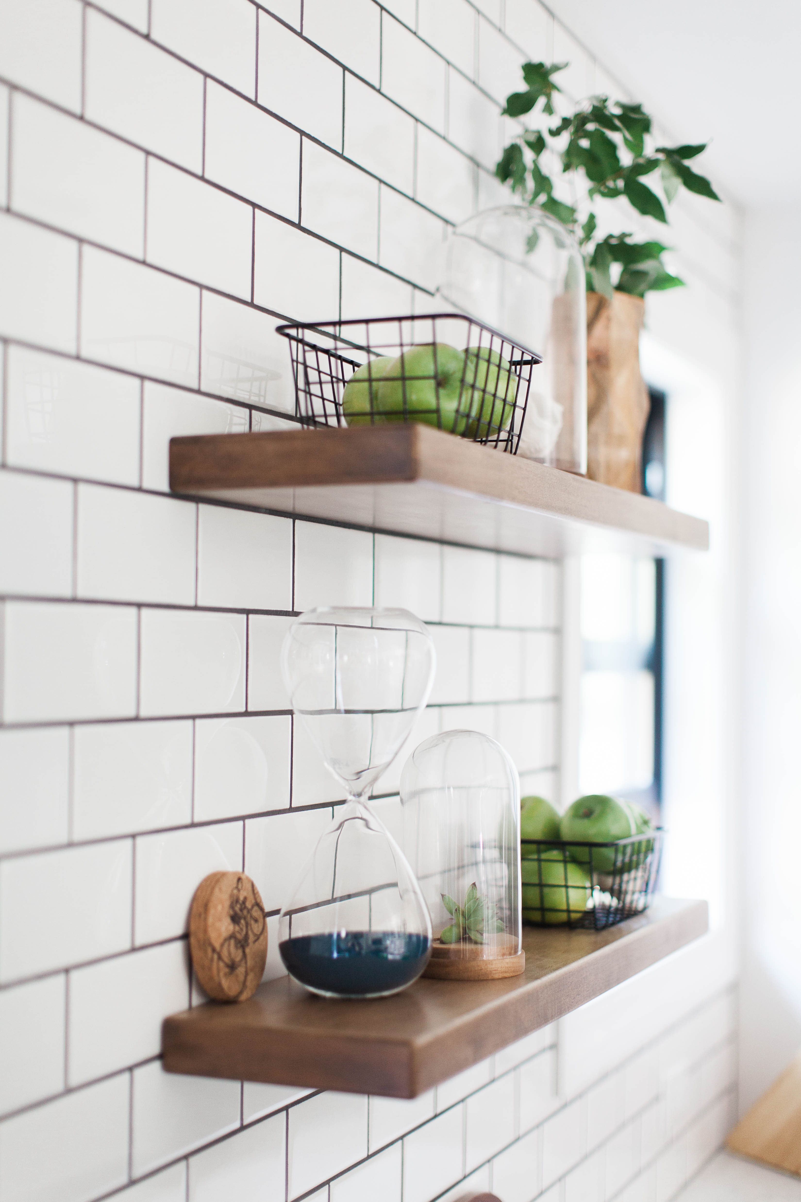
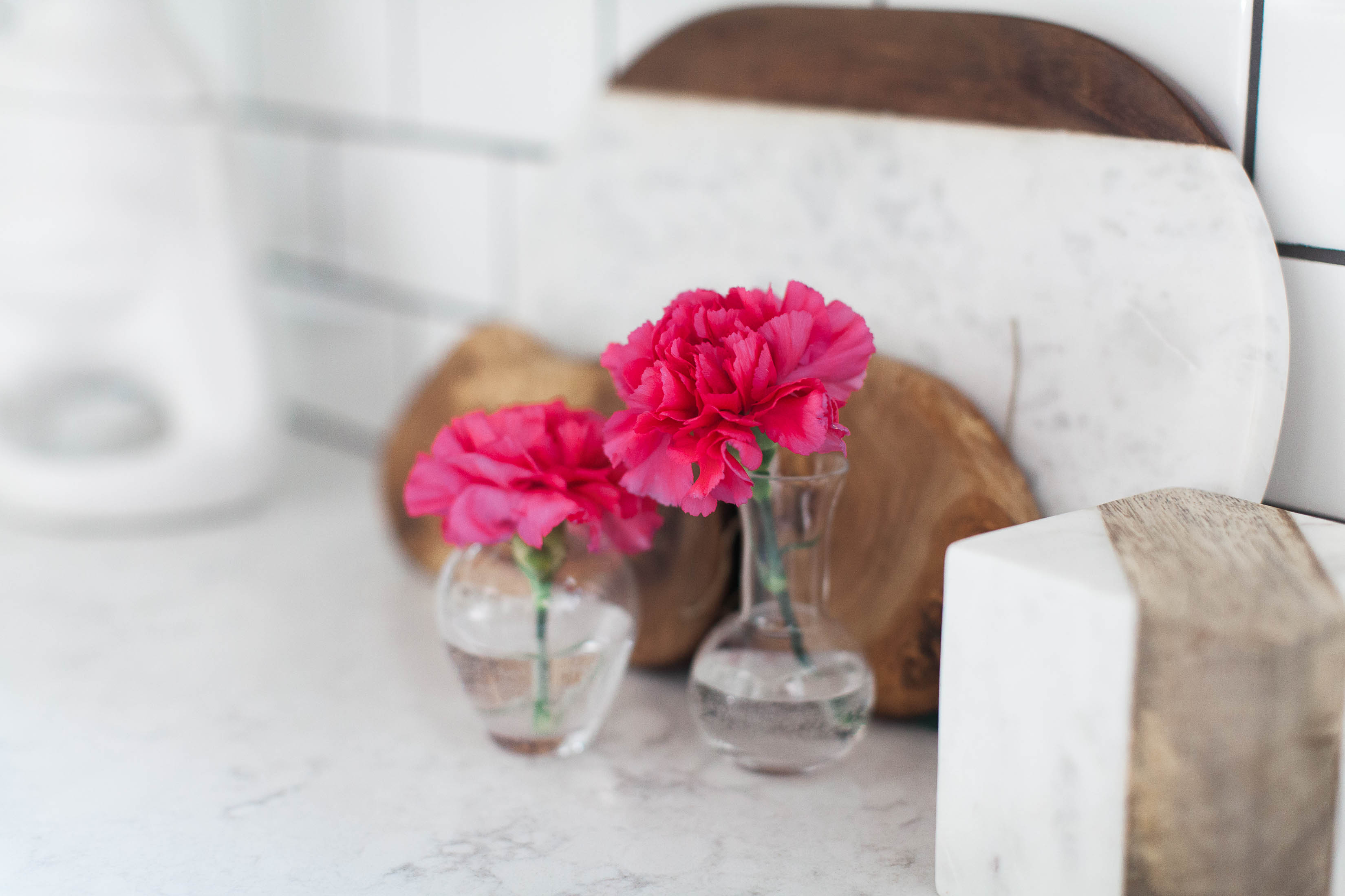
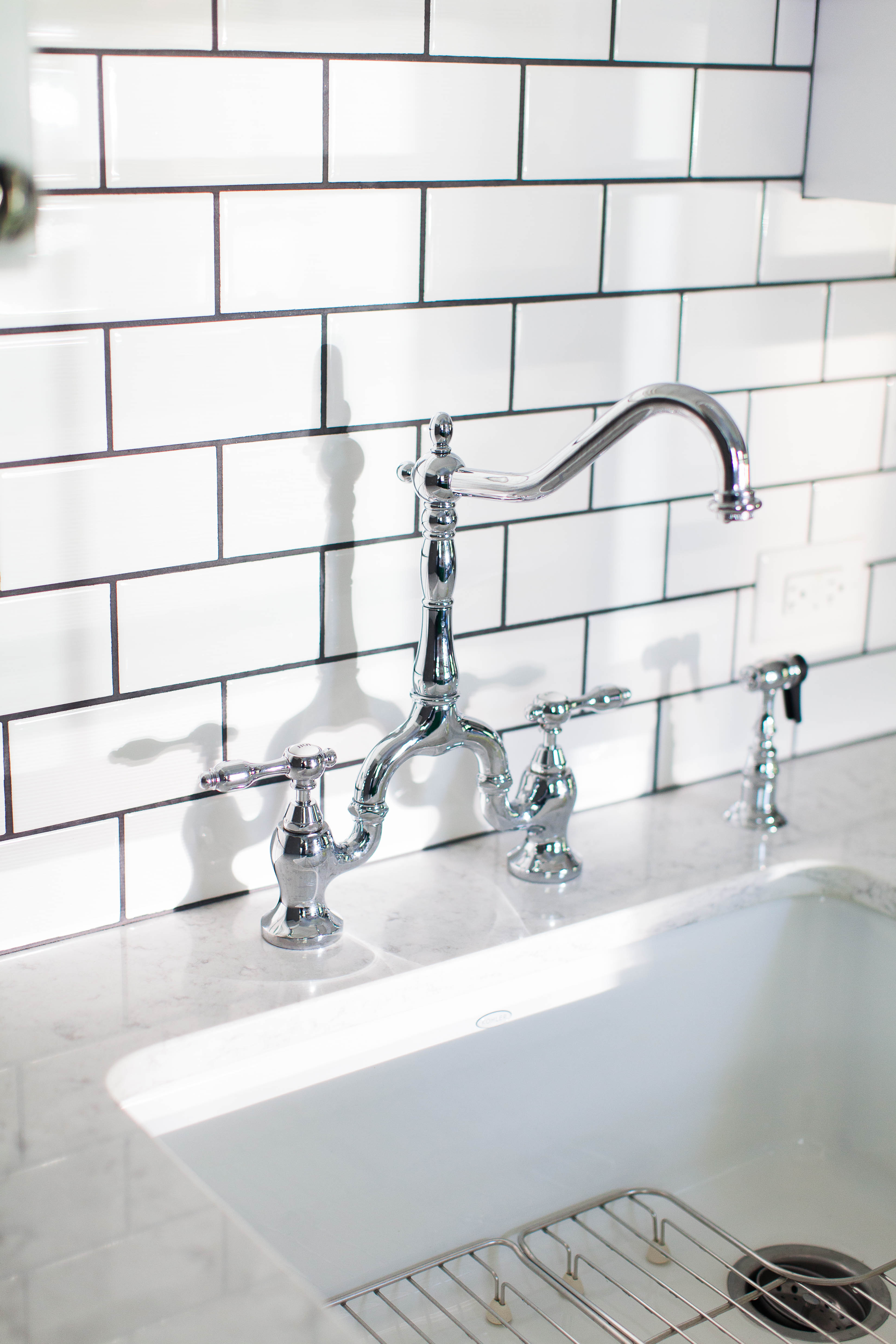
Floating wall shelves and subway tile all the way to the ceiling help to create a design focal point where there was once nothing.

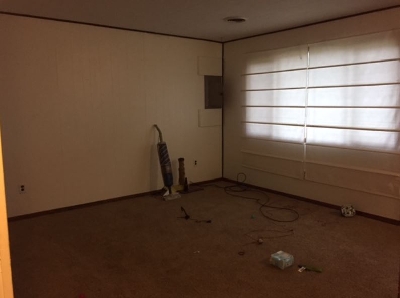
Living Room Before
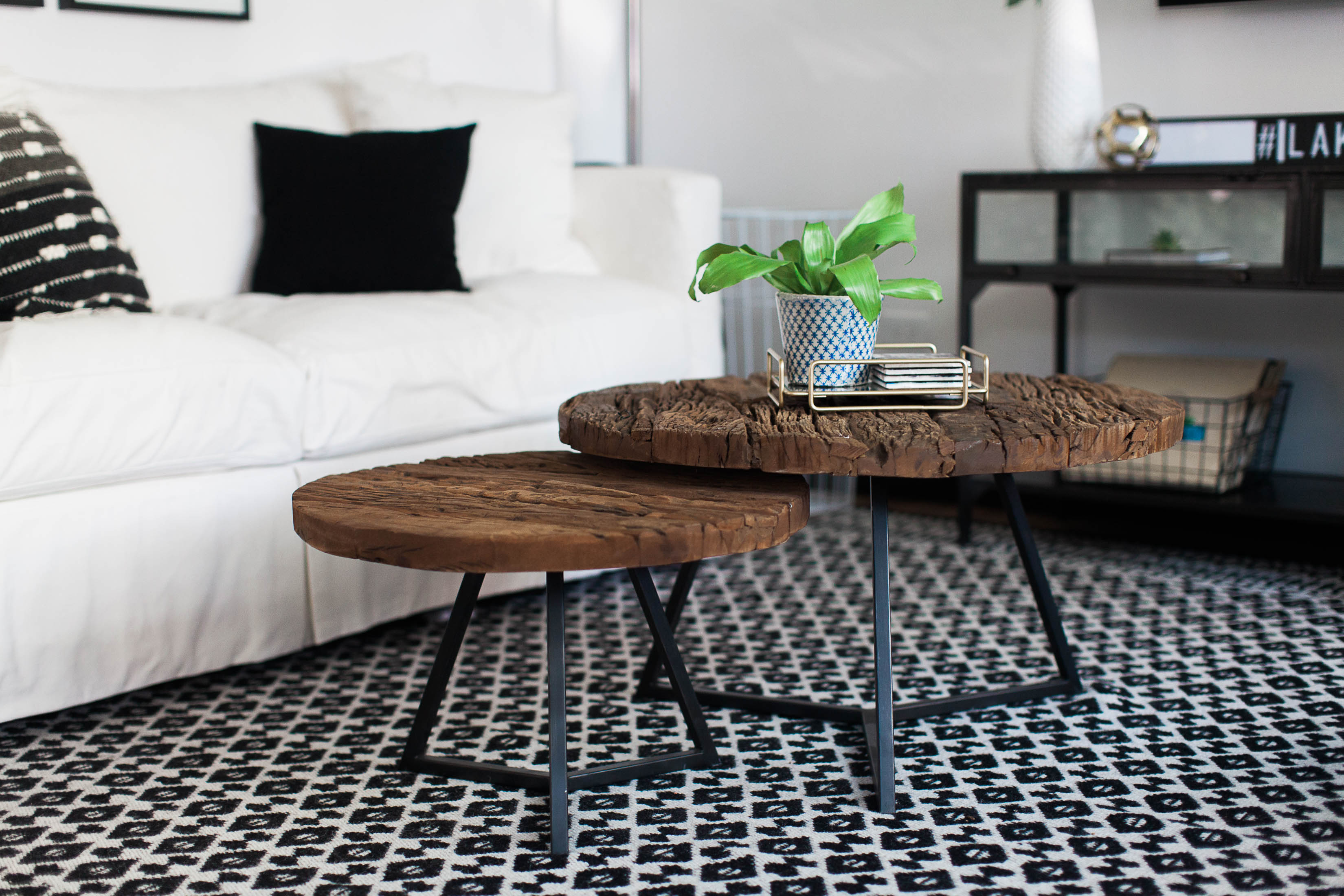
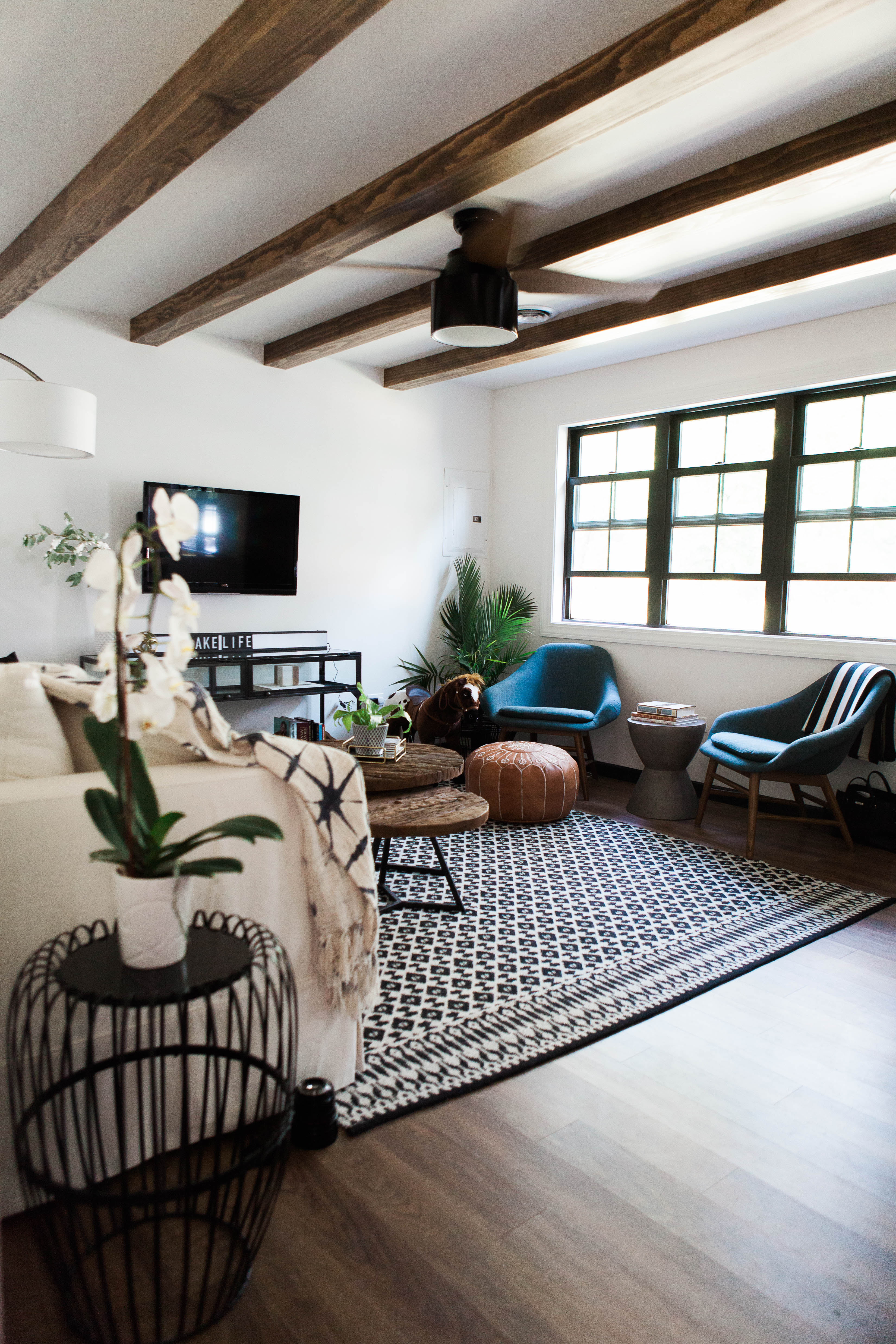
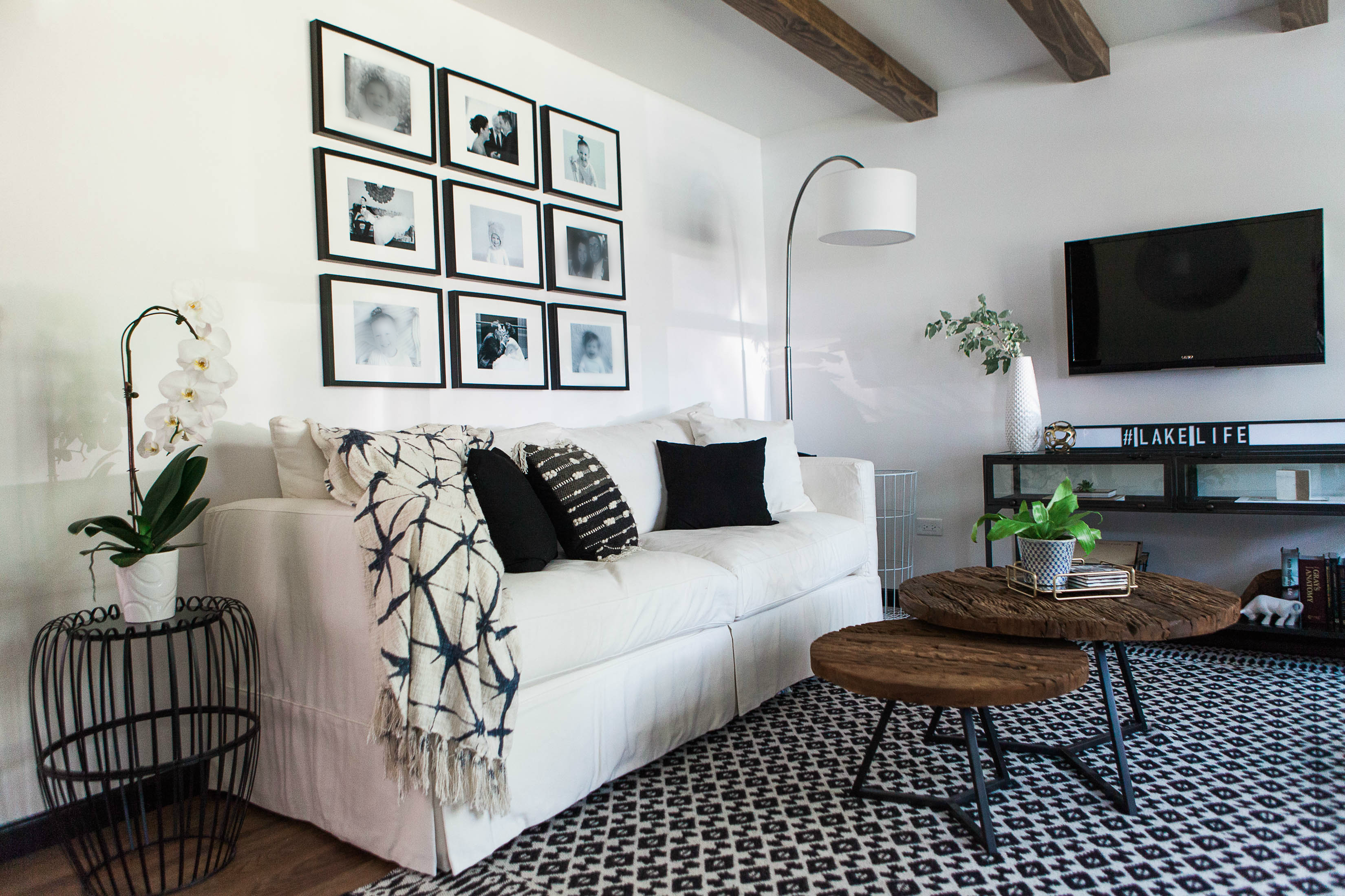
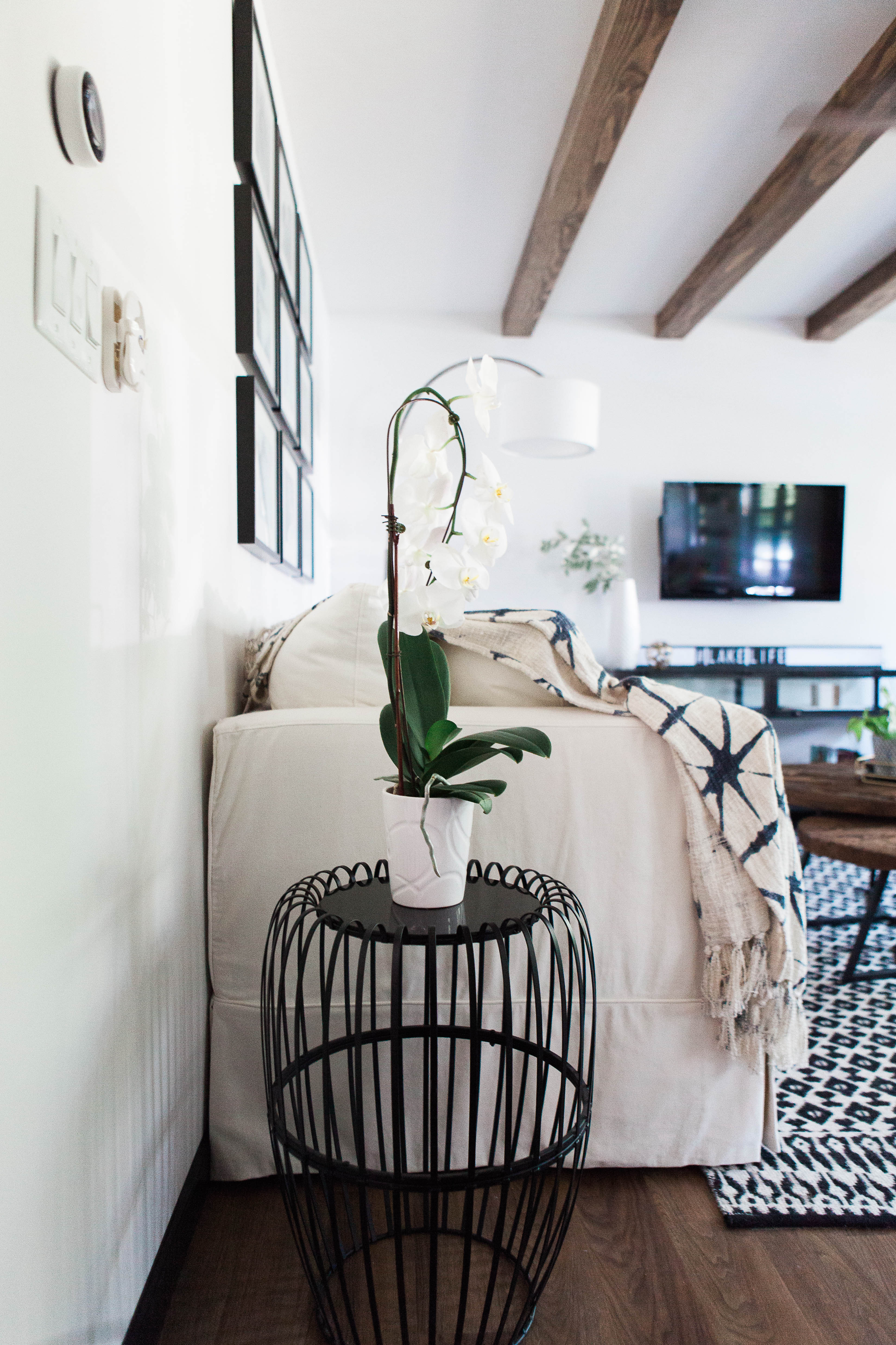
In the living room we added some architectural details with faux ceiling beams. We had a lot of back and forth about these with the clients, as they were concerned that with the low ceilings it might make the space feel even more cramped. But with all the fresh white paint and new windows the light pouring into the space made it feel larger, and we all agreed the beams were the way to go!
The ceiling beams added the character that was lacking in the original architectural bones of the cottage.

There are only two bedrooms in the cottage but we didn’t shy away from color or personality in either of them. With the all white walls carrying through the main house we could get away with the pops of bold color and mixes of pattern.
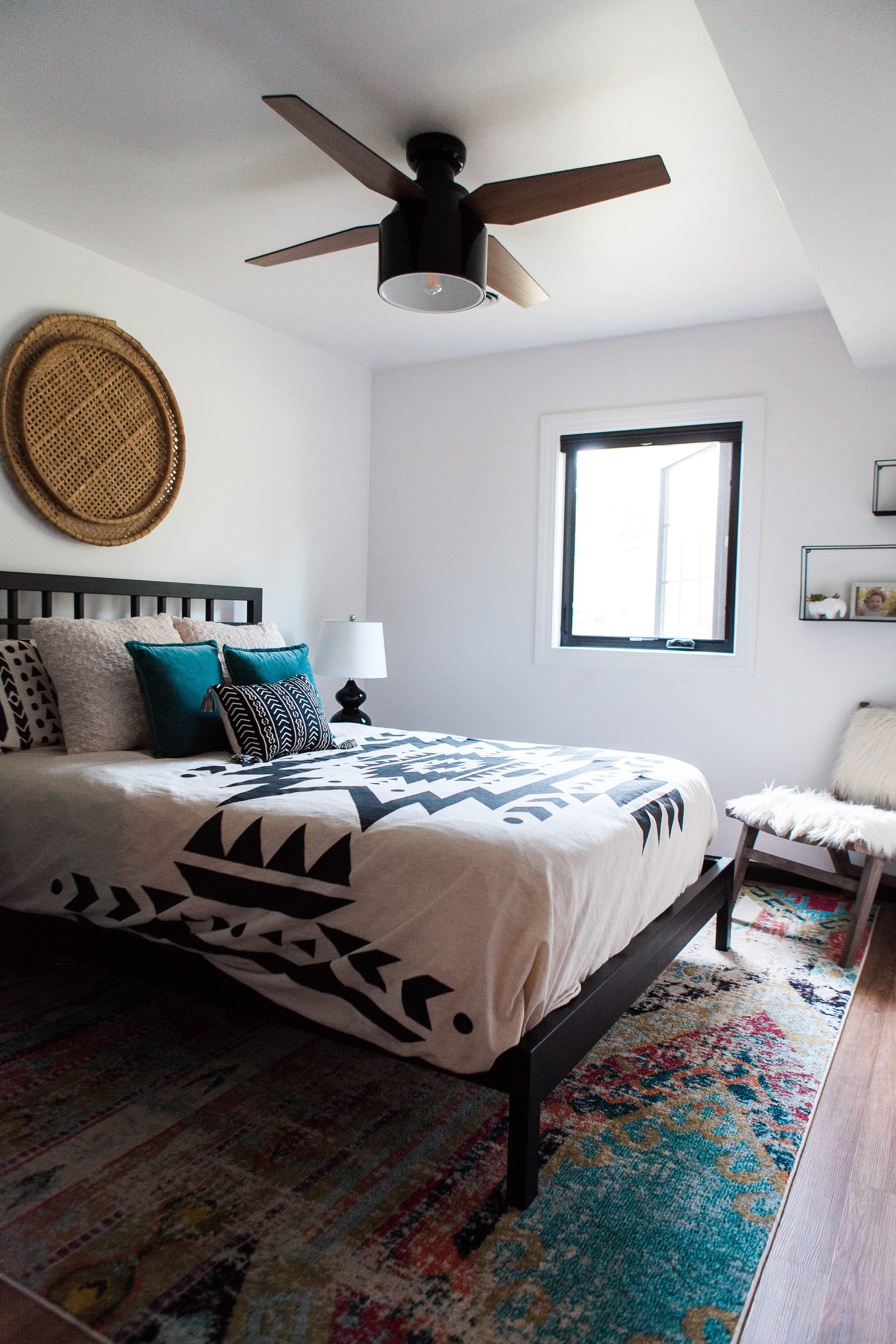
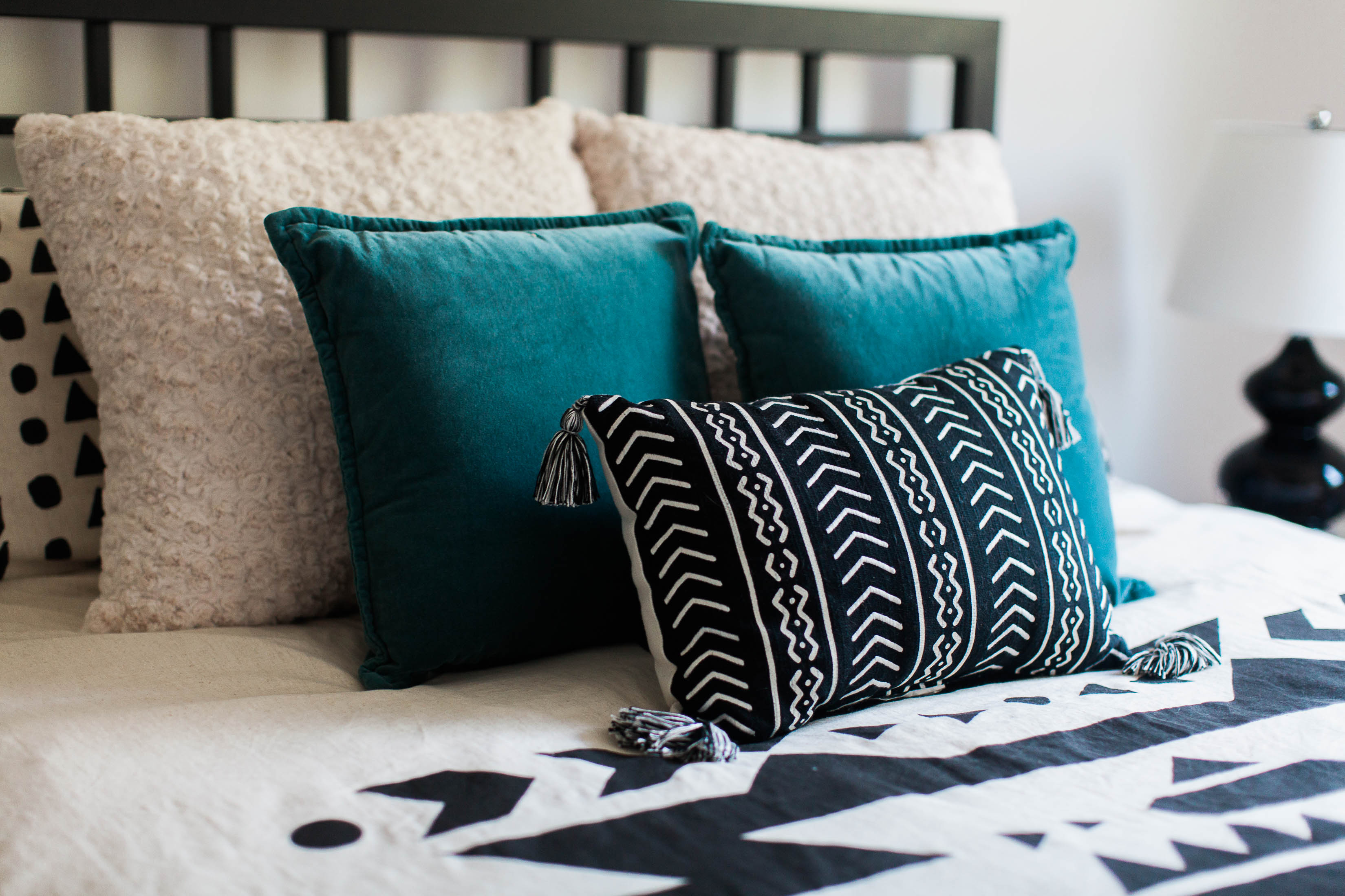
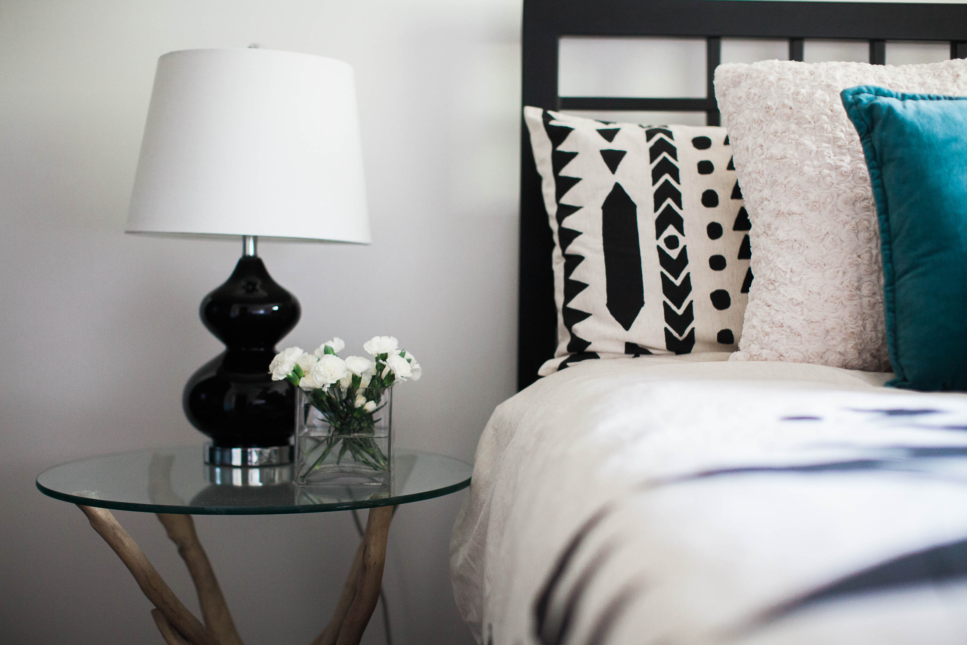
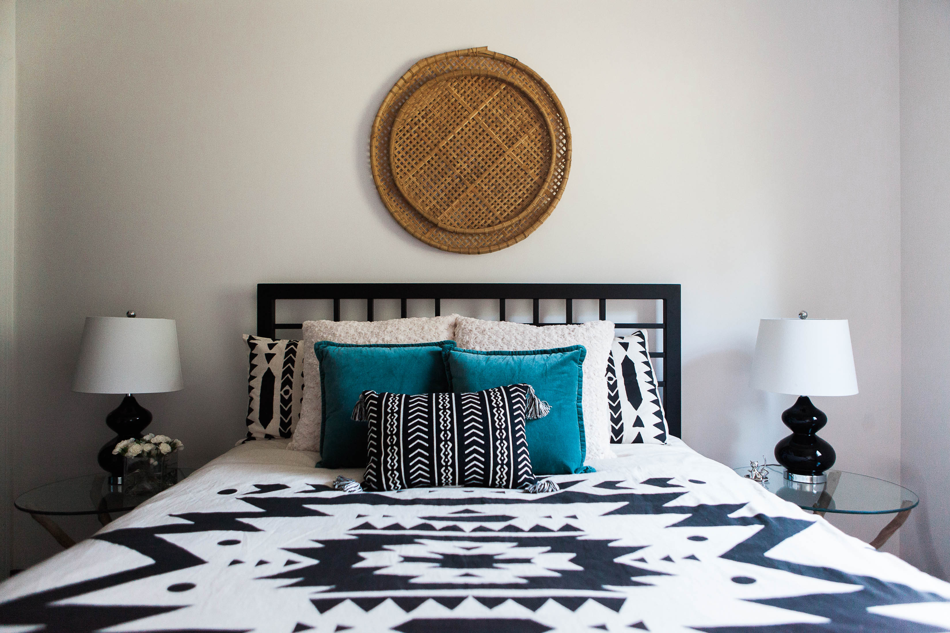
These bedrooms prove that all white walls don’t have to be boring or bland.
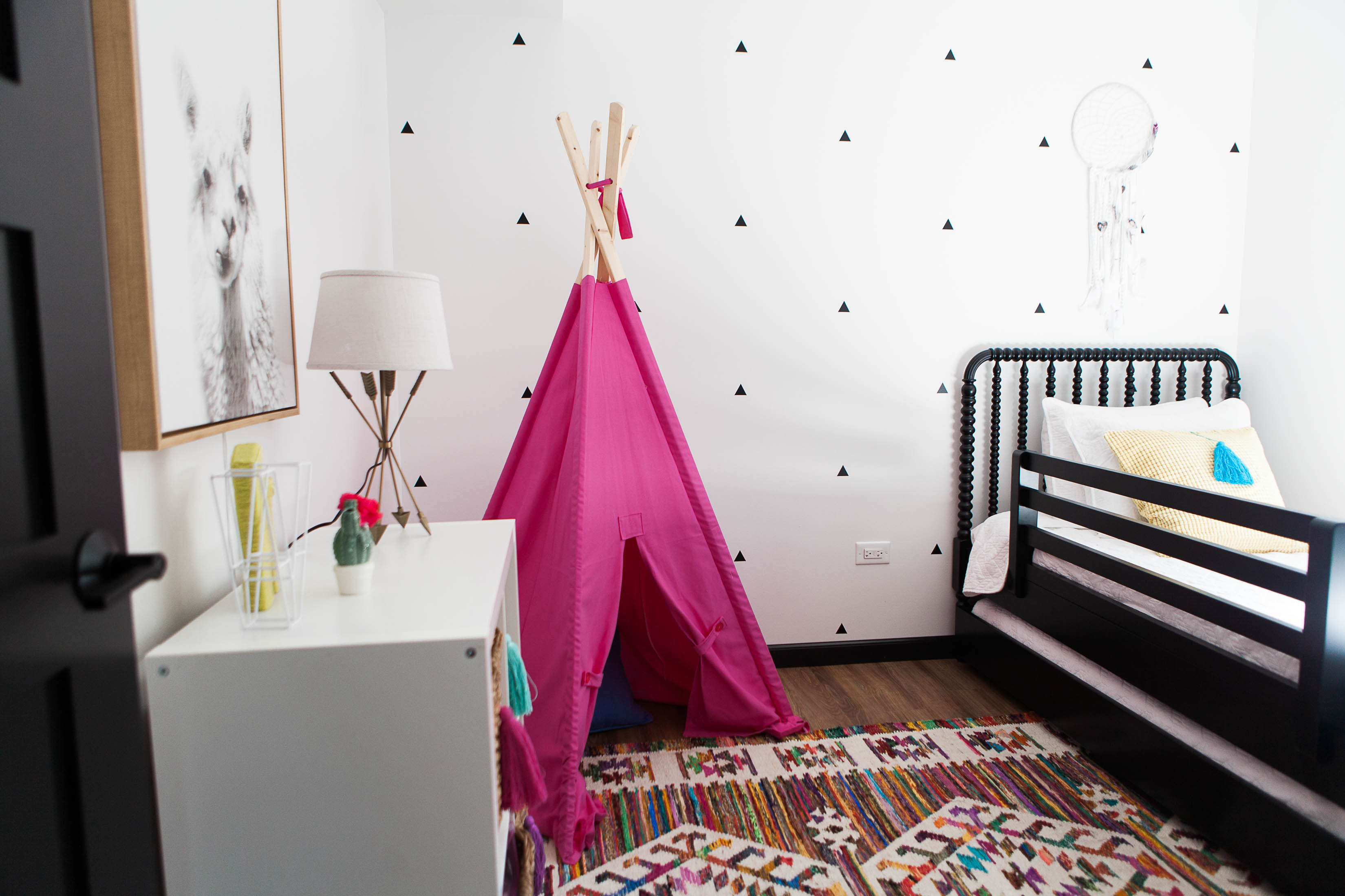

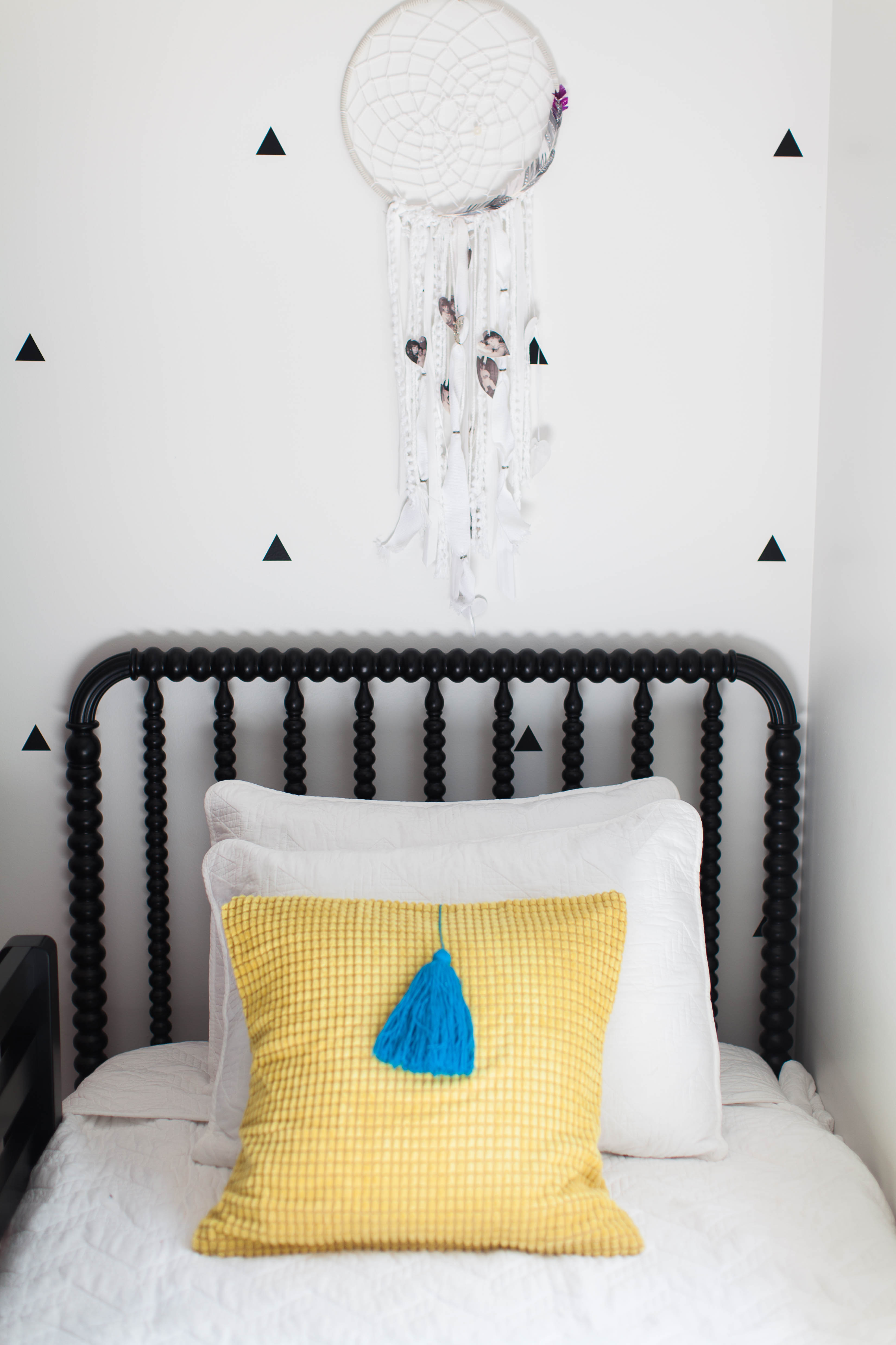
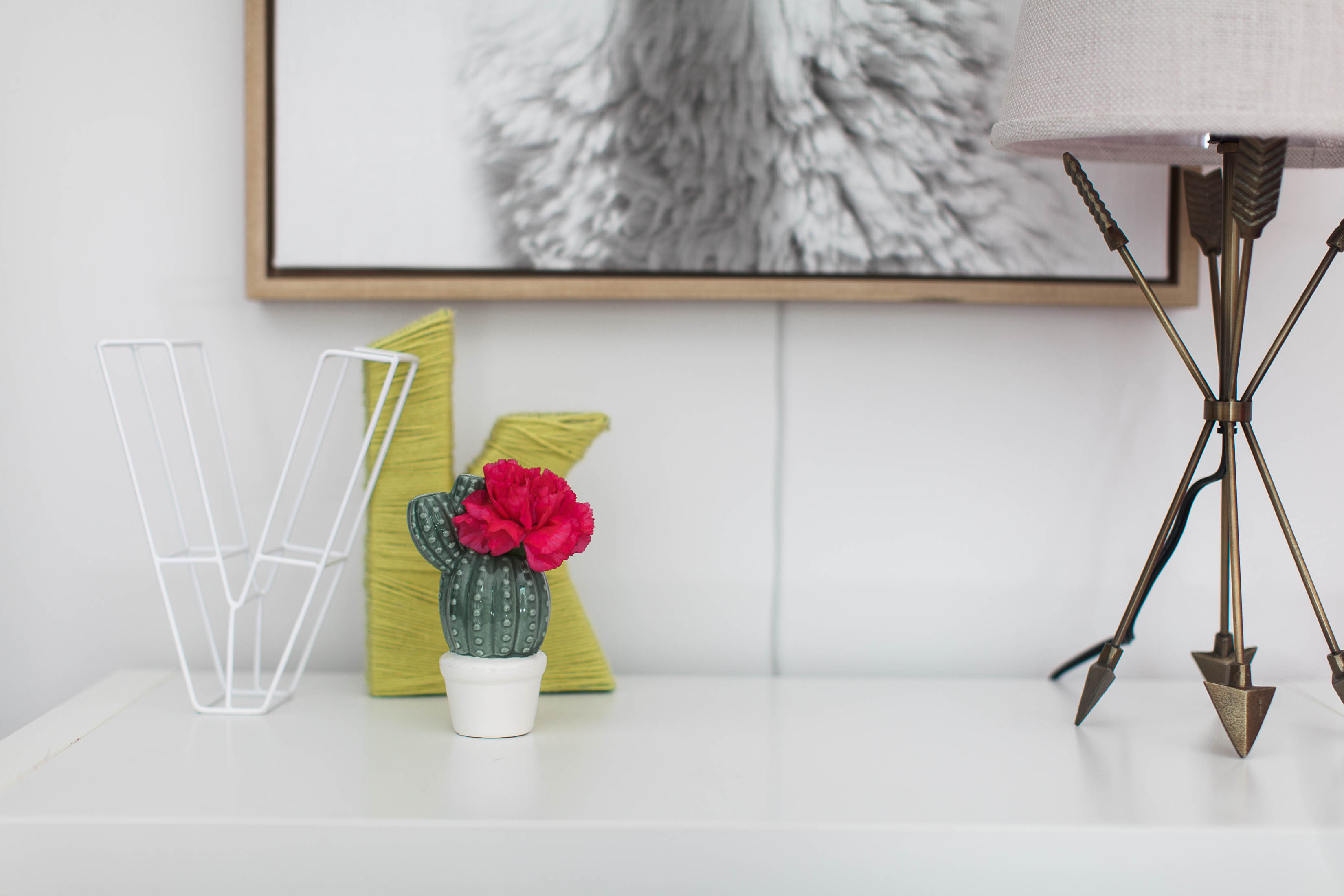
The Midcentury Cottage project is a testament to the overall design process.
We started out thinking about the big picture goals for this project, how we wanted it to look, feel, function, how much it should cost, and worked tirelessly to ensure that every detail was ticking one of those criteria boxes.
We never lost sight of the overall feel we wanted to space to have, no matter how many set backs or revisions were needed. The end result is a functional, beautiful space down to every detail.
Are you in need of a collaborative and highly detailed design plan for your next renovation or new construction project? Check out our collaborative consulting services— for local Marquette,MI clients and virtual clients around the world!
P.S.–stay tuned for a separate post about the Midcentury cottage bathroom renovation!

