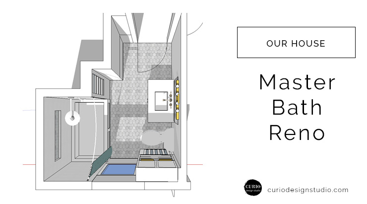
This summer we are planning to work on a lot of stuff in our new house–A 1908 2 story traditional that hasn’t been touched since 1988. I want to rip out everything and start from scratch, which eventually we will do. But since we are doing this ourselves we have to be strategic and start with the spaces that are in the most need. For us that is the renovation of the master bath. Since this is an older home I use the word “master bath” loosely– since there really is only one bath (for now). Eventually we plan on adding a powder room downstairs and possibly an en-suite in our grand future plans.
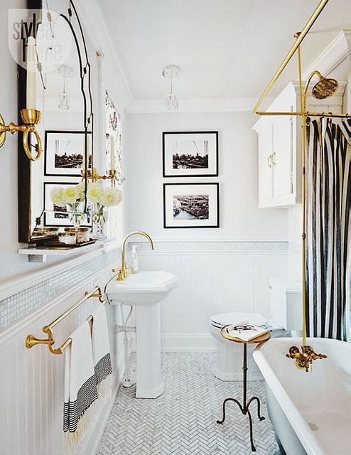
Right now I am in the planning stage. Finding inspiration, playing around with 3D models, shopping for product and ordering samples. I’ve been doing lots of pinning of crisp, clean, white rooms. Here are a few of my favorites (Pinterest links to original sources). P.S. are you following me on pinterest?!
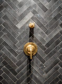
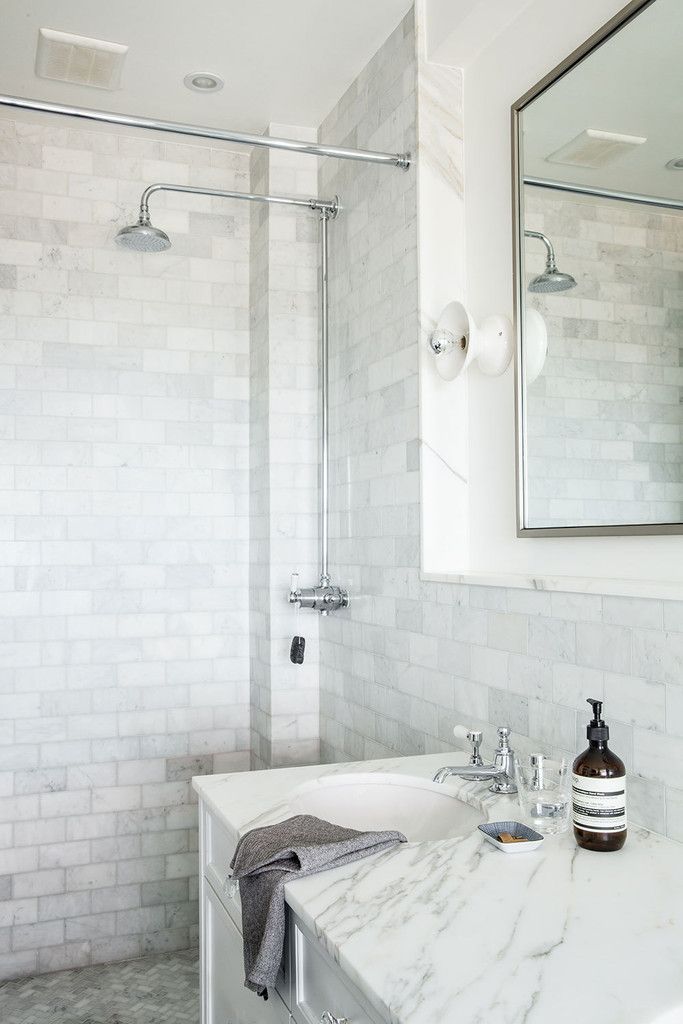
I love the white-on-white looks of these spaces with the simple metallic touches. It felt retro and modern and elegant all at the same time. A perfect fit for our vintage abode.
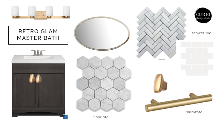
I got slightly obsessed with these 3″ marble hexagon floor tiles and started building out the design from there. If it were up to me everything metal in the space would be gold, because I LOVE GOLD! But unfortunately my husband and our budget wouldn’t allow for that. Although I did find this amazingly perfect light fixture in “brushed caramel” and knew I had to have it, and it was a steal for only $129 from lightingdirect.com. The knobs and hardware on the built-in cabinet will also be gold, while the remaining fixtures will be chrome. At first I wasn’t sure how I felt about this, because I was so set on the idea of having this brushed caramel everywhere, but in the end I am really loving the idea of mixed metals.
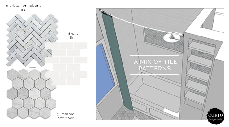
Because the space is monochromatic I knew I had to bring in interest through pattern. And what better way than with tile!? The main walls in the tile surround will be a simple white subway tile. I love the clean look of this, but since these tiles are so affordable it really helps to bring down the overall budget. The accent tile in the shower alcove as well as behind the built in shelves will be this amazing 1×3 marble herringbone.
The design side of me wanted to turn this tub in to a enclosed glass shower stall to really show off the tile, but my practical side knew I had to leave the tub since it was the only one in the house at the current moment. So hunting shower curtains will be for another day and post!
Overall I LOVE the direction of this bath and am so excited to get in there and start the transformation. Stay tuned for project updates!
Need help finding inspiration, product and fixtures for your remodel? Contact us today. We work locally with clients in Marquette, MI and virtually with clients around the world!





It’s beautiful. I love the tile that goes in that different direction!
The Chevron tile! I know it’s amazing. This is where we got it from!
http://www.thebuilderdepot.com/cvhherringbonefreeship.html