This post is a long time in the making! I have been so busy with client projects that I just haven’t had the time to put everything together for this post. But I am so excited to share our master bath renovation with everyone now!
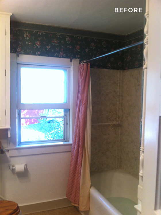
This summer we moved into our first home and had a long list of things we wanted to do, but the bathroom took priority. It was BAD! Like floral wallpaper, linoleum floor and faux plastic marble shower surround bad. I started plotting, sketching and shopping and came up with this plan. I wanted something clean & timeless but a little bit vintage with some modern touches. And really when you check out this before picture–anything would be better.
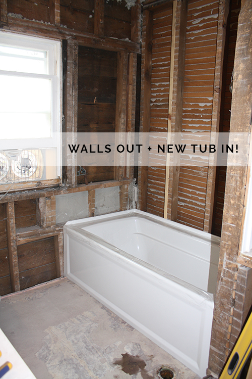
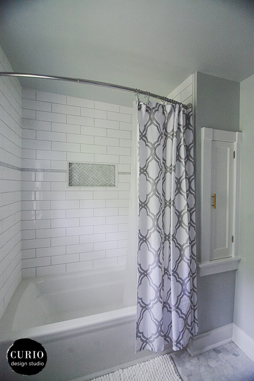
My husband was super amazing during this entire process. While I saw the vision for everything on the surface he really wanted to take it down to the studs and make sure all the electrical, plumbing and insulation was all updated as well. All the walls came down and we discovered that we have NO insulation in our 1908 home. Everything came out and was replaced with foam insulation and a a completely water proofed shower stall. We got a beautiful Kohler tub that is super deep and great for soaking.
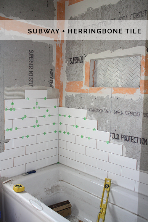
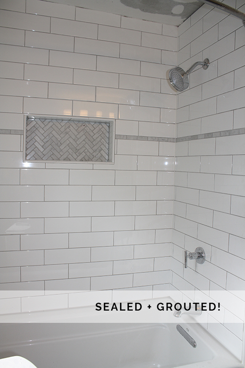
The wall was re-framed to accommodate a shampoo alcove so we have no need for hanging wire storage racks or bunches of bottles lining the edge of the tub. We used the alcove as a small accent area with this amazing herringbone marble tile from the Builder Depot. The rest of the shower is done in an over sized subway tile to give that classic + modern feel! At this point I was getting SOOOO excited. Mainly I just wanted to stop going to my mom’s to take a shower.
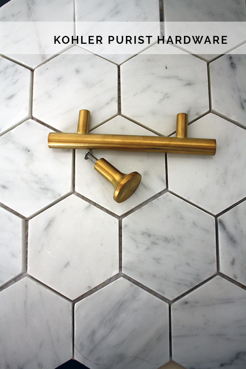
My husband will almost always say that he gets no voice when it comes to what the interior of our house looks like. But this photo proves him wrong! The addition of the horizontal marble strip around the shower was completely his idea, and is now on of my favorite parts! We went with the Kohler Purist line for the shower hardware + cabinet knobs and I love the sleek look. You can get great deals on this line from Wayfair!
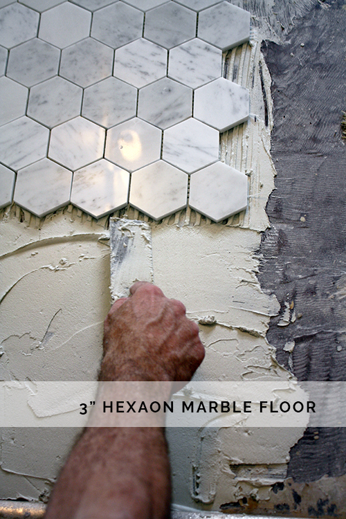
The day the floor went down was an exciting one! It really felt like it was almost done + we were having house guests coming and I really didn’t want to keep providing a half-gutted bathroom for my accommodations. Not real cozy, ya know? The floor tile is also from the Builder Depot and comes in a variety of sizes, as well as honed or polished.
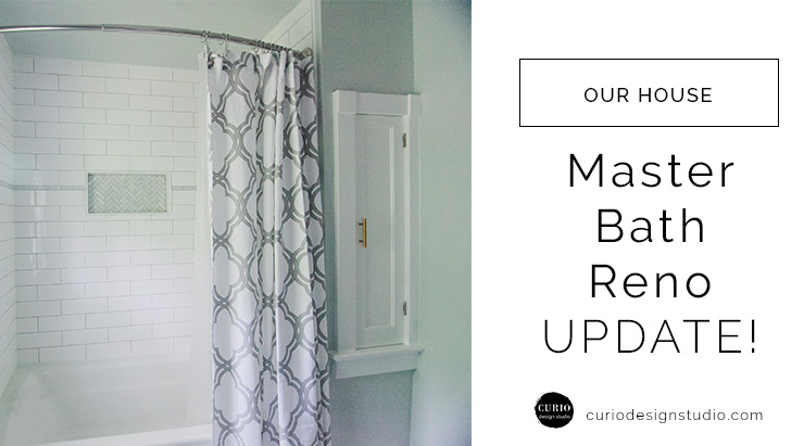
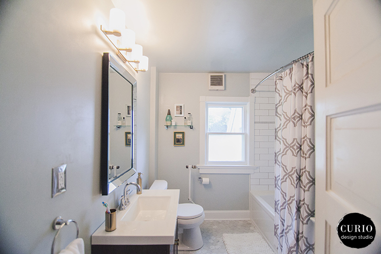
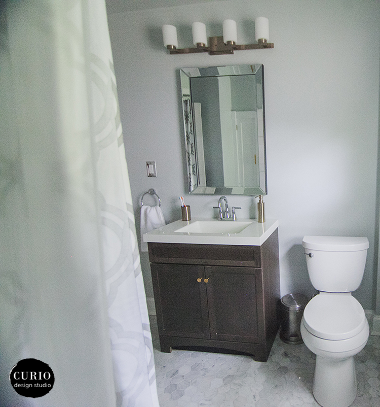
Here it is. The big reveal! quite a difference right?! The whole space feels so much larger, brighter and cleaner. I went with a curved shower rod and mounted it extra high to give the impression of space in the shower. It felt massive the first time I was in it. To really maximize the small space we went with a smaller size toilet (Kohler Cimmaron) which has a round bowl (vs. elongated) so it doesn’t stick out into the space as far. The wall color is Sherwin Williams Sea Salt– a true favorite of mine which works well in a variety of spaces. It goes great with grays and white and is such a light refreshing color.
Check out that baseboard! The original room had concrete molded baseboards (why?! No one knows!) So my husband custom made all the trim to match the rest of the trim in the house. Did I mention I have a handy husband?!
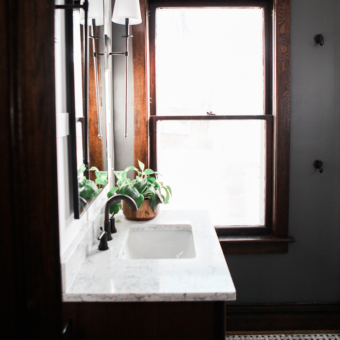
There are still a few touches that need to be added, decor and accessories and a more permanent solution to the window covering. But by the time this all came together we were just happy to have a bathroom again and ready to move on to the next room in the house.
What do you think? Leave a comment below!




Love it!! Great job Allison!
Beautiful! And so great to have a handy (talented) husband!