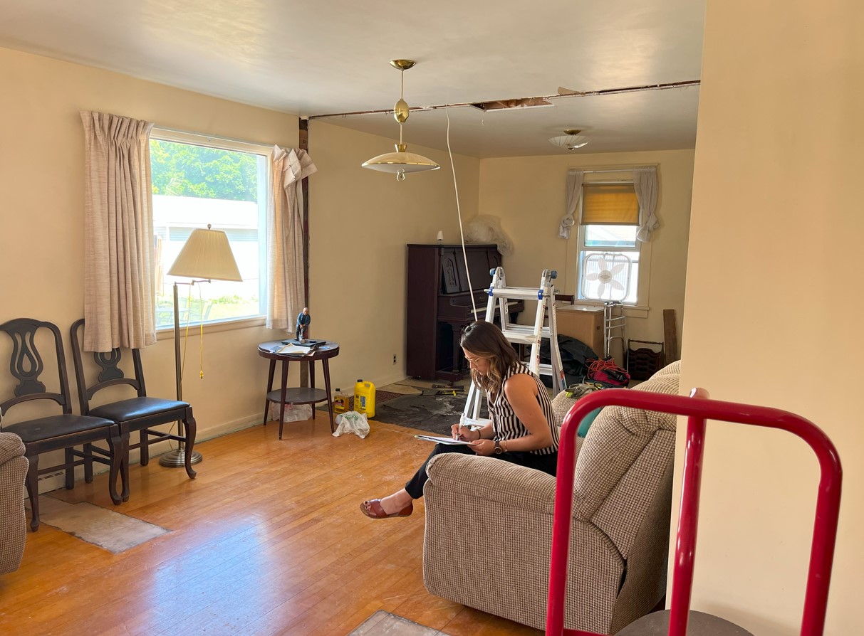
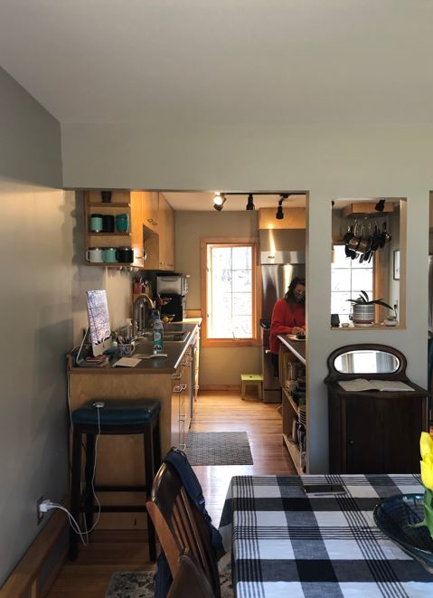
The Before.
Classic old house problems. The kitchen was small and felt completely cut off from the rest of the house. There wasn’t enough un-obstructed wall space to fit all the appliances and the client was lacking useable counter space and seating.
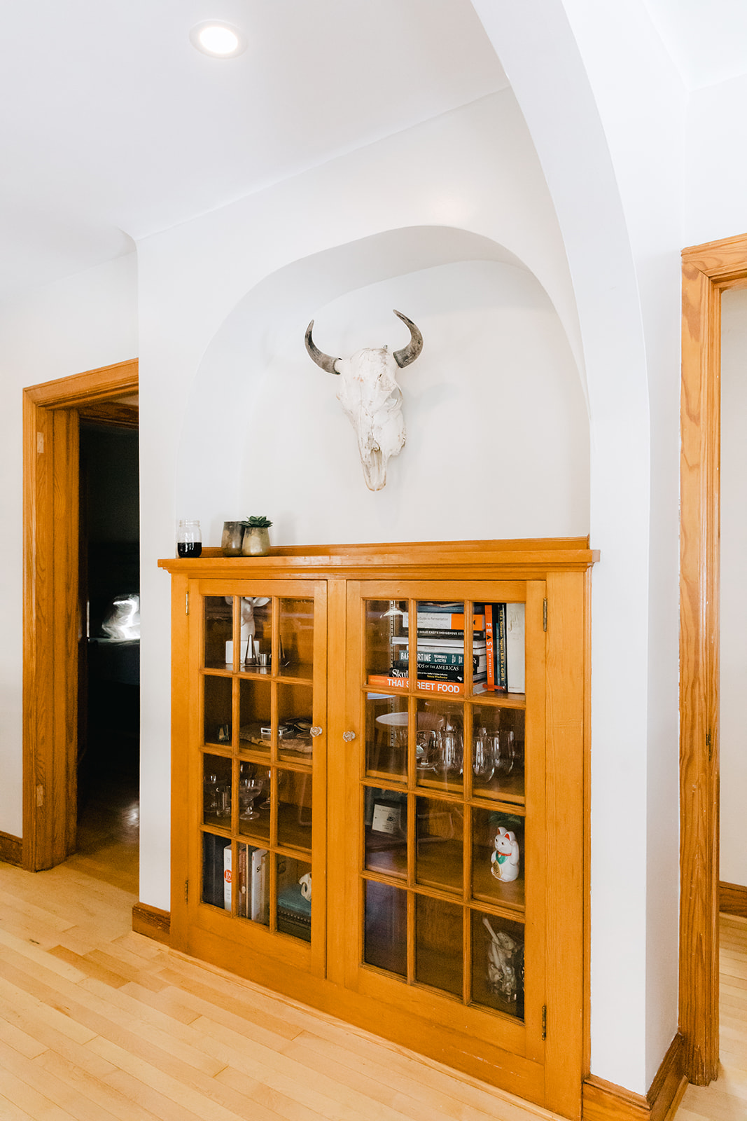
A few charming details that inspired us and we wanted to bring through into the re-design: the original wood work and the architectural arches.
The Plan.
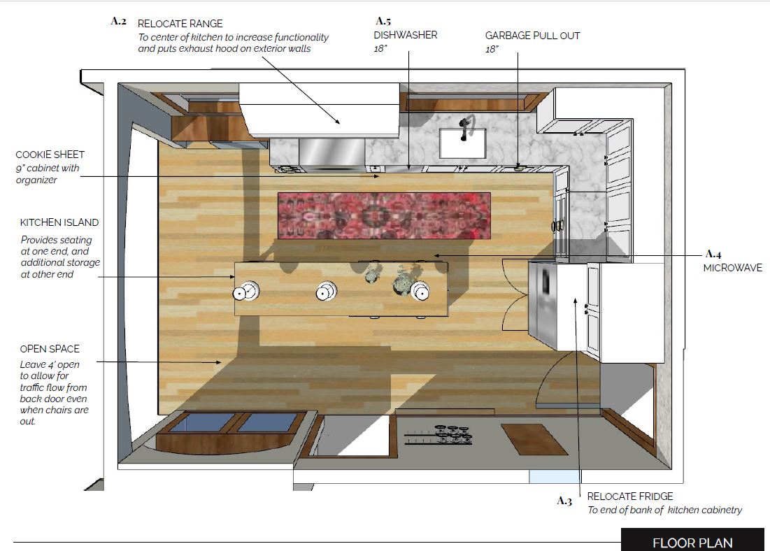
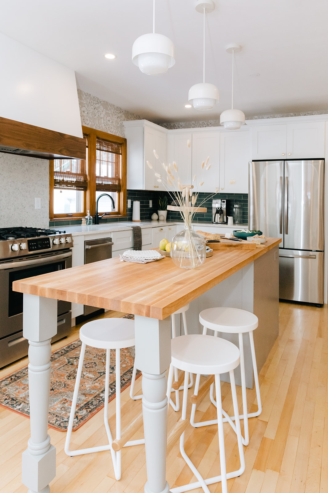
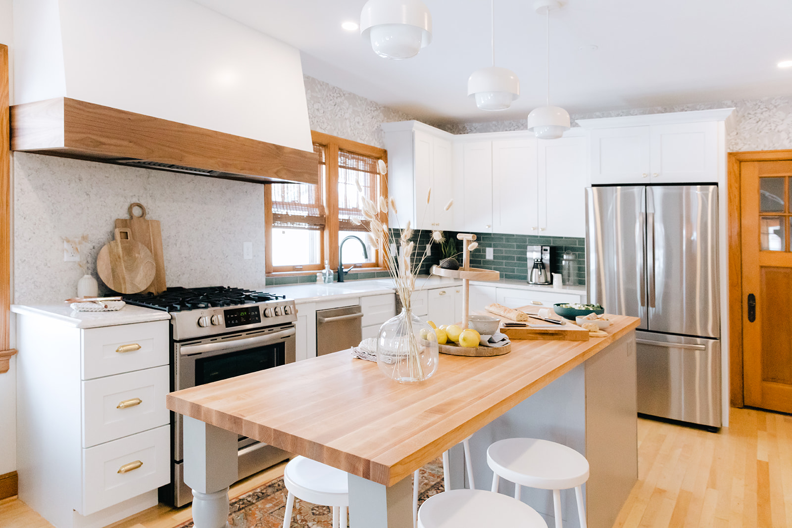
Like with any kitchen project, we started first with the layout. The main change was removing the existing wall between the kitchen and living space. We also closed off a door to a small room that backed up the kitchen in order to get more usable wall space for the optimal layout. The entry to that space was relocated to the back hall.
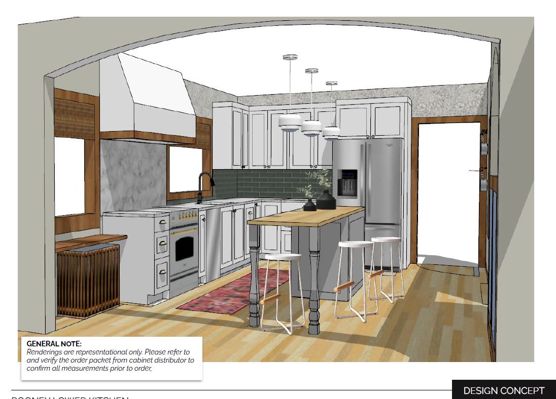
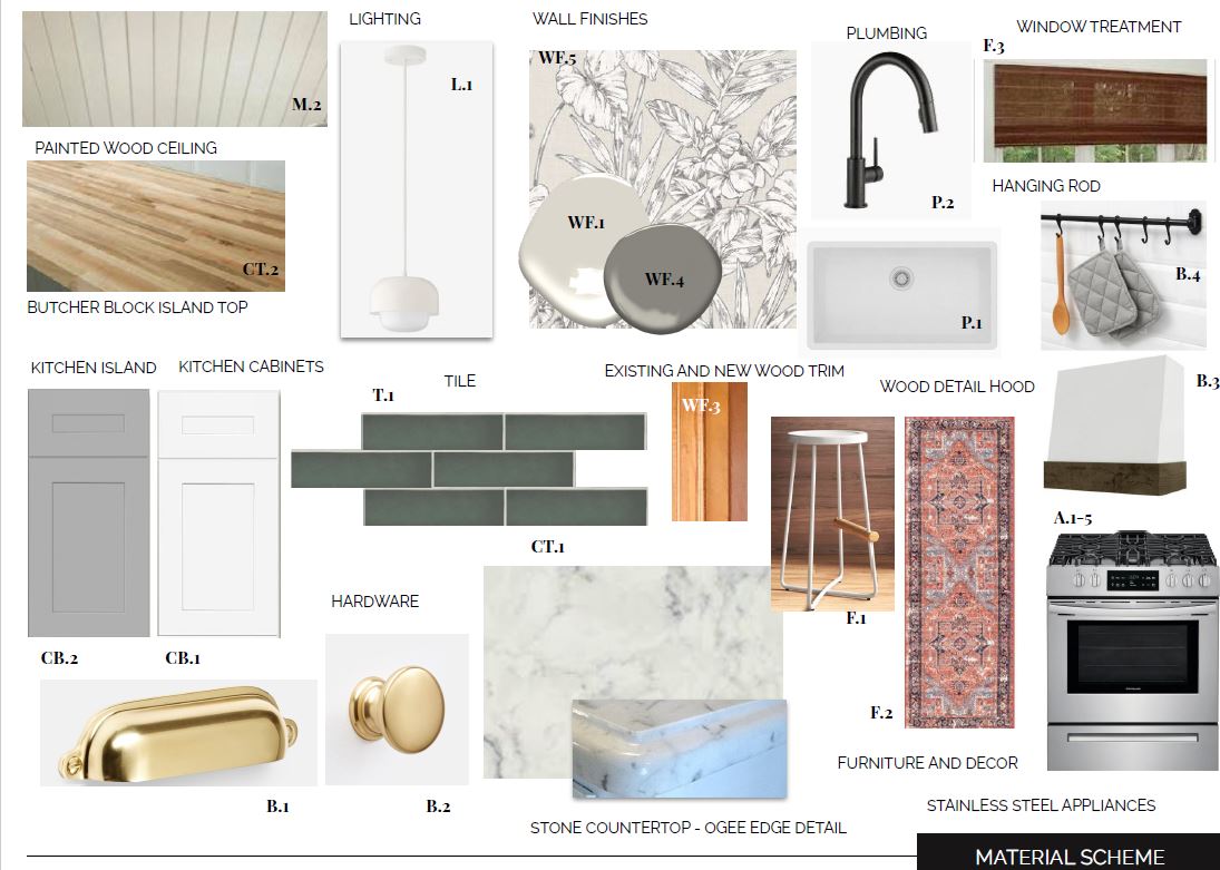
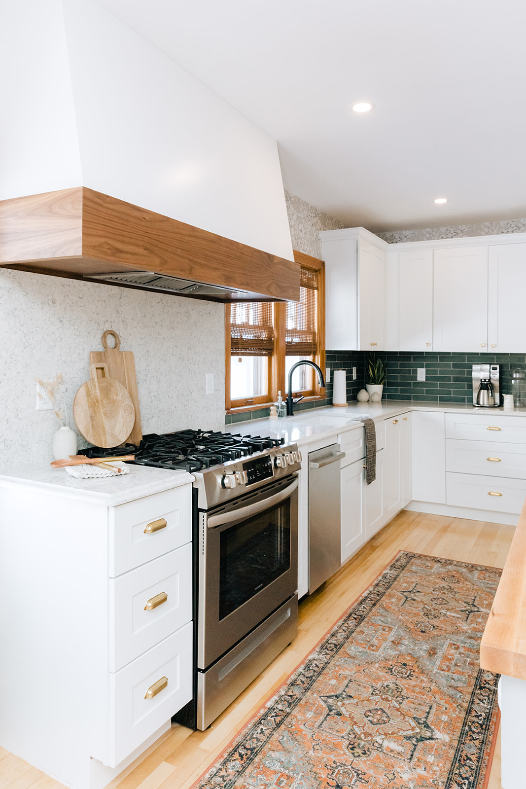
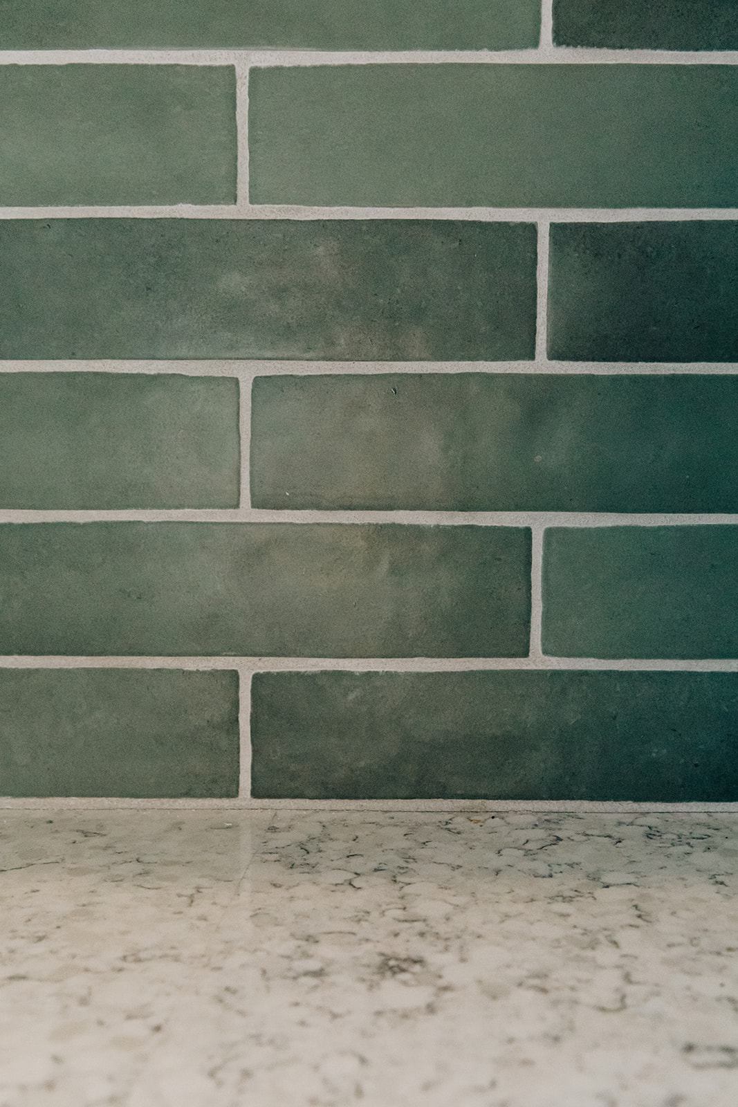
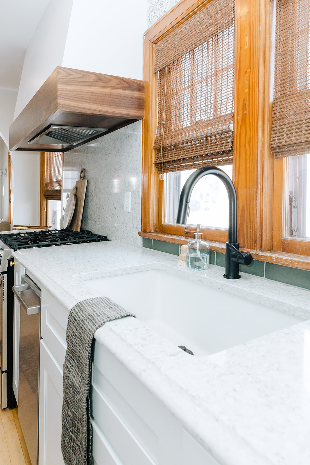
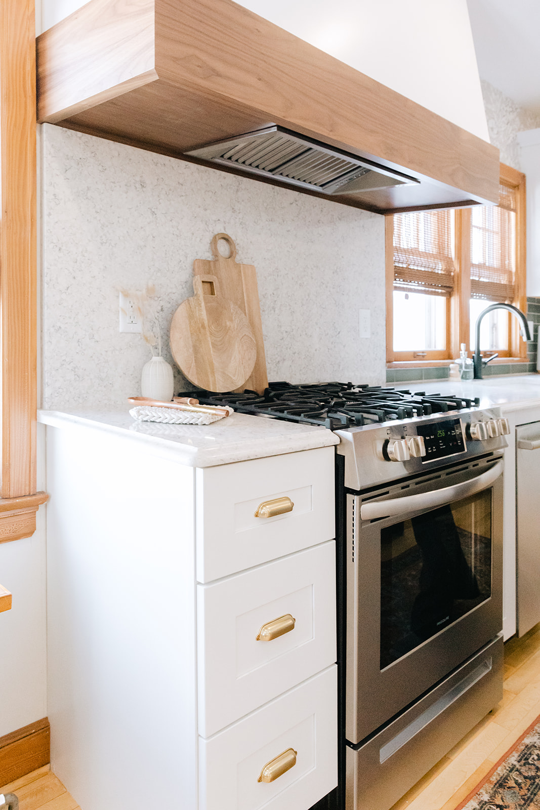
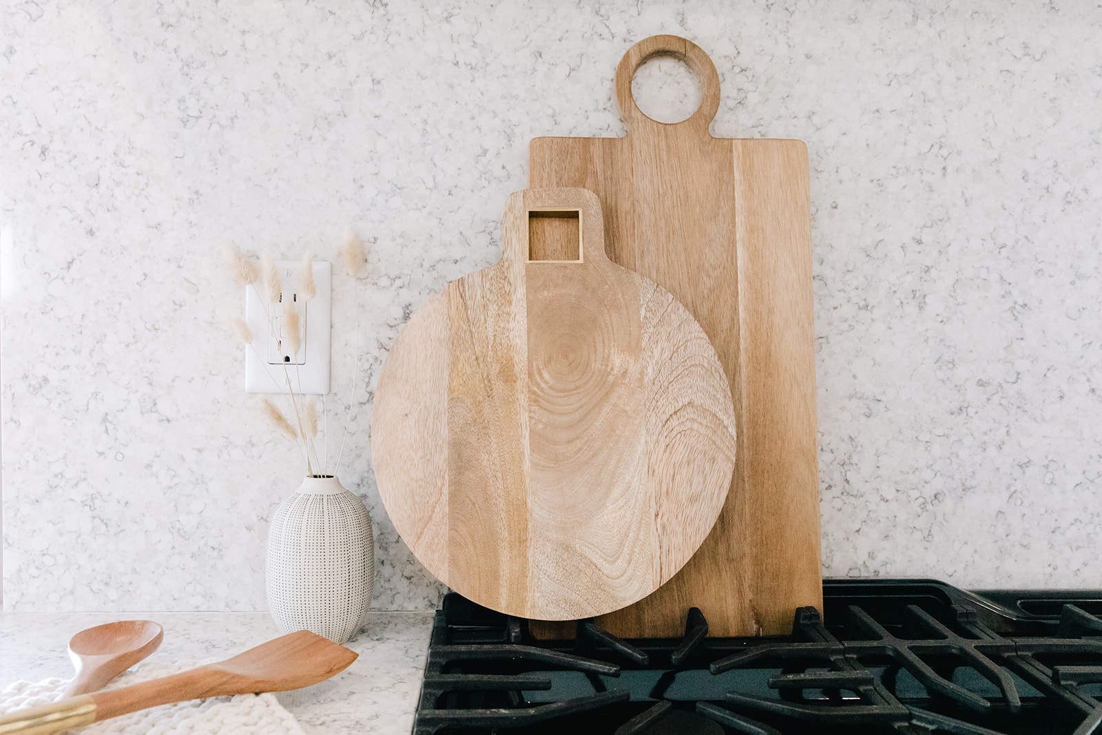
Once we had the layout locked in we started to flush out the material selections. The space needed to feel crisp and modern but with small nods to the original house. We settled on a classic white kitchen with marble-look quartz counters. We opted for a contrasting island in gray with a butcher block top. To make the space feel a bit more dramatic we added in a few details: an oversize range hood, an ogee edge on the quartz (old-world details) and a dark green matte backsplash.
In every project we try to add something unexpected that the client doesn’t know that they need. In this instance we selected a botanical-inspired wallpaper for above the cabinetry (budget constraints ruled out custom full height cabinetry from the start) to add interest to an otherwise forgotten space.
PROJECT REVEAL: MIDORI KITCHEN

Ready to create your dream kitchen? Let us help! We work locally with clients in Marquette, MI and virtually with clients nationwide!

