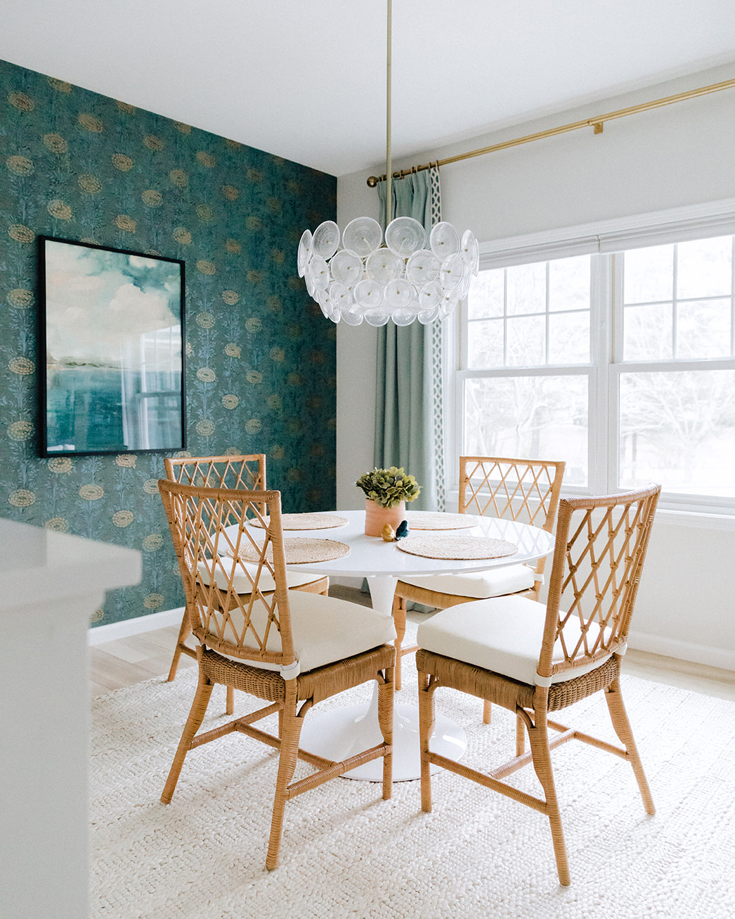
Not every project we take on is a major renovation (thank god). Often we work with clients to finish out their new construction home and make it feel like a real HOME. This means very little construction, and mostly finishing out the space with furniture art and accessories. Remember our beautiful Pineview Master and how the client took a minute to prioritize their grown up space first?! Well now they were ready to upgrade their open concept living space. They wanted to make it a mature space they could entertain in (sorry toys you get sent to the basement), that was also practical and friendly for their family of five. Check out the design plan we put together for the Pineview House.
PINEVIEW HOUSE: DESIGN PLAN
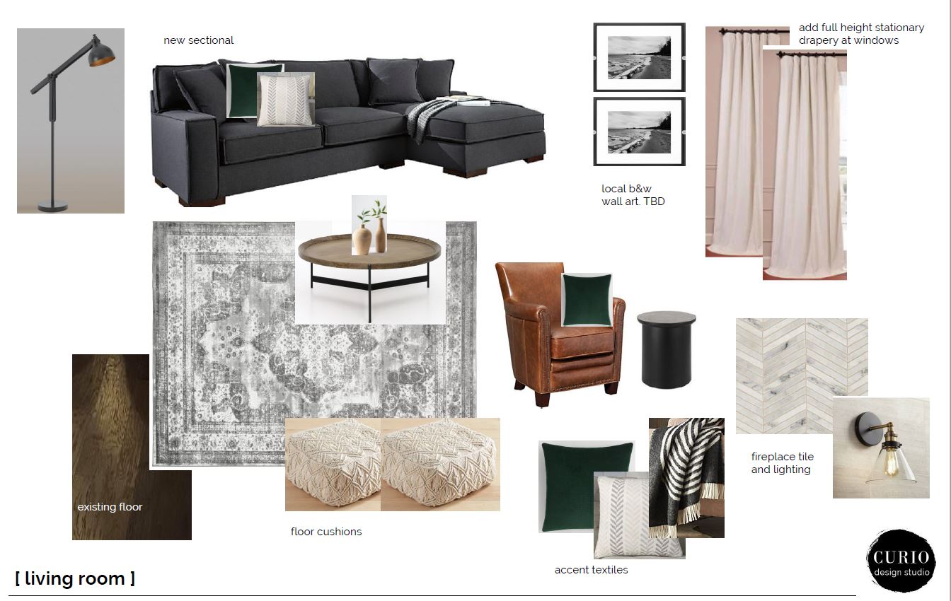
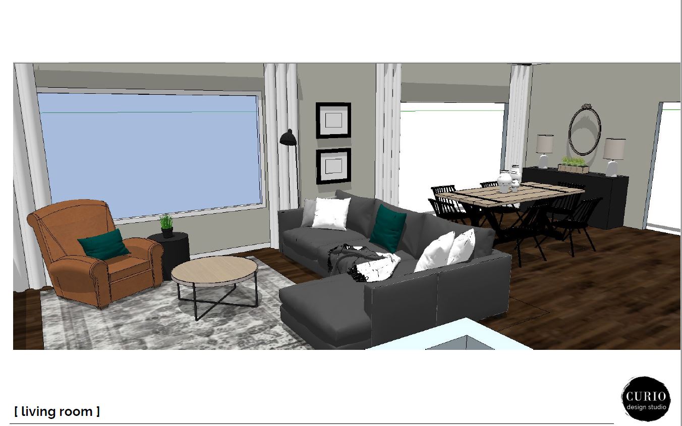
The living room scheme needed to be practical and coordinate with their new construction finishes ( dark hardwoods and neutral gray paint). We went with a large overstuffed sofa in a dark and durable fabric (bring it on kids!) an easily cleanable rug and a coffee table with round edges and metal top. We added in a pop of leather to make the space feel a bit masculine, but the leather is also a practical material for a house full of little hands.
The dining space is open and connected directly to the living room and kitchen. It is a casual space but we wanted to make it feel slightly more formal and ready for entertaining. We suggested a large rustic style dining table and contrasting black chairs. On the wall behind the table we wanted to continue the feel of a slightly more formal space by adding a buffet (hello art supply storage!) flanked with accent lamps.
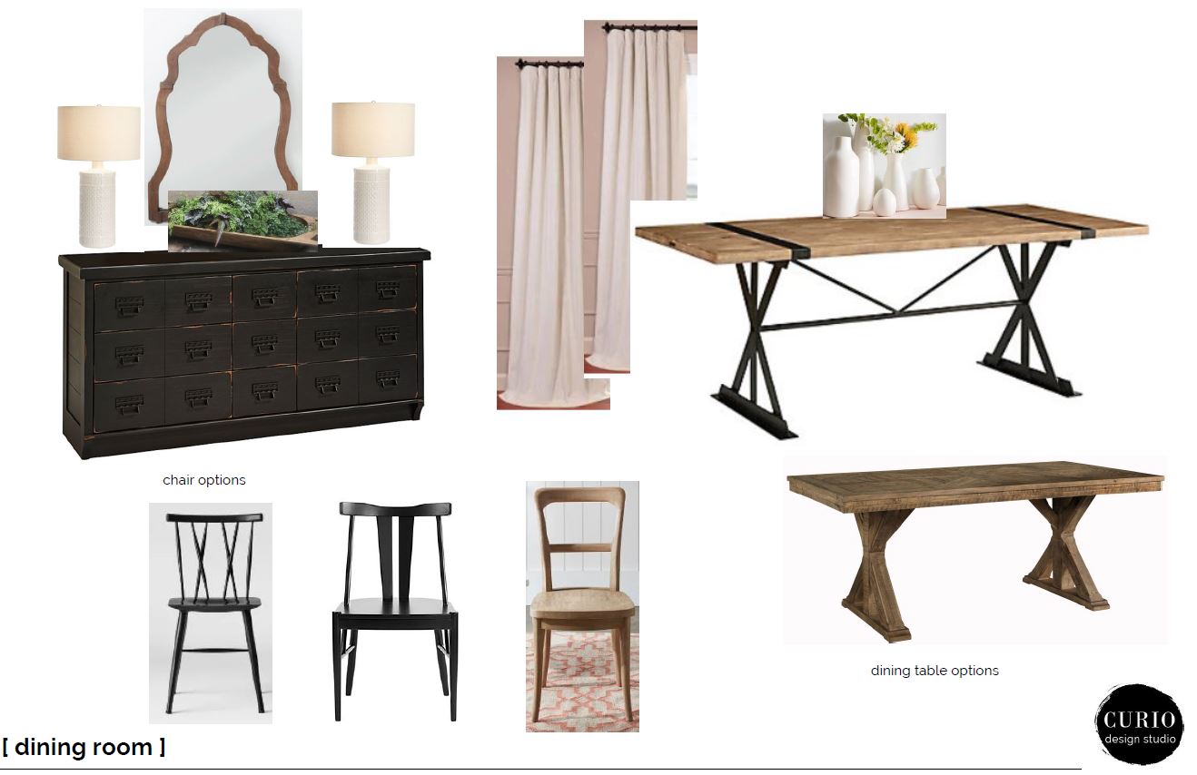
A slight roadblock was caused by the dining chairs. We looked at A LOT of dining chairs trying to find the right combo of price/availability/durable materials/style. Here are some options we looked at. 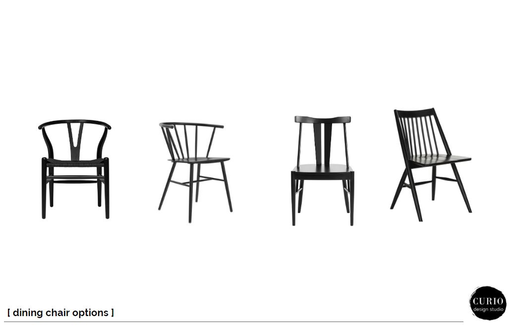
One thing we suggested to tie the two spaces together was the use some stationary drapery panels over both the large window and sliding glass door. We mounted them at ceiling height ( we always do if it makes sense in the space) to accentuate their super tall ceilings. The panels help for both spaces to feel cohesive in the large open format room.
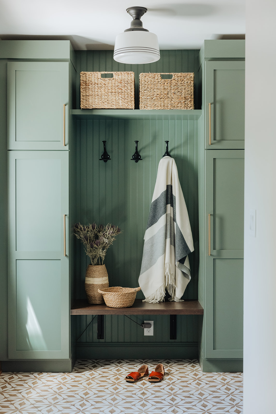
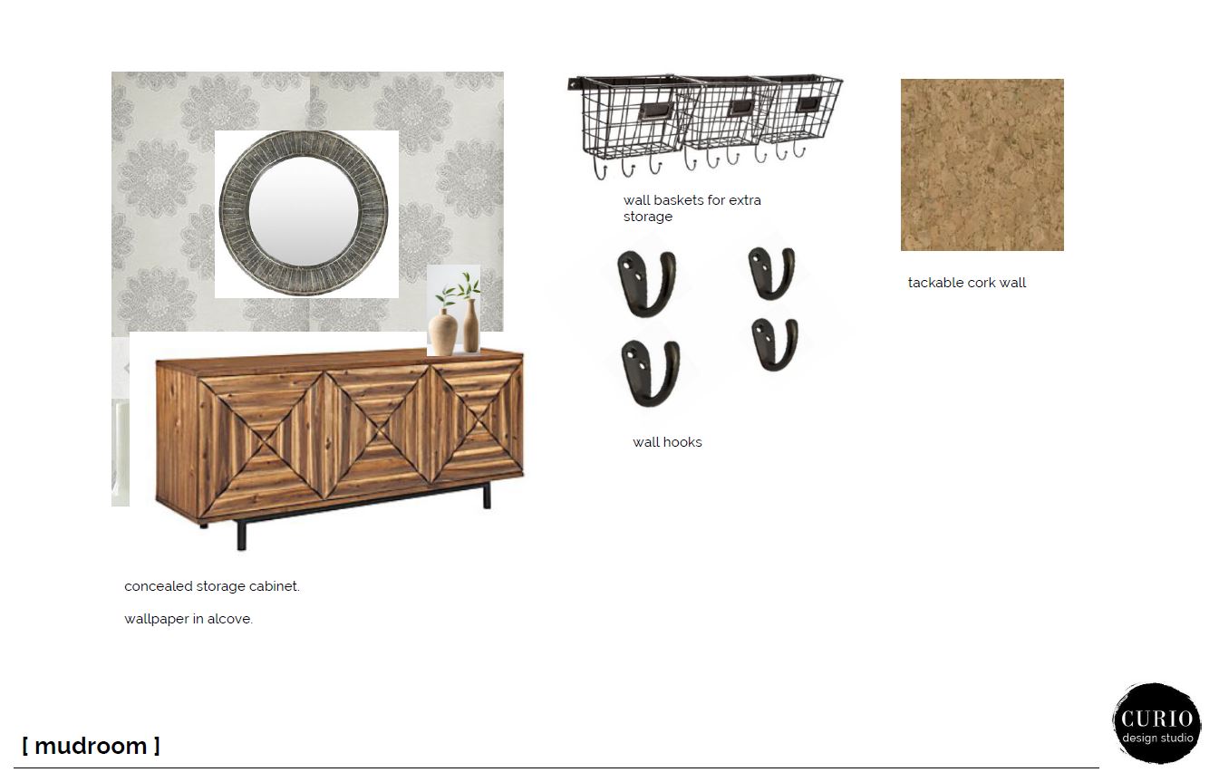
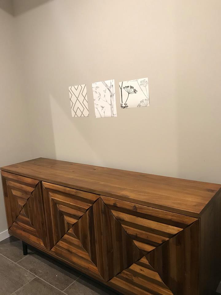
The back mudroom was another space we were addressing in this project. It already had a built in cubby and hook wall, but there was another alcove that was screaming for attention. There was a small alcove that was screaming for wallpaper. Our plan was to add some accent paper + a console with concealed storage for overflow hats and mitts. On top of the console we would have pretty + functional storage for keys, mails, phones etc.
We also pitched the idea of adding a tackable cork wallpaper on one side of the alcove. This was a curveball but to our delight the client went for it. We chose the wall that is out of sightline from the mudroom entry door and the rest of the house. This allows a space for school papers, schedules, bills etc. to be organized but the main sightline to the mudroom looks clean and pretty. The after photos of this space are going to blow you away!
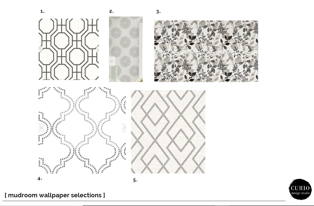
We showed the client several options for wallpaper, both geometric and organic. We always like to give options to our client and work through the process together. Afterall it is their home and not ours! We ultimately ended up going with the more geometric option number 5.
Stay tuned for the reveal of this gorgeous space next week! Need help finishing out a newly renovated or constructed space? We work locally with clients in Marquette, MI and consult virtually with clients nationwide to make beautiful rooms for your plants to live in!
Happy Designing!