Everyone is a sucker for a good BEFORE + AFTER of a project. Swiping between images of the transformation is so easy and satisfying. But I try to make it a point to not breeze over all the work and planning that gets us to this point in the way Fixer Upper does. The interior design of any space is always a long process of two steps forward one step back, revisions, budget cuts and never-ending creative solutions. This is true with a “cosmetic-only” update of a master bedroom and even more true for a MAJOR renovation of an abandoned century old log cabin (YUP, that’s what we started with here..)
The amount of work, collaboration and pure heart that went into the renovation of BARREL + BEAM is hard to capture in words in a blog post. But in the interest of breaking down any and all misconception around what Interior Design is all about let me try. Check out a little bit of what went into the BARREL+BEAM BREWERY design plan
People always ask me : “What is the best place to start when re-designing a space?” And to be honest I don’t have an exact answer. Every project is different and has a life of its own. Sometimes there is clear inspiration within the space, or sometimes the client has a brand identity that needs to be expressed in the interior. For BARREL + BEAM it was both. We started out by pulling a range of finishes and colors that were going to enhance some of the existing finishes of the original cabin. But we also wanted to inject some colors and pattern that were going to reinforce the concept behind the business and the beer : UP NORTH BELGIAN COTTAGE.
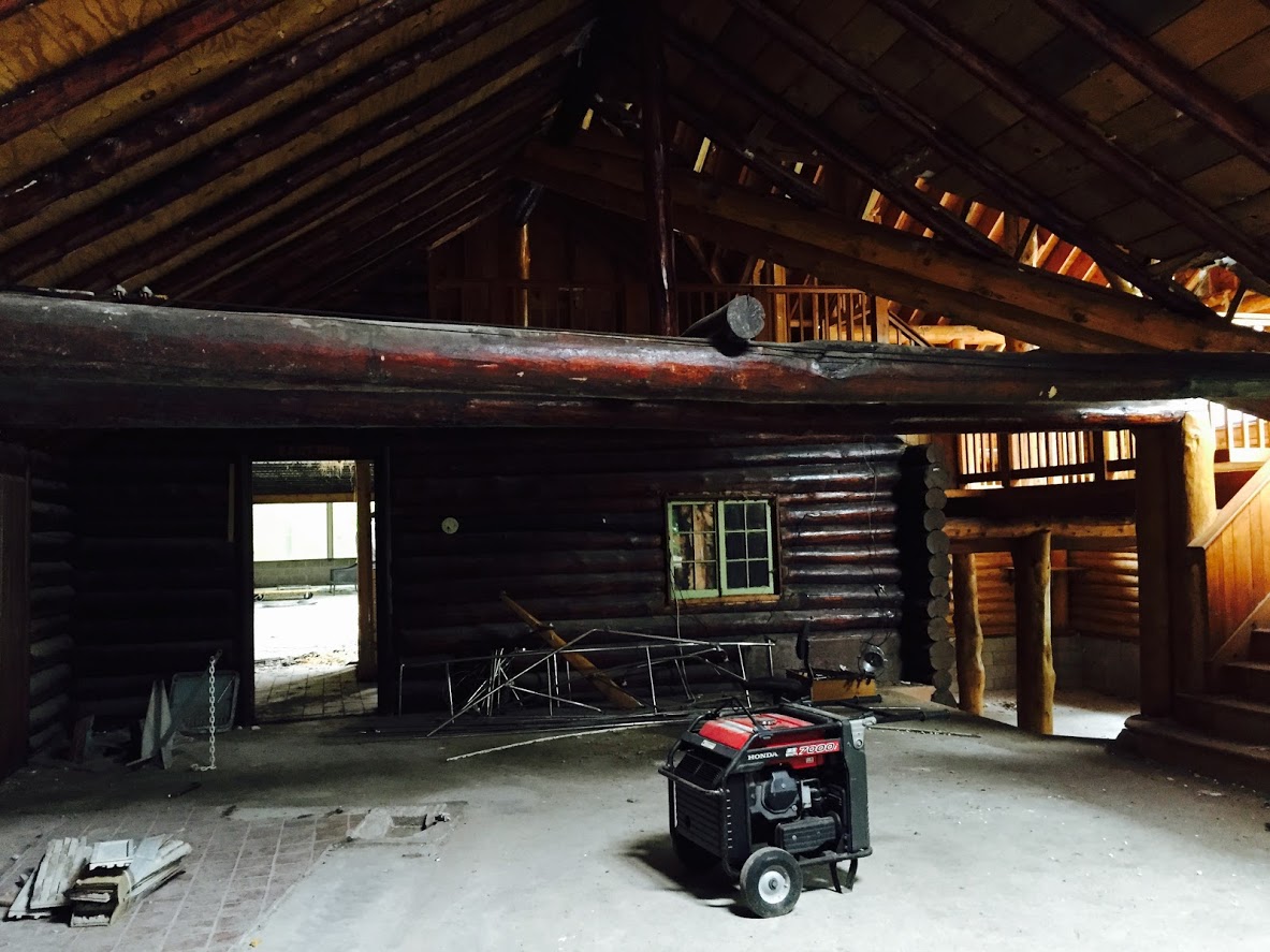
Brewery Before
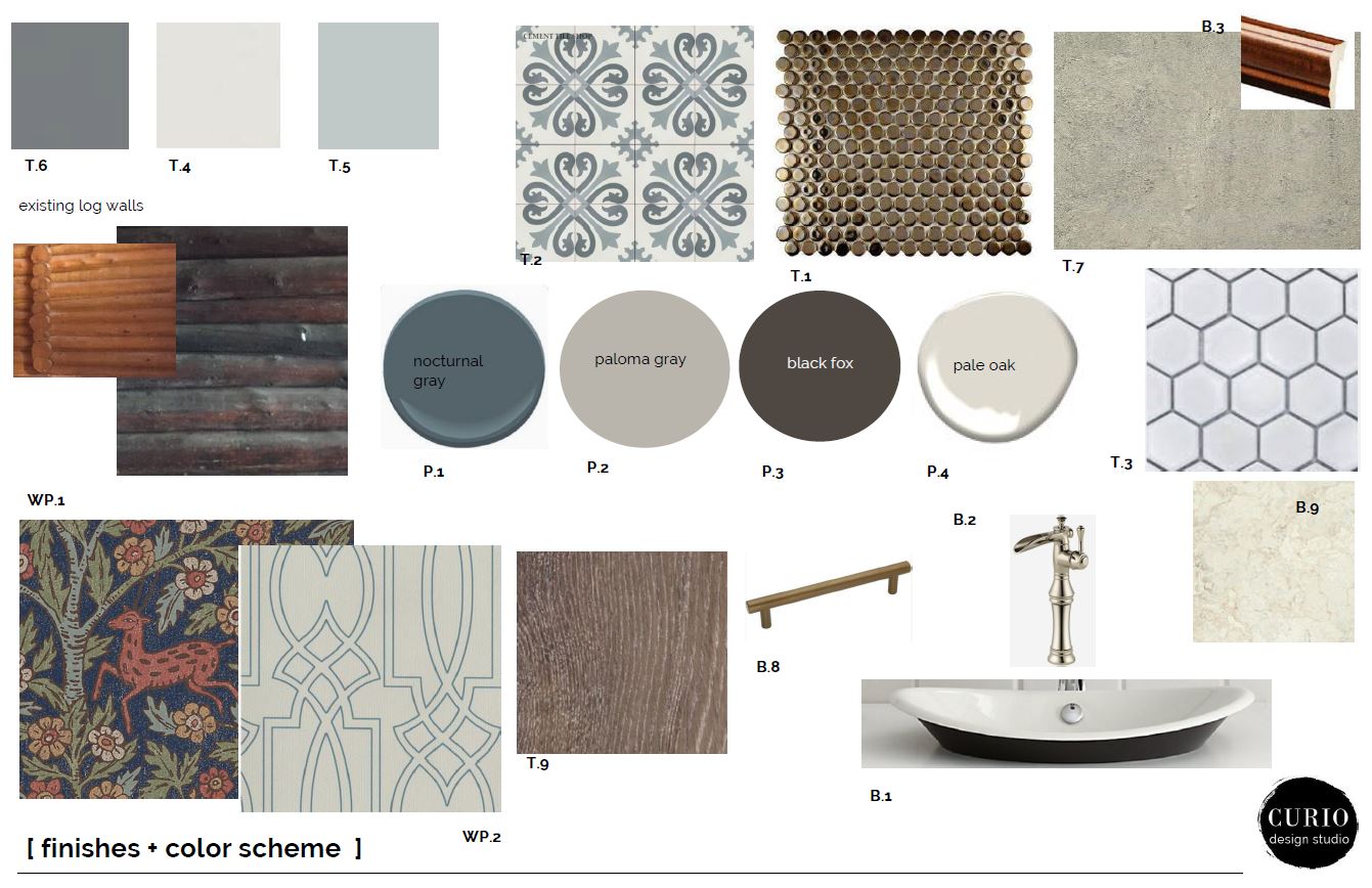
What does that mean exactly? For us it meant a mix of the original log walls and raw wood finishes mixed with updated traditional patterns, soft colors and unique fixtures.
It’s farmhouse meets U.P. log Cabin meets old Belgian bed and breakfast.
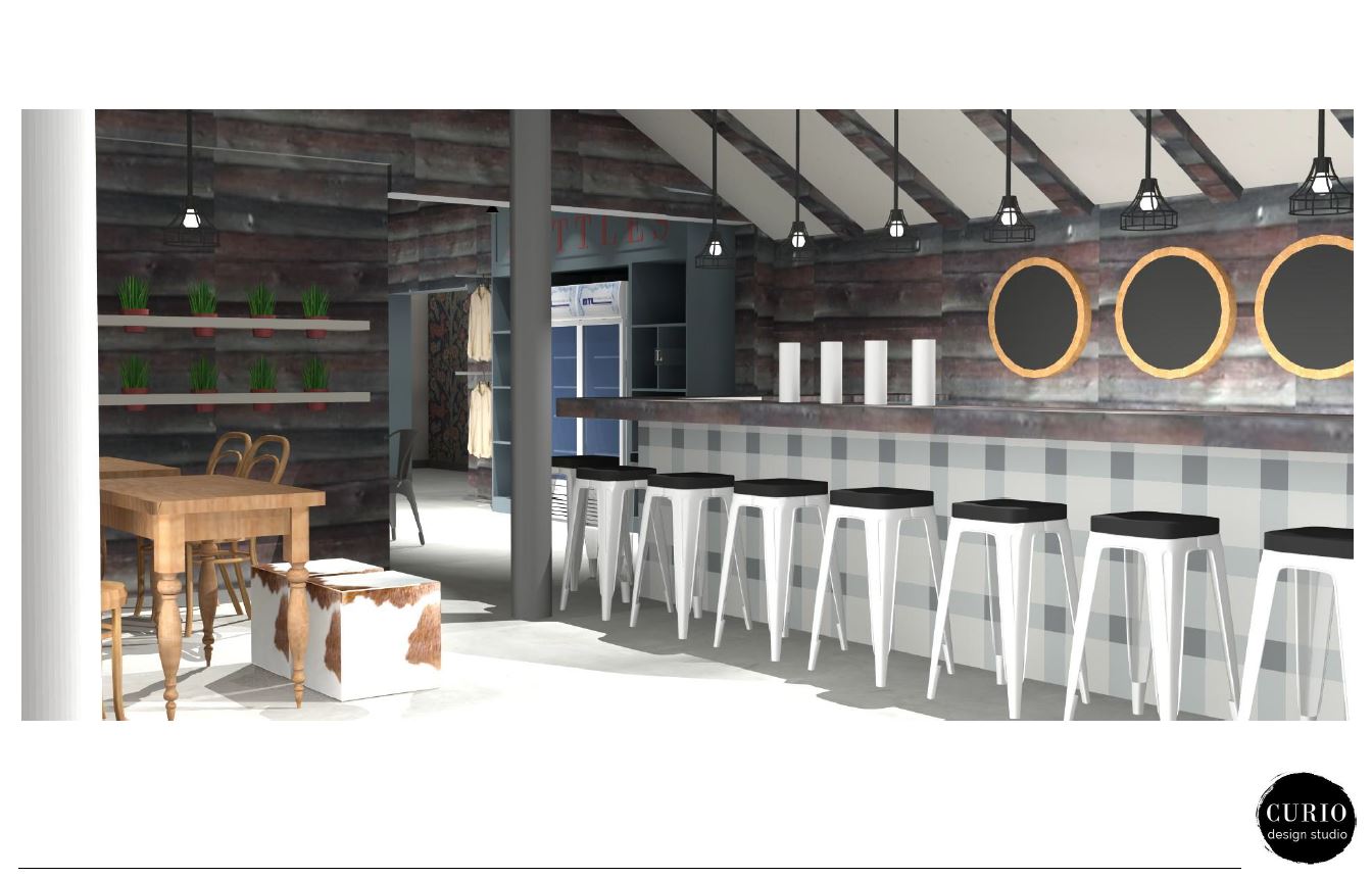
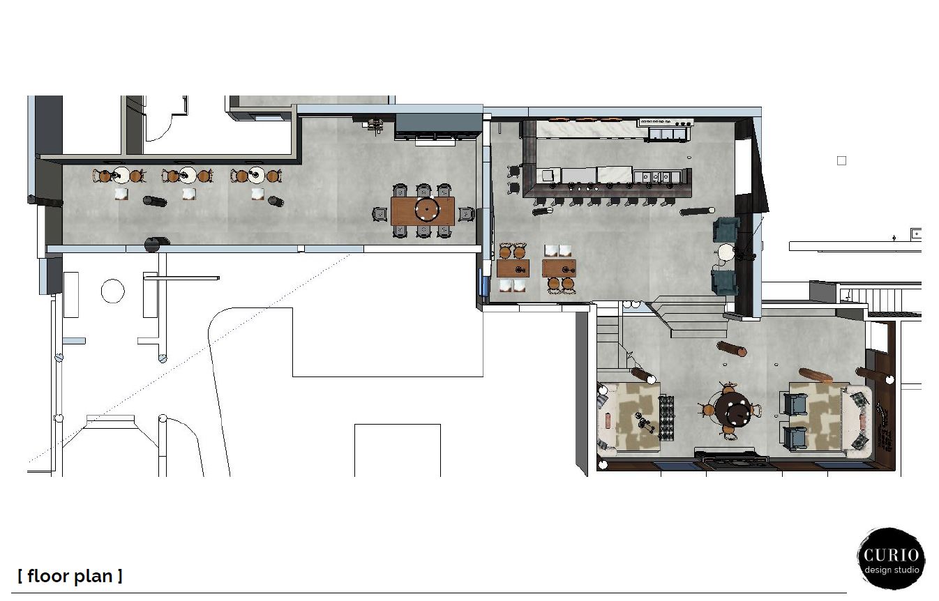
Furniture selection was also extremely important. When we worked on the floor plan we purposely included several different zones for a variety of activities. We planned for large tables for big groups, small cozy corners for more intimate conversations and of course TONS of bar seating. Actual furniture selection was important. It had to feel like it had been collected over a period of time.
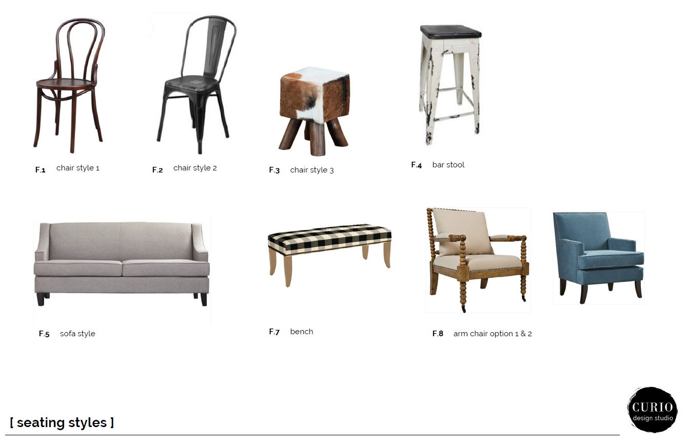
So we went with a huge variety in actual seating. Two chair styles make of the main table seating–a mix of metal and wood. Inserting a few random cowhide stools brought in a little more of that collected + up north feel. For soft seating area we went with a mix of clean lined upholstery pieces to create cozy settings for convos and board games.
And of course in any brewery we need a bar. We wanted this to be a stand out piece. Since we were working within the confines of a log cabin we had A LOT of wood to deal with. That combined with the low ceilings made the space feel dark. Using the bar as an area to inject a light and modern material helped to break up all the dark wood finishes. We presented the idea of doing a plaid bar front and the client LOVED it (YAY for awesome clients!). Not only is this the feature of the space when you walk in, it was also an affordable solution.
Created from 3 standard colors of an inexpensive 4 x 4 ceramic tile it was the perfect solution.
Another big part of our design concept was this AH-MAZ-ING accent wallpaper in the restroom corridor. We wanted this little bit of wall that peaked out to be super interesting and draw people back down this hallway.
This wallpaper could not embody UP NORTH BELGIAN COTTAGE more perfectly. It felt like a risk to present it but again–AWESOME CLIENTS who trusted the vision and loved the wallpaper. *SPOILER ALERT This wall paper gets SO MANY comments in the new brewery and people are constantly instagramming it. Stay tuned for the after photos in an up and coming reveal post! 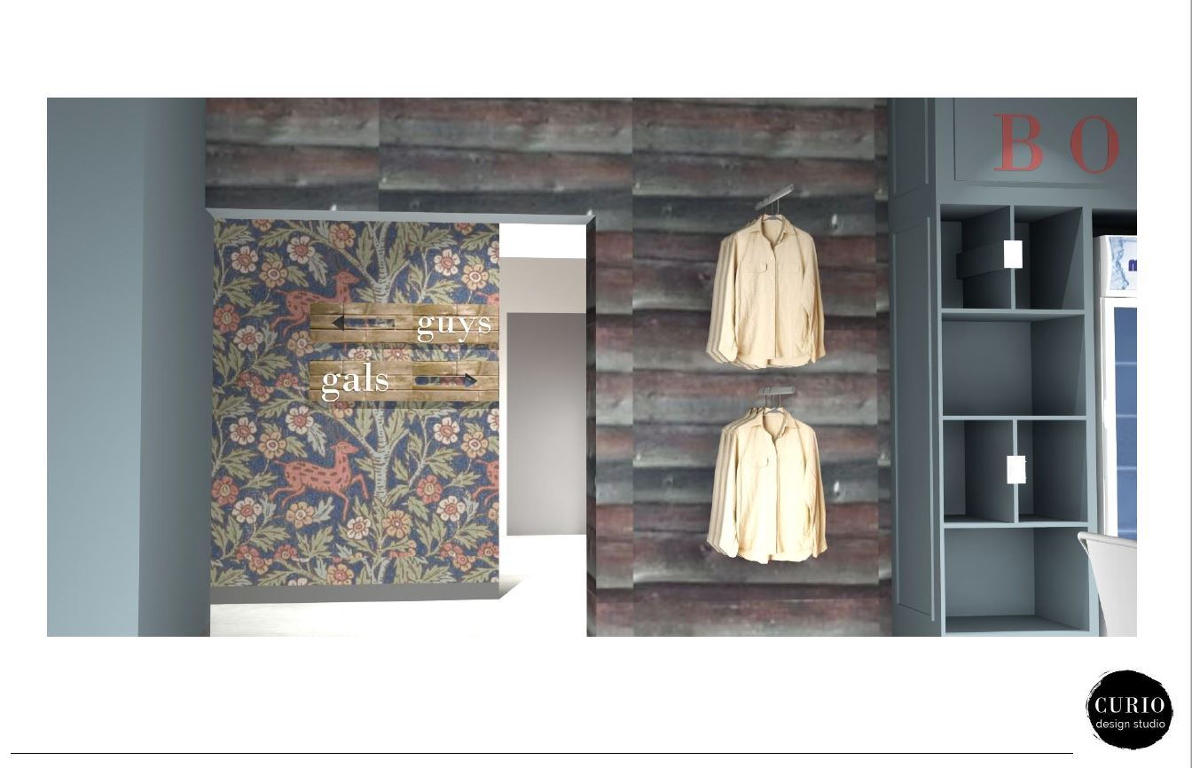
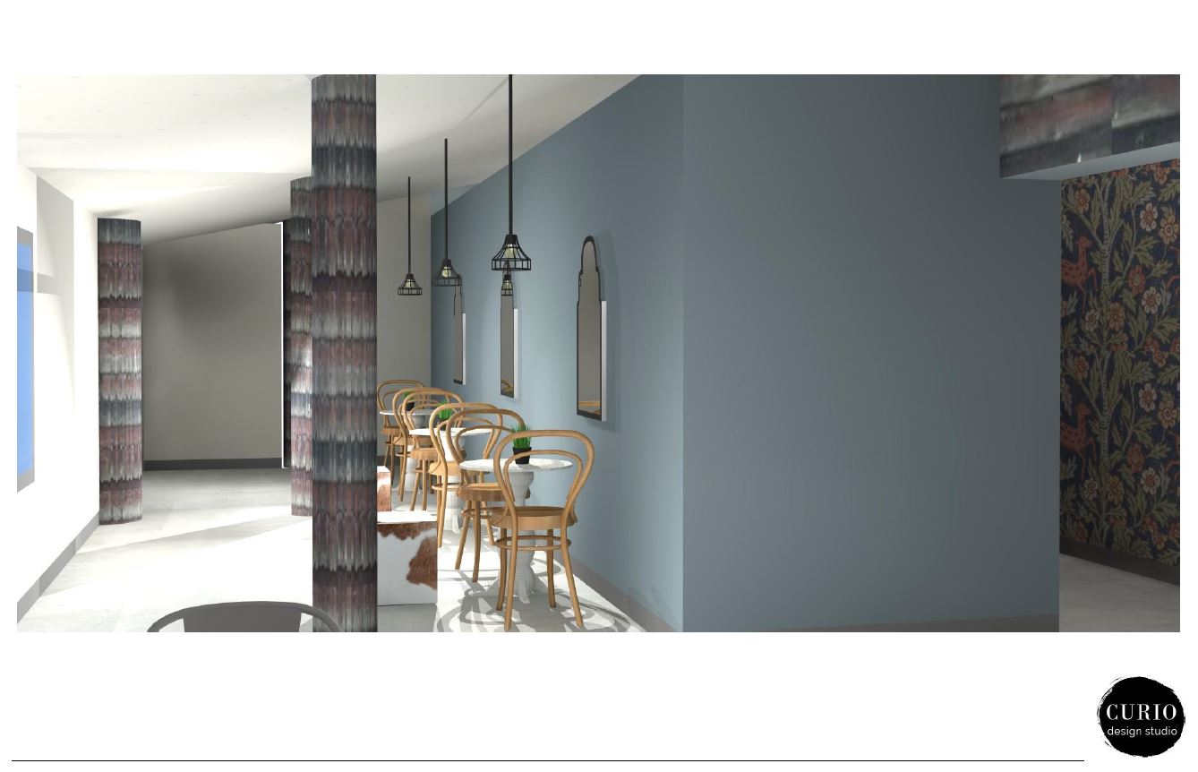
So far it seems like this was a seamless process and everything we presented went over without a hitch right? Well, finish wise our concept stayed true from concept to completion. But when it came to the actual building layout we had a lot of revisions. As construction hummed along we were presented with a lot of challenges to work around. Walls and beams that couldn’t be moved, constantly changing ceiling heights, the unpredictability of all things that come with a century old log cabin. And sometimes it is hard to let go of that original concept and change course. Which we had to do (several times over with this entry way). In the end we settled on creating this cozy seating area to accommodate several 3 top tables. It has now become one of my favorite spots in the brewery.
All the changes also led us for to the perfect spot for a branding wall upon entry. In the end it all worked out so much more perfectly than the original layout could have ever achieved.
Reinforcing a strong theme in design–stay flexible + stay creative!
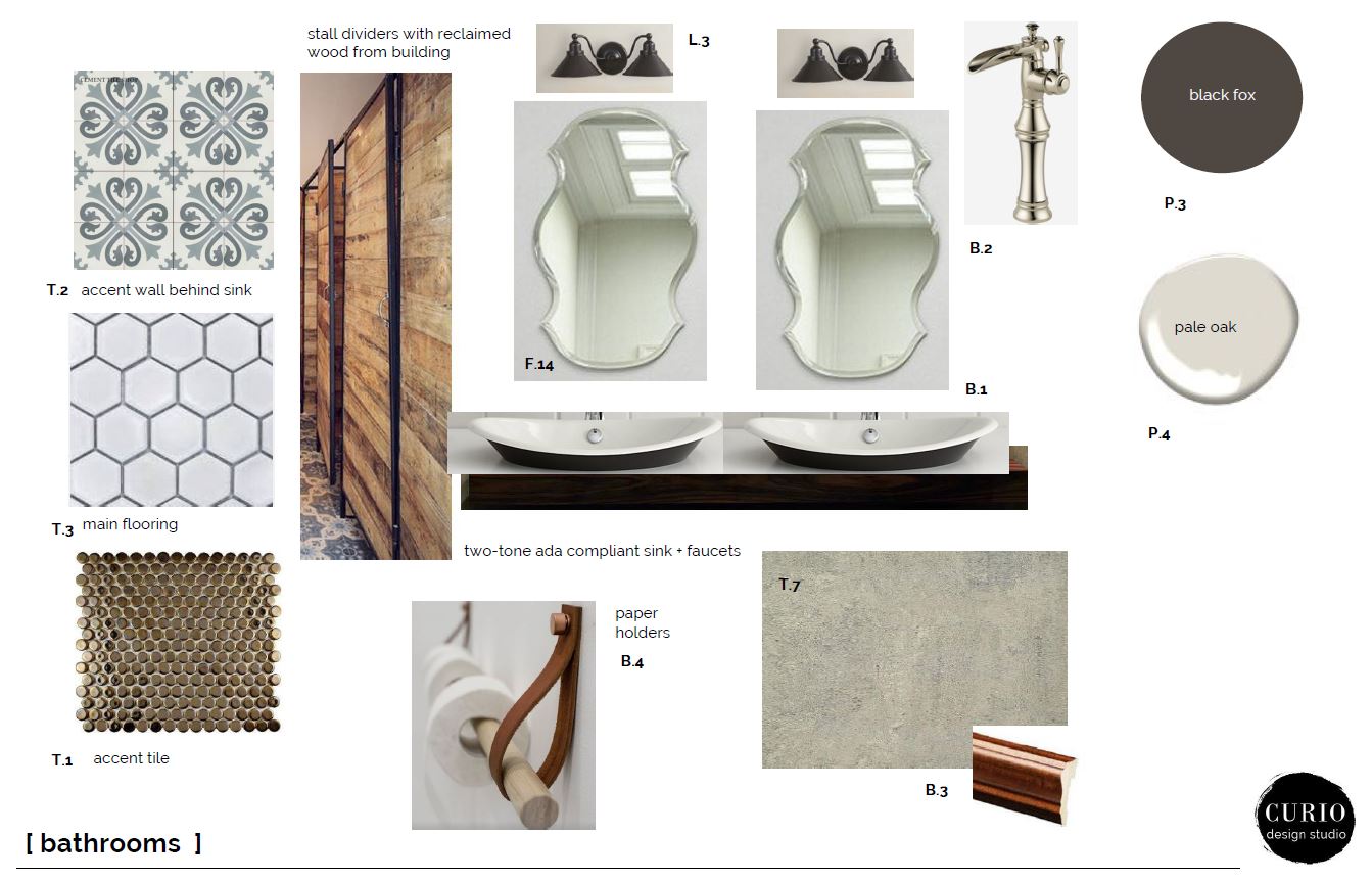
The bathrooms were also a place where we put a lot of effort vs. just breezing over with standard commercial finishes. We carried through the same color scheme through walls, lighting and finishes. In the Women’s room (sorry guys!) we went with an amazing custom designed cement tile as a backsplash to the vanity and mirrors. It really is breath-taking when you walk in. In order to balance out that tile splurge we went with lower cost + simple tile on the walls and floors.
One of my favorite finishes in the entire plan was the copper penny tiles that we used in both bathrooms. BUT man! Those tiles caused us some headaches, out of stock, no longer available, out of the price range we had allotted for accent tile. After looking at several alternates we were all in agreement that nothing could replace them. I literally spent a full week hunting those tiles down—oh the glamorous parts of interior design you never consider! In the end we found them and they are a beautiful addition to both bathrooms!
A project of this scale there is SO MUCH that goes into it. We started out by presenting a material concept and furnishings that were going to enhance the brand identity of BARREL + BEAM. Throughout that process we pivoted and did full 180’s. Our job was to always stear the client and the project in the direction of that original concept that we all loved. AND YOU GUYS. This space is just ( I mean maybe I am biased?! ) but when you walk in it is so breathtaking. It is a tribute to the amazing clients and amazing team of tradespeople who poured themselves into this project for the better part of a year. Thank you for letting us be involved in the process! Can’t wait to share the project reveal in a few weeks!
OH P.S. (if you are still reading..) it should be noted that we worked on this project almost entirely virtually through our Collaborative Consulting service. The results speak volumes to what can be accomplished with great communication + seamless processes + and a collaborative team! Think we could help your small biz out with their interior? Let’s chat!

