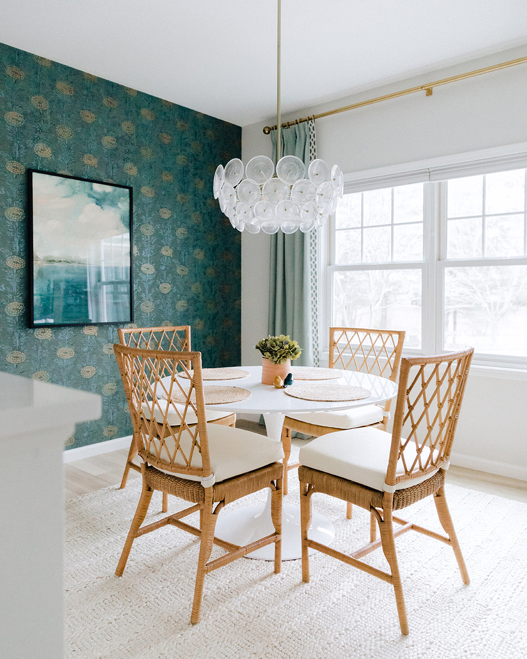
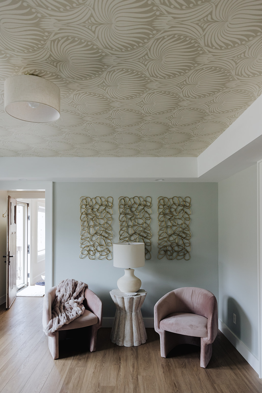
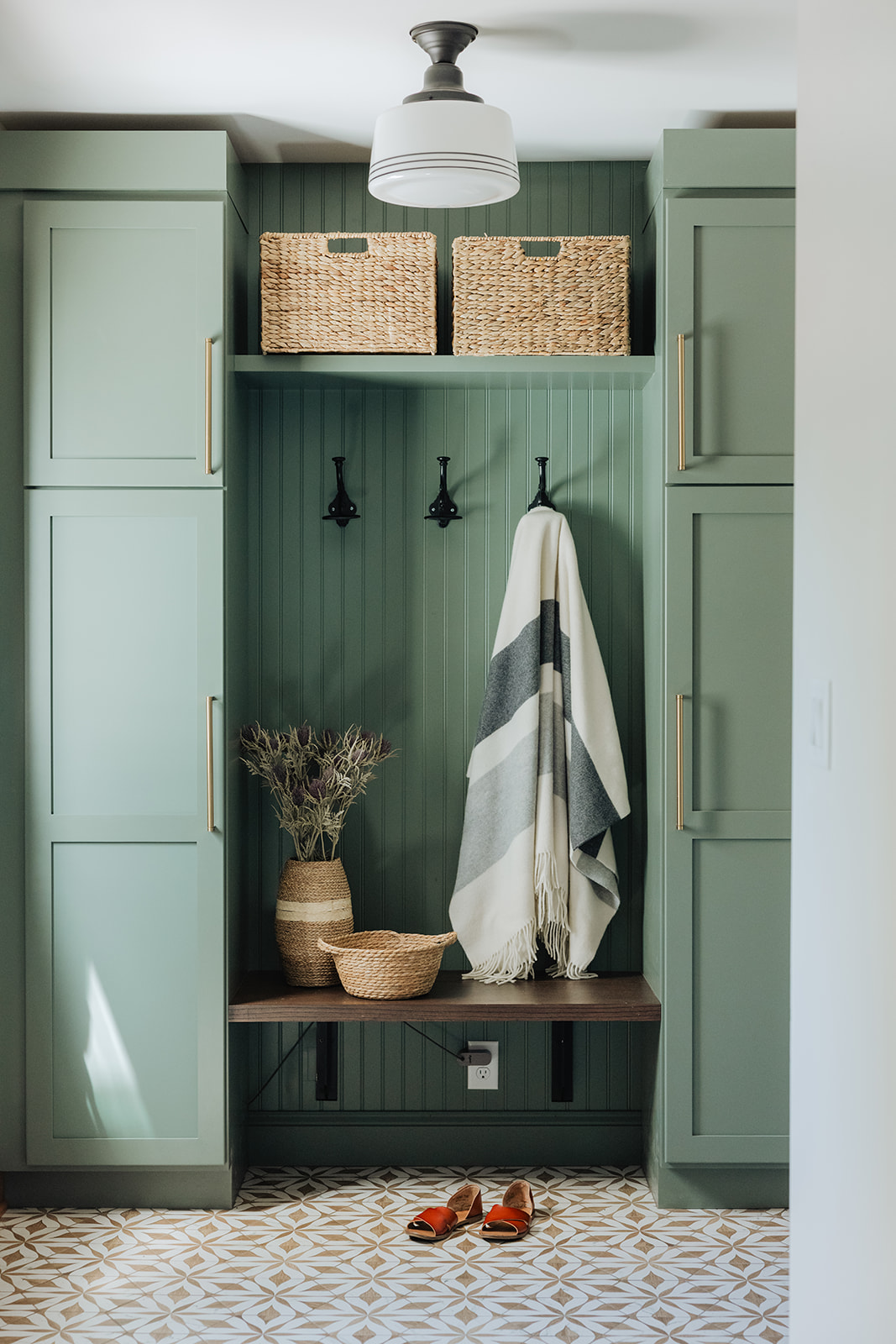
Reveal day is like Christmas for us! We finally get to share the final product of months (and sometimes years) of hard work come to fruition. The reality is that major renovations take time, a lot of time, despite what HGTV might be telling you. And sometimes the in-between stuff is not so pretty. But that “in-between” stuff is what takes a house from the before to the after we all love to see.
Check out how we renovated this dated bathroom into an oasis for one lucky little girl.
MID CENTURY MAIN HOUSE GUEST BATH
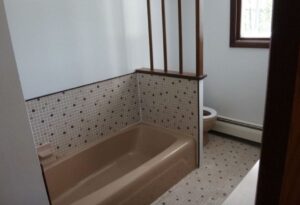
The Before.
This is what we started with. Dated, dark and cramped. We new this would be a full-gut reno–taking the bathroom down to the studs.
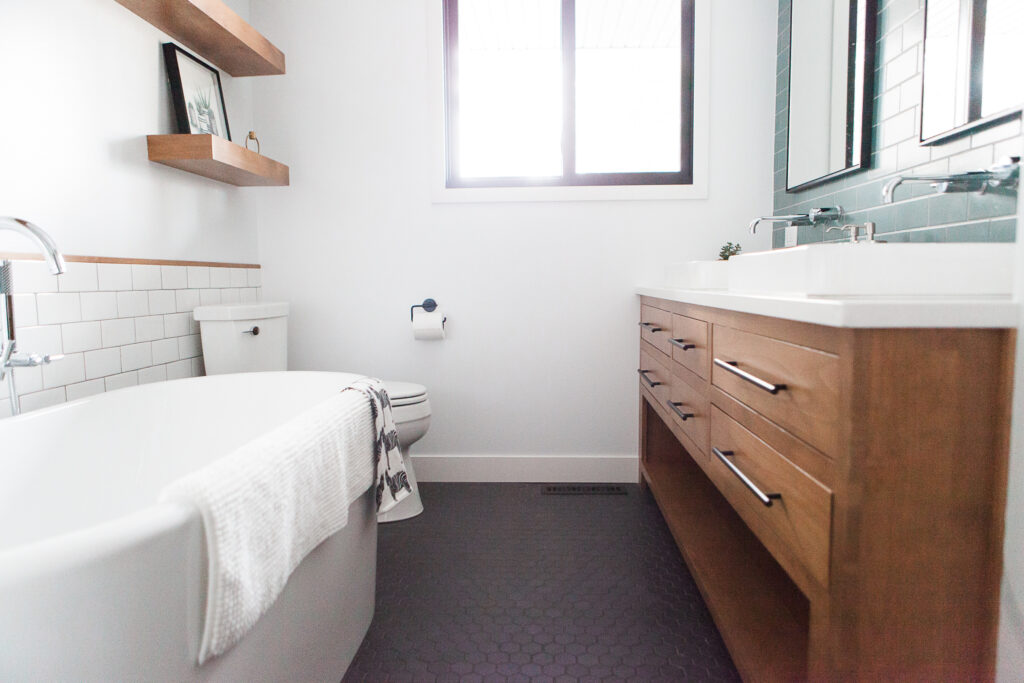
The wishlist: brighter, more open but within the existing footprint of the bathroom, freestanding tub, double vanity and storage! 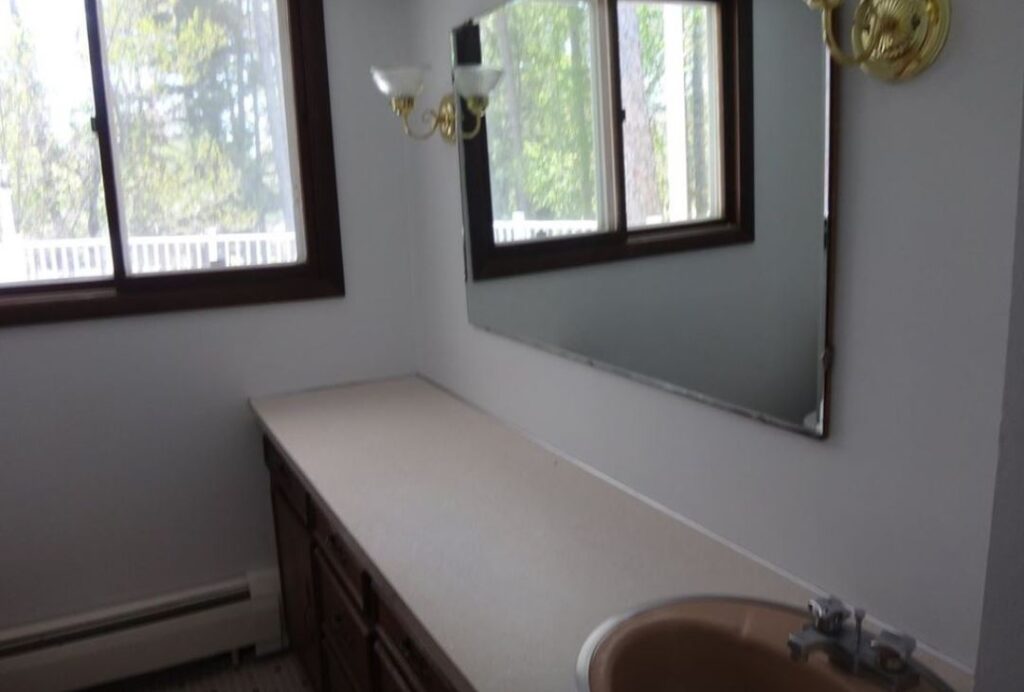
The Design Plan.
Working with-in the constraints of the existing footprint meant no knocking through walls to gain more space. In order to gain a few actual inches + the perception of space we decided on a few things with the layout.
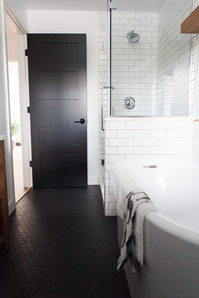
First, we moved the entry door. Previously it was centered on the wall and opened up right into the shower, leaving a dead space behind the door. We moved it so it was tucked directly against the wall when it opened, allowing for better flow in and out of the bathroom.
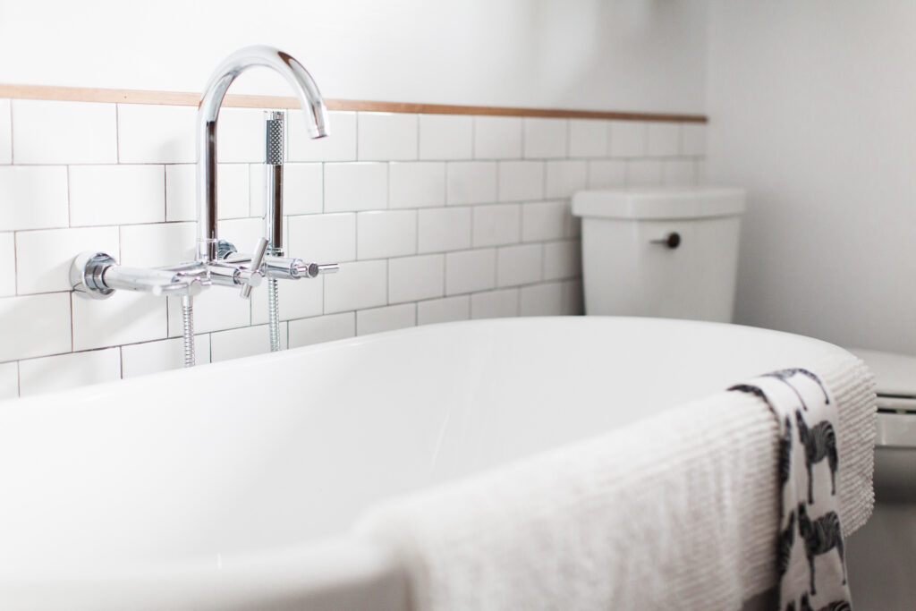
Second, we completely removed the divider wall between tub and toilet, opting instead for a freestanding tub and more visually open space.
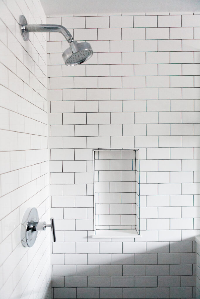
Last, we busted out the shower. Previously this was drywalled and tiled on all sides with a small opening to get in. We ditched those walls in favor of seamless glass + a tiled knee wall separating tub and shower
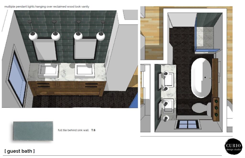
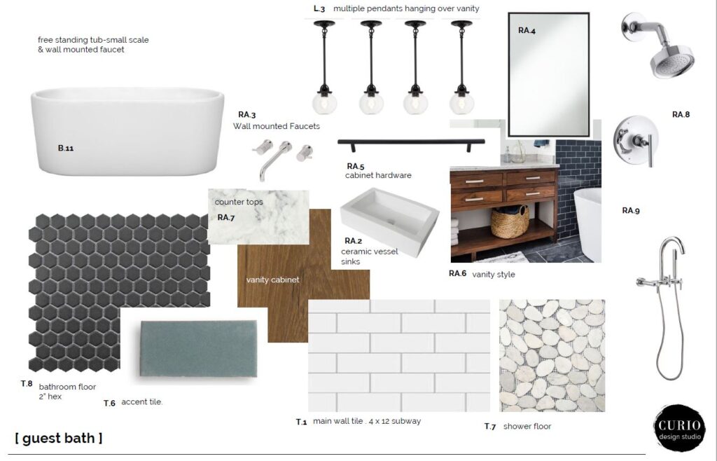
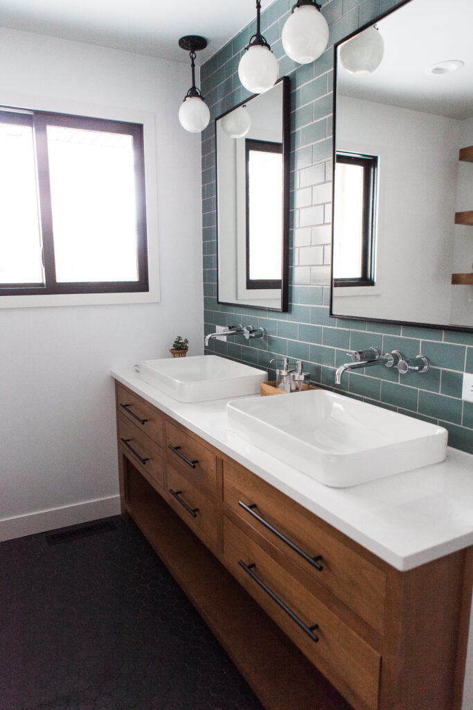
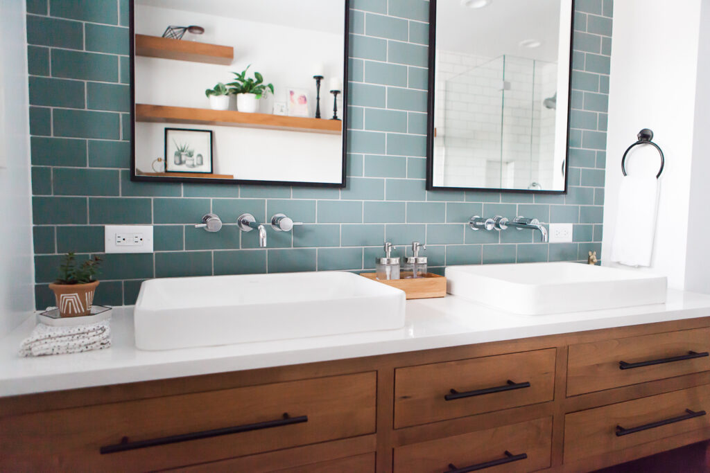
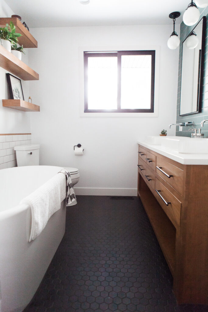
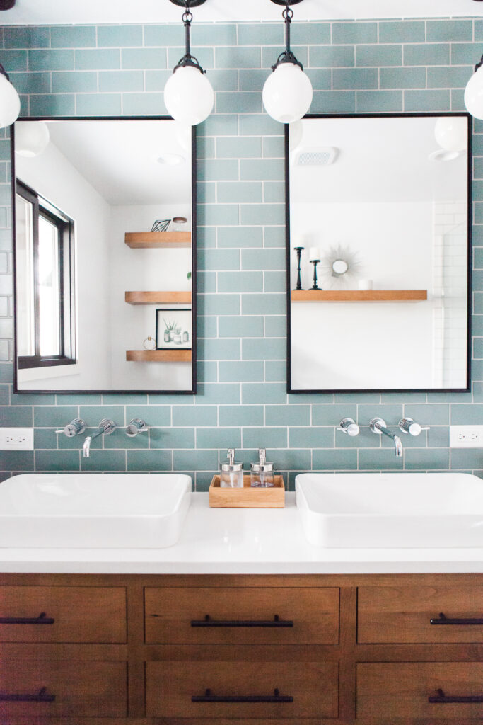
Material selections were kept sleek + simple. A matte black hexagon for the floor, warm wood vanity style with marble-look quartz and chrome plumbing fixtures. The main focal point of the space was the amazing teal tile that runs the full wall behind the sinks. Classic subway tile, off-set by wood trim and black accents completes the space the rest of the space.
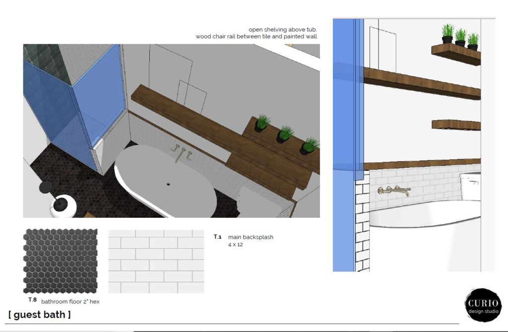
For added storage and a design feature element we created custom floating shelves on the wall above the tub. Not only is this a great (+ decorative) way to store needed toiletry items, it also connects back to the material of the wood vanity.
The Reveal.
If you have a reno or two under your belt you know that hardly anything ever goes to plan. But this one was DAMN.CLOSE. A few minor changes to the plumbing fixtures and the shower floor tile and WA-LAH, feast your eyes on the Mid Century Main House Guest Bath!
Thinking of renovating? Let us help! We work locally with clients in Marquette, MI and virtually with clients nationwide!

